Picture this:
You're about to learn everything about "7 Reasons Your Logo Design is Not Making the Cut No One Considers Number 3" — without the jargon, without the fluff, and with at least one dad joke that'll make you groan. Grab your coffee. Let's go.
Key Takeaways
6 min read
- 1What you need to know before printing
- 2Common mistakes to avoid
- 3How to get the best results
Coca Cola. What image comes to mind? You're definitely not picturing a clown with pink and blue hair. No, the very first thing you think about when I say Coke is that signature red and white logo design. Maybe paired with those fizzy brown bubbles we all love.
That's the power of a brilliant brand logo. Still not convinced? Picture this: you're wandering around China, Thailand, or Russia, can't read a single sign. Then you spot those golden arches – that big, yellow M – and feel instant relief. McDonald's! Finally, food you recognize!
When your business logo is powerful enough, people start associating specific ideas and feelings with that image. You want customers to connect positive emotions with your brand. Your logo becomes an immediate emotional trigger. And when people feel something, they buy.
<AcademyQuote> Your logo isn't just an image – it's the visual handshake between your brand and every potential customer. </AcademyQuote>
At Printulu, I've seen some truly wild requests from clients. Being our in-house designer can be incredibly rewarding, but also frustrating at times. I genuinely want my clients' businesses to thrive. But when someone asks me to use a pixelated image they downloaded from some dodgy website for a large <a href="https://www.printulu.co.za/product/banners?utm_source=blog&utm_medium=content&utm_campaign=internal" class="internal-link text-[#007756] hover:text-[#005d42] underline font-medium">banner</a>? I can't help but cringe.
Your business isn't low-rate, so why make it look that way to customers? You wouldn't rock up to a job interview in sweatpants and your gran's hair curlers, right? You put your best foot forward because we live in a world where books are absolutely judged by their covers. Here's how to make your logo stand out from the crowd.
1. Be Unique and Clever#
In most cases, imitation might be flattery – but not with logo design. Every few years, new design fads pop up. I love studying design trends, and you'll often find me suggesting clients jump on certain bandwagons to stay current. But with logos? Following the herd makes no sense.
Instead of using clichéd designs, strive for something uniquely recognizable. Your logo helps distinguish your brand from competitors, so it must stand out from the pack – something many brands struggle with. BMW's logo isn't a car, but everyone recognizes it and knows it's a car brand.
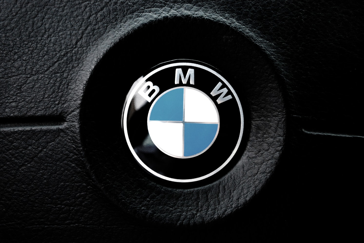
BMW Logo
2. Understand the Brand
Every good logo tells a story. Yes, it's an image, but it's also your brand's introduction to the world. Your logo must reach a specific audience, and you need to keep this front of mind during design. Write down your thoughts about the brand. Create a mood board with imagery that captures the brand's ideology.
3. Colour is Key
Here's the consideration most people completely overlook: your colour palette choice. This isn't a superficial decision! Please don't choose colours just because they're your personal favourites.
When considering your brand's personality, you must think about every aspect of the image. Bright, bold colours grab attention but might seem brash. Muted tones suggest sophistication but could be overlooked. Every colour carries different implications and adds nuance to your message – don't fall into the trap of conveying the wrong message with a simple brushstroke.
<AcademyProTip> Test your logo in grayscale first. If it doesn't work without colour, it won't work in single-colour printing scenarios either. </AcademyProTip>
The Logo Company released an article "The Science Behind Colors" and an infographic showing The Psychology of Color in Logo Design. Here's a quick breakdown:
- 1Red: energetic, sexy, bold
- 2Orange: creative, friendly, youthful
- 3Yellow: sunny, inventive, optimism
- 4Green: growth, organic, instructional
- 5Blue: professional, medical, tranquil, trustworthy
- 6Purple: spiritual, wise, evocative
- 7Black: credible and powerful
- 8White: simple, clean, pure
- 9Pink: fun and flirty
- 10Brown: rural, historical, steady
These meanings can shift depending on culture, so do your research! Remember that a versatile logo will still function beautifully in grayscale.
4. What's in a Name?
A logo consists of two elements: a word-mark and a symbol. Before companies can represent themselves solely with a symbol, they need serious advertising muscle (think Starbucks or Mercedes). Some companies stick entirely to logotype, like Google.

Google Logo
5. Keep it Simple, Stupid!
We actually have a <a href="https://www.printulu.co.za/product/posters?utm_source=blog&utm_medium=content&utm_campaign=internal" class="internal-link text-[#007756] hover:text-[#005d42] underline font-medium">poster</a> with this exact wording at Printulu because it's SO crucial. Simple yet powerful logos dominate the business world and consistently prove to be the best icons for standing the test of time.
You want a balanced combination of simple and quirky – interesting enough to catch attention, but not so complex that people need to sit and analyze what they're looking at.
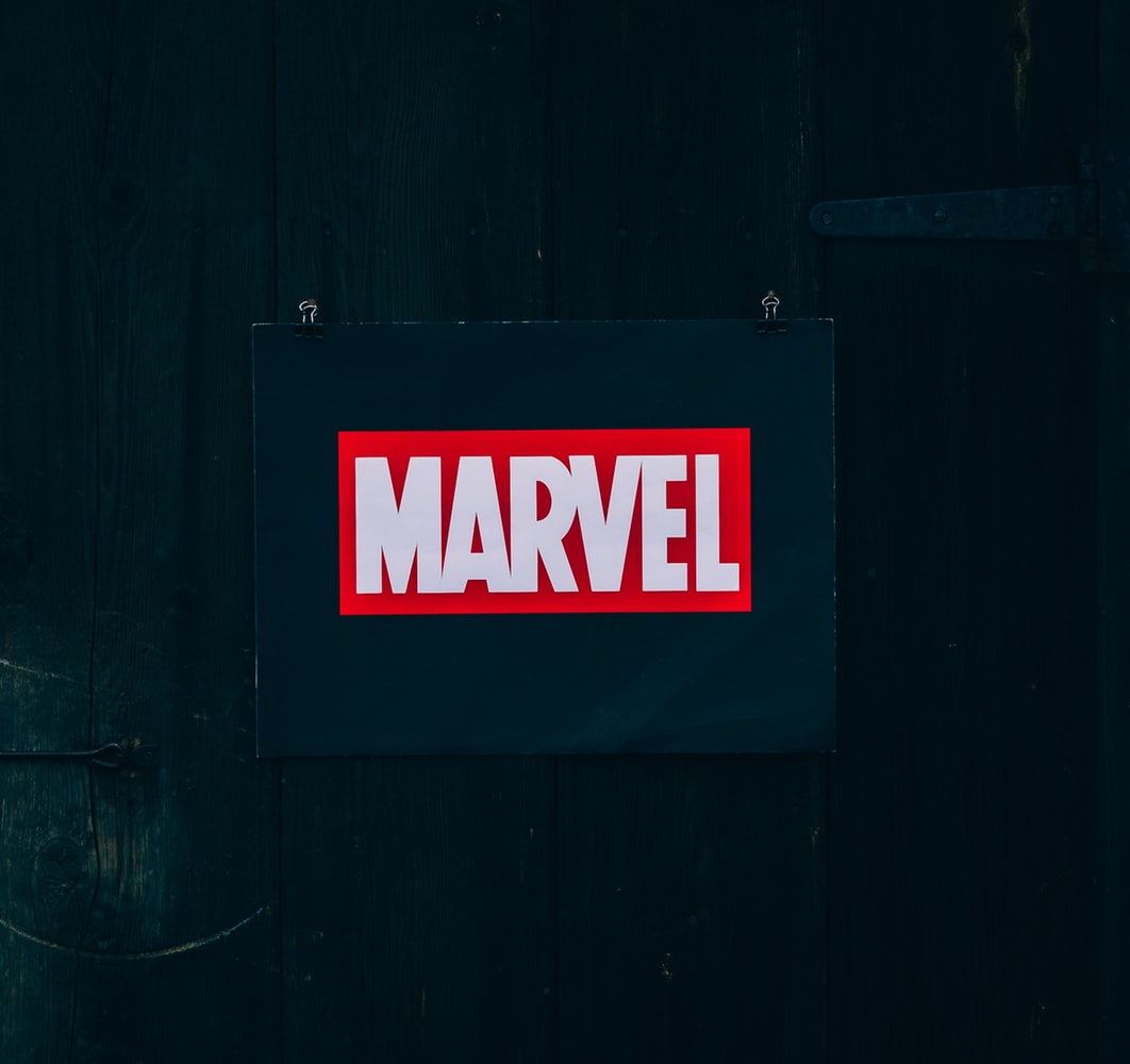
Marvel Logo
6. Don't Expect Instant Success
Nike, Puma, Audi – all iconic logos now, but like anything successful, they took time to gain recognition. Logos won't become instantly iconic, even if you've designed the most stunning combination of vectors. Success depends on the product's performance and its market position.
7. Use Online Resources and Tools
There's a massive ocean of information online for those seeking inspiration, collaboration, or assistance with logo design. If you're looking for a quick start, experimenting with logo templates can provide an excellent foundation to build and adapt from.
Use Pinterest for inspiration, and don't be afraid to sketch multiple ideas. And remember, if you can't get it right, I'm always here to help. Printulu offers professional design services at affordable prices, so don't stress if you don't have a logo yet!
<AcademyDadJoke> Why don't logos ever get tired? Because they always have good resolution! </AcademyDadJoke>
Resources
10 Tips for Designing Logos That Don't Suck
Related Articles
[5 Things Your <a href="https://www.printulu.co.za/product/letterheads?utm_source=blog&utm_medium=content&utm_campaign=internal" class="internal-link text-[#007756] hover:text-[#005d42] underline font-medium">Letterhead</a> Design MUST Include by Law! (Everyone Forgets Number 2)](https://www.printulu.co.za/blog/5-things-letterhead-design-must-include-law/)
Our Game-Changing Design Process: And How To Use It)
Top 5 Best Free Design Software of 2019: Design Like A Pro – FOR FREE!
[Design Manuals: The Crucial <a href="/blog/topics/branding-identity" class="internal-link text-[#007756] hover:text-[#005d42] underline font-medium">Branding</a> Tool You Didn't Know About!](https://www.printulu.co.za/blog/design-manuals-crucial-branding-tool/)
The Best Design Websites for Non-Designers (Design Like a Pro)
10 Design Do's and Don'ts You Don't Want To Miss! (Designers Cringe at Number 3)
