
Picture this:
You're about to learn everything about "Is Your Typography Print Ready? Easy Ways To Make Sure Printing Text isn't a Hassle" — without the jargon, without the fluff, and with at least one dad joke that'll make you groan. Grab your coffee. Let's go.
Key Takeaways
8 min read
- 1What you need to know before printing
- 2Common mistakes to avoid
- 3How to get the best results
Great marketing means reaching the right person, with the right message, in the right format. Sounds simple, right? We know getting everything right isn't that straightforward. Imagine you've crafted the perfect message for your clients and you're ready to send your marketing collateral to the printers. Now imagine something going very, very wrong – people aren't understanding your message. That perfect message isn't so perfect anymore. This is why you need to know what you're doing when printing text (typography).
The world of fonts is vast and communicates different attributes. Each font needs to be structured according to proper typography design for print. It's a lot to understand and manage, but get it right and you'll be a big step closer to appropriate design. Good typography makes what you're saying easier to read and therefore retain. Using the right software does most of the work, but there are guidelines you must follow to ensure a comfortable read and a design that's pleasing to the eye.
<AcademyQuote> Typography is the silent ambassador of your brand – it speaks before your words are even read. </AcademyQuote>
These guidelines work particularly well for print items such as [<a href="https://www.printulu.co.za/product/posters?utm_source=blog&utm_medium=content&utm_campaign=internal" class="internal-link text-[#007756] hover:text-[#005d42] underline font-medium">posters</a>](https://www.printulu.co.za/product/posters?utm_source=blog&utm_medium=content&utm_campaign=internal), [<a href="https://www.printulu.co.za/product/flyers?utm_source=blog&utm_medium=content&utm_campaign=internal" class="internal-link text-[#007756] hover:text-[#005d42] underline font-medium">flyers</a>](https://www.printulu.co.za/product/flyers?utm_source=blog&utm_medium=content&utm_campaign=internal), annual reports, brochures and folded leaflets. Some guidelines also apply to digital media such as email, social media, blogs and web pages.
Your goal when structuring typography? Make your message crystal clear.

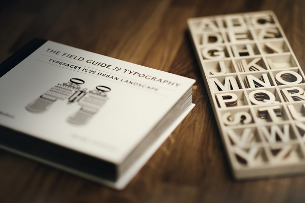
Fonts - Photo by Jon Tyson on Unsplash
Fonts
Fonts#
Being graphical in nature, the font itself can convey a message similar (or different) to what you're spelling out. Choosing the right font means being aware of the various types and what each "says". Here are the main font categories and what they communicate:
- 1Serif fonts communicate tradition, respect, reliability and comfort. E.g. Times New Roman.
- 2Sans Serif fonts convey stability, objectivity, cleanliness and currency E.g. Helvetica.
- 3Script fonts exude affection, elegance and creativity. E.g. Bickham Script.
- 4Modern fonts express strength, progression, style and chic. E.g. Futura.
- 5Display fonts inspire friendliness, excitement, amusement and uniqueness. E.g. Cooper.
Using more than 1 font?#
There's nothing wrong with using more than one font. Try to limit yourself to 3 fonts maximum (excluding your logo font). That's one for body text, one for headlines and one for call-outs, quotes, and other annotations. Too many fonts create cluttered design. When using multiple fonts, try combining a serif and a sans-serif font.
Serif fonts work best for printing documents with lots of text. The extra flourishes make it easier to distinguish letters that are close together, making them better for reading.
Sans serif fonts shine in headlines because they have a clean, simple look.
Bold and italic fonts versus bold and italic settings#
You can create bold or italic fonts in two ways:
- Use an actual bold or italic font.
- Use your design software's settings to convert any font into bold or italics.
Option 1 gives you more accurate final prints than option 2. Option 2 might cause distortion from the conversion.
Don't make entire bodies of text bold or italicised. These settings work best when used sparingly to emphasise particular words or phrases. A bold/italics font makes sense if you want bold/italics headings. Otherwise, you'll have few issues using the settings to highlight some words in your body text.
Also, avoid using all caps or all small letters. All caps might work for very short headings, but always try to stick to sentence case or title case.
<AcademyProTip> Before finalising your font choices, print a test page on your home printer. What looks good on screen doesn't always translate perfectly to print. </AcademyProTip>
Typographical hierarchy - Photo by Alexander Andrews on Unsplash
Typographical hierarchy
Typographical hierarchy and spacing#
Typically the hierarchy breaks down into 3 sections:
- 1The primary heading – Chapter title
- 2Secondary heading – Sub-heading
- 3Body text – paragraphs
Each level is more prominent in size than the one below. To create logical visual structure, all font sizes must be based on the body text. The main guidelines, derived from this great article, are:
Body text: Between 9-11pt for small to regular prints (such as <a href="https://www.printulu.co.za/product/business-cards?utm_source=blog&utm_medium=content&utm_campaign=internal" class="internal-link text-[#007756] hover:text-[#005d42] underline font-medium">business cards</a>), and 16-18pt for larger prints (such as A1 posters)
- 1Primary heading: 180-200% of the body text
- 2Secondary heading: 130-150% of the body text
- 3Tertiary heading: 100-125% of the body text
- 4Small text/captions: 70-75% of the body text
Be aware of alignment#
Most readers are used to reading from left to right. Use left alignment as standard and use centring, and other alignments, sparingly for headings and annotations.
Line spacing#
Correct line spacing makes it easier to distinguish each character, letter and word. Best practice is using line spacing between 120–160% of the text size. For example, line spacing for body text of 18pt is 22-28pt.
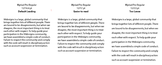
Line spacing example #3
Source: https://99designs.com/blog/tips/6-tips-line-spacing-typography/
Paragraph spacing#
Paragraph spacing helps parse paragraphs, headings and subheadings. Since font size already distinguishes body text from heading text, paragraph spacing should equal the body text in these cases.
What about the measure?#
The measure is how long a line of text is. This is particularly important for body text as line length affects readability. Shorter lines are easier to read than long ones. The ideal measure is 65 to 75 characters. This also depends on your document format and font size. If your lines are too long, you might need to tweak font size or reduce copy.
Make space for holding#
Unless you're printing signage, posters, or Banners, your printed items will likely be held. Avoid placing text where readers will hold your printed material – usually the first left third of the page. Also, ensure no text is placed in or near the 3mm bleed area.
Using colours - Photo by Gemma Evans on Unsplash
Using colours
Using colours in your text#
Rule of thumb: Black fonts are easiest to read.
However, it's not bad to use coloured fonts as long as you use colours the same way you'd use bold or italics settings – to draw attention to certain words, phrases or annotations.
Creating contrast#
Remember to consider your background colour when choosing font colour. Pair dark backgrounds with light fonts and light backgrounds with dark fonts.
Printing fonts using CMYK#
CMYK printing uses four different layers of ink to create the final image. This can cause a shadow of colour around your coloured text, particularly for small fonts (12pt or less). If you stick to the recommended size of at least 16-18pt, you'll minimise these errors.
Tip: when designing with black fonts, remember to set cyan, magenta and yellow levels to 0% with black at 100%.
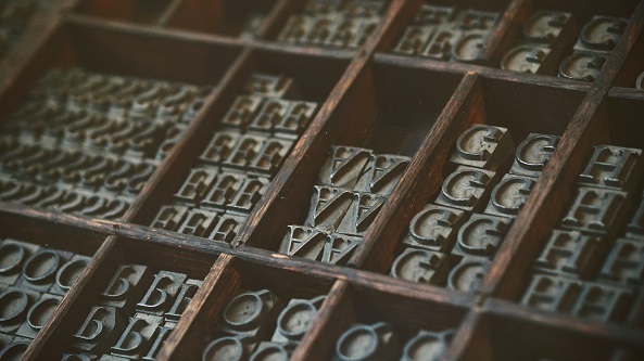
Print Typography - Photo by Natalia Y on Unsplash
Print Typography
Other suggestions#
Avoid glare#
If your design contains lots of text, avoid printing in gloss and rather opt for a matt finish. Glare from gloss can make reading difficult in certain lighting conditions.
Test your fonts#
An easy readability test is to flip your design vertically and turn it upside down. If you can still read it, and it doesn't look cluttered, you're on the right track.
<AcademyDadJoke> Why did the font break up with Comic Sans? It wasn't their type! </AcademyDadJoke>
Conclusion#
Fonts should show the personality of your brand or message. Use fewer than 3 fonts and use bold or italics settings to emphasise certain words, phrases or annotations.
Hierarchy and spacing make it easier to distinguish between characters, letters, words, body text, paragraphs, headings and titles. Using your body text as a baseline will help you optimise for comfortable reading.
The best colour to use is black on a light background, or white on a dark background. Use coloured text to highlight certain words, phrases or annotations.
Avoid causing glare in your finish, make space for readers to easily hold your material while reading, and test before you print.
Enjoy this brief history of typography:#
Resources:#
- Typography tips for a more comfortable read
- 7 Effective Typography Tips to Boost Your Print Designs
- 17 Essential Tips for Printing Fonts
- 6 tips for better line spacing in your typography
- 5 Typography Tips for Document Design
- A Pro Designer Shares the Psychology of Font Choices
Related:#
- 4 ways to save money on graphic design
- What to consider when printing your annual report
- A quick guide to professional writing