
Picture this:
You're about to learn everything about "Pamphlets Design To Make An Impression How To Stay Memorable" — without the jargon, without the fluff, and with at least one dad joke that'll make you groan. Grab your coffee. Let's go.
Key Takeaways
5 min read
- 1What you need to know before printing
- 2Common mistakes to avoid
- 3How to get the best results
“**_"Make it simple. Make it memorable. Make it inviting to look at."
LLeo Burnett on advertising._**
Your pamphlet design can make or break your marketing campaign. While most businesses focus heavily on digital advertising strategies, they often overlook the powerful science behind print design that makes pamphlets incredibly effective for brand recall and customer engagement.
<AcademyQuote> Print advertising creates 42% more engagement than black and white alternatives, and physical materials are significantly better remembered than digital content due to hands-on exposure and reduced distractions. </AcademyQuote>
When you choose an advertising strategy, Leo Burnett's golden advice should guide every decision. Most of us apply this to digital campaigns, but your leaflets and pamphlets deserve the same attention! Your brand evolves constantly – just look at Coca-Cola's countless bottle designs over the decades. Everyone still recognizes the brand instantly.
The job of advertising is making your brand as memorable and inviting as possible. But how do you achieve this when memory works in such complex ways? The answer lies in science!
I can already hear the sceptics laughing. Design, art and advertising... related to science? Absolutely!
Are you here to order pamphlets and leaflets? Check out our awesome Folded Leaflets & Pamphlets with unbeatable prices and free delivery all over SA!
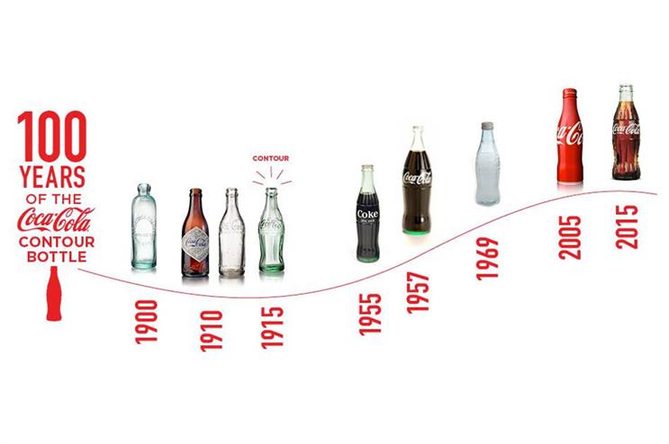
Coca Cola Bottles through time
**What difference does how I design my pamphlets make?**#
Advertising breaks down into two main categories: digital and tangible paper advertising like leaflets and pamphlets. With advertising, we want our product or information to be the first connection consumers make when they see a need. Better yet, we want to remind consumers of needs that aren't always apparent to them.
A study conducted for the Mass Communication Quarterly in 1998 showed that significantly more advertising material was remembered and recounted by subjects exposed to written print. The scientists argued this was due to 'hands-on' physical exposure to information and reduced distractions.
Your font choice has a bigger impact than you think!#
A 2010 study proved that hard-to-read fonts were best for memorizing and recalling information. The downside? These fonts are obviously hard to read. We don't recommend using hard-to-read fonts on your pamphlet designs – you want your clients to have a brilliant experience with your brand.
<AcademyProTip> Find the sweet spot between memorable and readable fonts. Choose fonts with subtle character variations that make your brain work slightly harder without frustrating your readers. </AcademyProTip>
The secret is finding the happy medium between the two spaces and using it to your brand's advantage.
What about colour?#

Orange fire showing warmth.
Memory isn't just affected by medium or font choices. Colour has a proven effect on your overall mood and ability to retain memory! This is why it should be central when you design your brand and advertising collateral.
Dr White of Ohio University found that coloured print advertisements attracted readers 42% more than black and white ads. He was also a strong believer that blue light from screens negatively impacts your ability to retain memory. Score another point for colour and paper!
Different colours link to different levels of arousal – not the naughty kind, but the kind that can make you serious money long-term. The more arousing or emotive the colour, the more memorable it becomes.
Here are just a few examples:
- 1Red – for importance and ultimatums
- 2Yellow – for stimulating mental activity
- 3Blue – for memorizing general themes rather than details
How does this benefit me?#
This is where memory, basic colour theory, common sense, and social science interact beautifully. Every consumer will have their own memories attached to specific colours, shapes, and sizes. But this basic knowledge can still influence your design decisions – and it should.
<AcademyDadJoke> Why did the orange pamphlet get more attention? Because it was absolutely a-peel-ing to customers' emotions! </AcademyDadJoke>
For example, orange is almost globally associated with autumn and Halloween. It's a colour linked to warmth, happiness and comfort. These are super positive emotions you can evoke in your customers with one well-executed pamphlet design.
With the right tools (and the right printer) you can use your own colour/memory connections to take advantage of customer memory and print's advantage over digital information retention. All it takes is some thought about what you want your customers to remember after reading your beautifully coloured pamphlet.
Keep it real and keep it colourful!
“_P.S.
IIf this all sounds great, but you have no idea how to get started, give our professional in-house design services a shot._
Related:
- Top 5 Best Free Design Software of 2019: Design Like A Pro – FOR FREE!
- [Design Manuals: The Crucial <a href="/blog/topics/branding-identity" class="internal-link text-[#007756] hover:text-[#005d42] underline font-medium">Branding</a> Tool You Didn't Know About!](https://www.printulu.co.za/blog/design-manuals-crucial-branding-tool/)
- Our Game-Changing Design Process: And How To Use It
