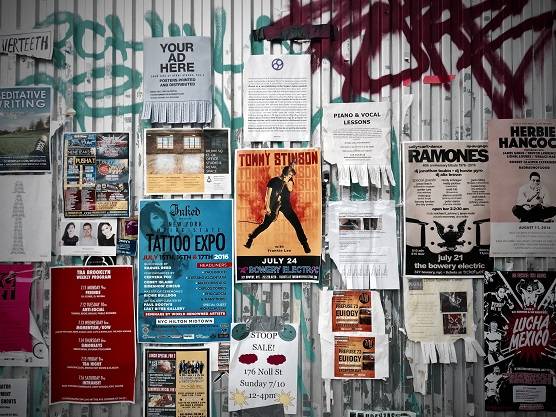
We started using flyers in the 15th century and we still use them today in the 21st century. Even in our modern world of always-on digital media, a well-designed and printed flyer, with the right distribution, adds to the effectiveness of your marketing campaign.
So, in this post, we will give you some pointers on your design, printing and distribution to get the best from your flyers.
Strategy
It all starts with strategy. This can all be set out on one page, with detail on the following quick points:
Have a clear objective
Your flyer is just one tactic in your marketing campaign. When used well, it delivers a message to someone and encourages them to perform your desired action. Your objective informs what that message is, who that someone is, and what that action should be. Your objectives could be:
- Acquisition – drive people to do an action like signing up for your services or purchasing your product.
- Activation – influence perceptions about your brand and create a connection with your audience.
- Referral – create advocates out of existing customers and enable them to recommend your product or service.
- Retention – keep your existing customers and drive repeat purchases.
Once you are clear on these objectives, you can dictate your message, audience and action that your flyers should state, reach and achieve.
What is your key message?
What is your key message?
Your objective guides your key message. This message could be about:
- Your new product offering
- An event that you are hosting or sponsoring
- A discount on referred leads
- Your key competitive advantage
Note that one key message can achieve many objectives as a by-product, however, try to focus your message on achieving your main objective.
Who should receive your flyers?
A good flyer design needs to be married with great distribution. Great distribution requires you to be clear on who you want to receive your flyers. Be specific as this will increase the chances of success with your campaign. I.e. Achieving your objective. Use the following checklist to refine your target audience:
- Your current customer base – what characteristics (demographics) and interests (psychographics) do they share?
- Competition – who is your competition targeting?
- Your product features and benefits – who do they suit?
- Analytics – look at previous campaigns and confirm that this is the right audience for the current objective.
What do you want your target audience to do?
Buy, attend, sign-up, share, remember, prefer, etc. These are all actions dictated by your objective.
This also determines your flyer copy and what your call-to-action devices will be. More on that later.
Distribution
Now that you know who your audience is, you can plan your distribution.
The demographics will determine where to distribute, how to distribute and when to distribute. Remember you are not limited to handing out at the dynamic South African traffic light intersections (also known as “robots”).
Distribution areas can be in malls, shopping centres, university campuses, office parks, etc. Make sure you have permission to distribute in the area to avoid fines or other penalties.
Distribution methods can be “feet on the ground”, inserts in newspapers or magazines, takeaways on your counter or via a display in your store, or inserted into your delivery packages.
[Related: Counter Stands – How to maximise your point-of-sale advertising]
[Related: Flyer Printing and Distribution]
The “when” is based on days in the week and the hours of the day.
A perfect combination of the above three options will ensure that you reach the right audience.
P.S. This will also determine the size of your flyers, so make sure you are clear on your distribution when choosing your size.
Bold and eye-catching design
Design
Now that you have a clear idea of what your flyers will say, who they will say it to, and how you will get it in their hands, it is time to design the actual flyer.
Here are some items to have a clear idea of when you are either briefing the design or designing it yourself.
Colours
We recommend ensuring that your colour choices allow your flyers to stand out from the competition and draw attention to your message. Reference your corporate identity guidelines or your logo colours to determine the colours that resonate with your brand.
P.S. Please remember to set up the artwork in CMYK before you submit it to print. CMYK is vital if you want your colours to be printed according to what you have designed.
[Related: Knowledge Booster – Different colour spectra – RGB VS CMYK]
Imagery
If you are promoting a product or service, try to use the image of the offering in the context where it will be used. This creates a story that allows people to see exactly how they can benefit from it and therefore influence their buying decision.
Also, consider using people in the imagery. Engagement is higher on marketing collateral that uses images of people.
Lastly, consider your audience and what they have responded to in the past. Use these learnings to guide and improve your designs going forward.
Copy
Knowing your key message and the action you want people to take will make it easier when creating your copy.
Keep it short – the flyer has limited space and your audience has limited time. Try to communicate your key message in as few words as possible.
[Related: Is your typography print ready?]
Format (size and shape)
This is determined by 2 factors:
- Distribution
Regarding the distribution methods above. Insert, takeaway and handout.
Takeaways and handouts can be in a variety of sizes. However, A5 or smaller increases the chances of people actually taking and keeping them.
Inserts depend on the format of the holding device. Know the size of the device, e.g. magazine, before you design and print your flyer. - Message
How much do you need to say?
If this is a technical product that requires a lot of detail on the features and benefits, then an A4 flyer or multi-page pamphlet may be better suited to the task.
Check the formatting
Call to action
Your call to action will enable your audience to perform your required action based on your objectives.
Acquisition – purchase or signup?
Try a vanity URL, a QR code, a coupon code or your store location.
Activation – follow your social media page.
Include the name/handle of your social media pages.
Referral – recommend your company to a friend?
Use a special coupon code that can be used to add a discount if the code is shared with a friend.
Retention – keep your current client?
Provide a special coupon code that provides an upgrade.
In some instances, such as referral or retention, the distribution method will have to go hand in hand with the CTA and conversion. For example, for retention, it may be more effective to distribute as a takeaway from your store.
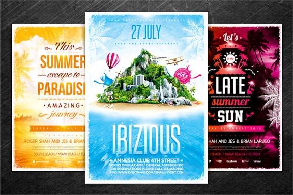
Don’t forget other important details such as your phone number, email address, website URL and location.
N.B. For events, please don’t forget the time, date and location. Tripple check these details.
Check the details
Getting print ready
Before you submit it to print make sure you have done the following:
- Tripple check – check that phone numbers, emails and URLs are correct and working.
- Proofread – check for spelling and grammar.
- CMYK – ensure your artwork is set in CMYK and not RGB.
- Resolution – the artwork should be high resolution, we recommend 300 DPI.
- 3mm bleed – apply a 3mm bleed as a security margin.
Save on your flyer printing
Plan beforehand to take advantage of our free economic delivery.
This can take quite a while, so ensure you have ordered, sent artwork and paid to get your free delivery on time. We also provide express and *next day delivery at an additional cost.
*Rapid delivery is only to Central JHB and Midrand.
Brief your design as part of all the required marketing elements.
If you are using an agency or graphic designer to design your elements, ensure your flyers are included in the brief. This will likely be cheaper than briefing it separately.
Plan the required quantity appropriately.
A well-planned distribution will inform this accordingly.
And of course, use our instant quotes on our flyers page to plan your budget accordingly.
[Related: How can I minimise my printing costs?]
In conclusion
Ensure that you design your flyers bearing in mind the objectives that you want to achieve using your flyers as a tactic. Use this to influence your design, whether you are briefing a designer/agency or designing yourself. Proper planning may also allow you to save on your printing costs, especially if you take advantage of our affordable prices and free delivery.
Resources:
- How to design a flyer: the ultimate guide
- 99 flyer design ideas that will give you wings
- How to Define Your Target Market
- Brand activation and its role in driving consumer engagement and awareness
Related:
- Is your Artwork Ready for Printing? Follow These Steps to Get the Best Quality Print! With Checklist…
- How can I minimise my printing costs?
- Print Ready Artwork – An Easy Checklist
- Flyer Templates: Creating Ready-to-Use Designs
- Expert Flyer Printing and Targeted Distribution Services

