Design your business cards the right way with this quick tutorial:

How to design business cards in Illustrator
- Choose your size.
- Add your logo and other graphics.
- Add necessary text.
- Choose your typography.
- Consider special finishes.
- Embed your text and images.
- Save your file in print-ready PDF format.
Before We Get Started
Whether you’re an individual freelancer, founder of a startup, or part of an established enterprise, there are two crucial design components you need finalised before you even begin thinking of cards:
- The finished logo
- Your brand’s colour scheme
Logos and colour schemes are the two most important visual choices for branding. Not only will these elements play a big part in creating your business card, they’ll also help influence other areas like layout and identity.
There’s one other preliminary activity that makes the rest of the business card design process run more smoothly. You need to know what you want to communicate. What kind of brand are you, as an individual or business? What do you want your business card to say, not just with words, but with the design? These are questions you need to have the answer to before you get started.
Firstly, Let’s Get The Basics Right
Before we take our drawings into Illustrator we need to define some basic parameters to avoid mistakes and further corrections when we take our design to the printer.
First, you should set the file colour mode and there are two options: RGB or CMYK. As our project is for printing purposes we will select CMYK.
We are going to create the usual rectangular size which is the standard for a reason: it fits into wallets, and card trays, and it is universally recognised for what it is.
The two standard sizes for Business Cards at Printulu are 90 x 50mm and 85 x 55mm.
A Quick Word On Bleed
But wait a minute… What is bleed?
Have you noticed that magazines use plenty of “full screen” images which go to the edge of the paper
Or sometimes they use a colourful background to pop up certain pages?
To create those pages without a white frame around the edge we should extend our artwork “beyond the line where the paper it is printed on will be cut.” That area where we extend the artwork is called the bleed.
Set Up Your Document Correctly From The Beginning
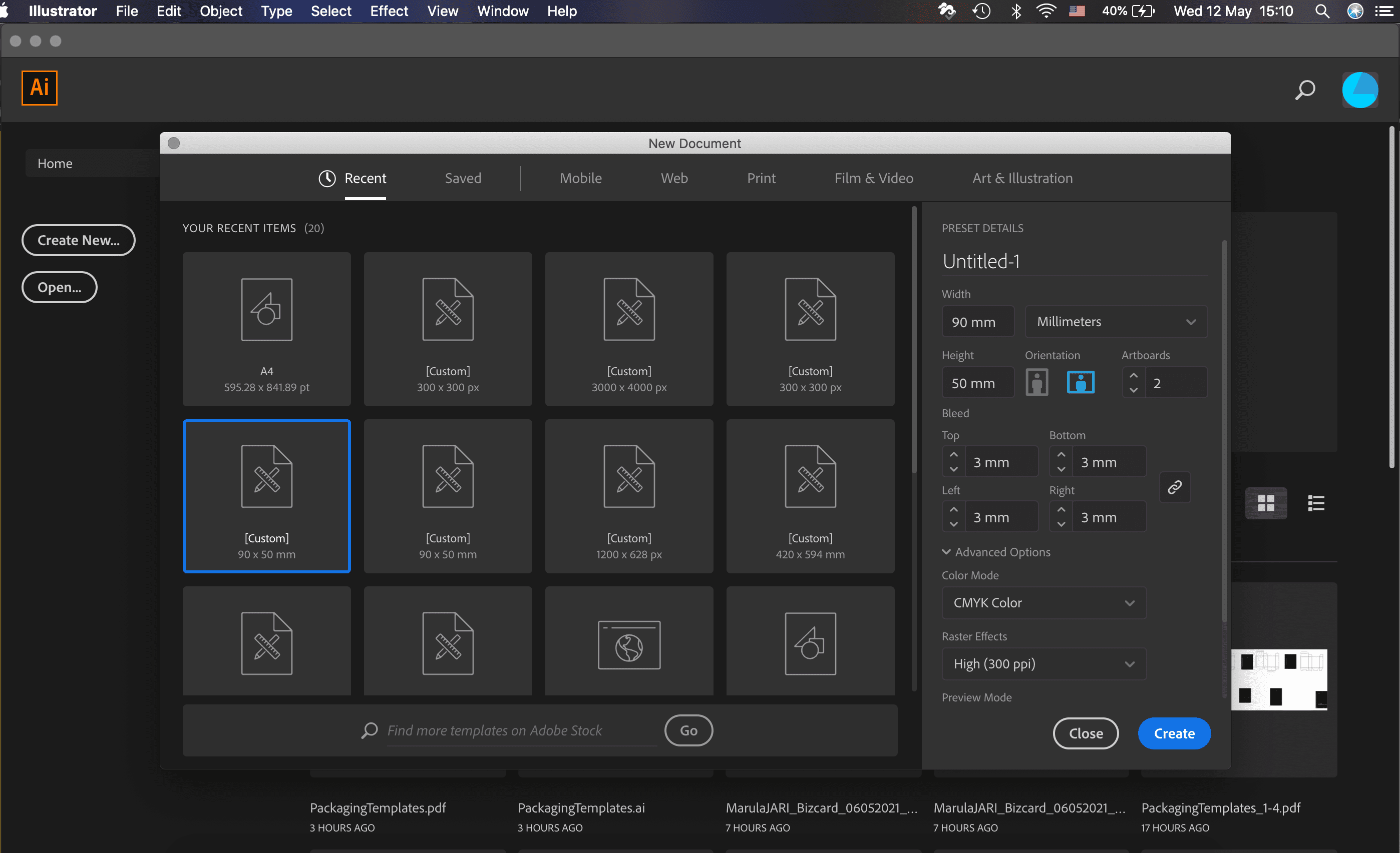
Let’s create a new document with the following settings:
Document Presets: Print
Width: 50 mm
Height: 90 mm
Orientation: Horizontal
Artboards: 2 if double-sided, 1 if single-sided.
Bleed: 3 mm on Top, Bottom, Left and Right margins (this is indicated by the red line around the artboard).
Advanced Options:
Colour Mode: CMYK Colour
Raster Effects: High (300ppi)
P.S. If you don’t see the bleed (red border), go to View > Guides > Show Guides.
Add Your Logo
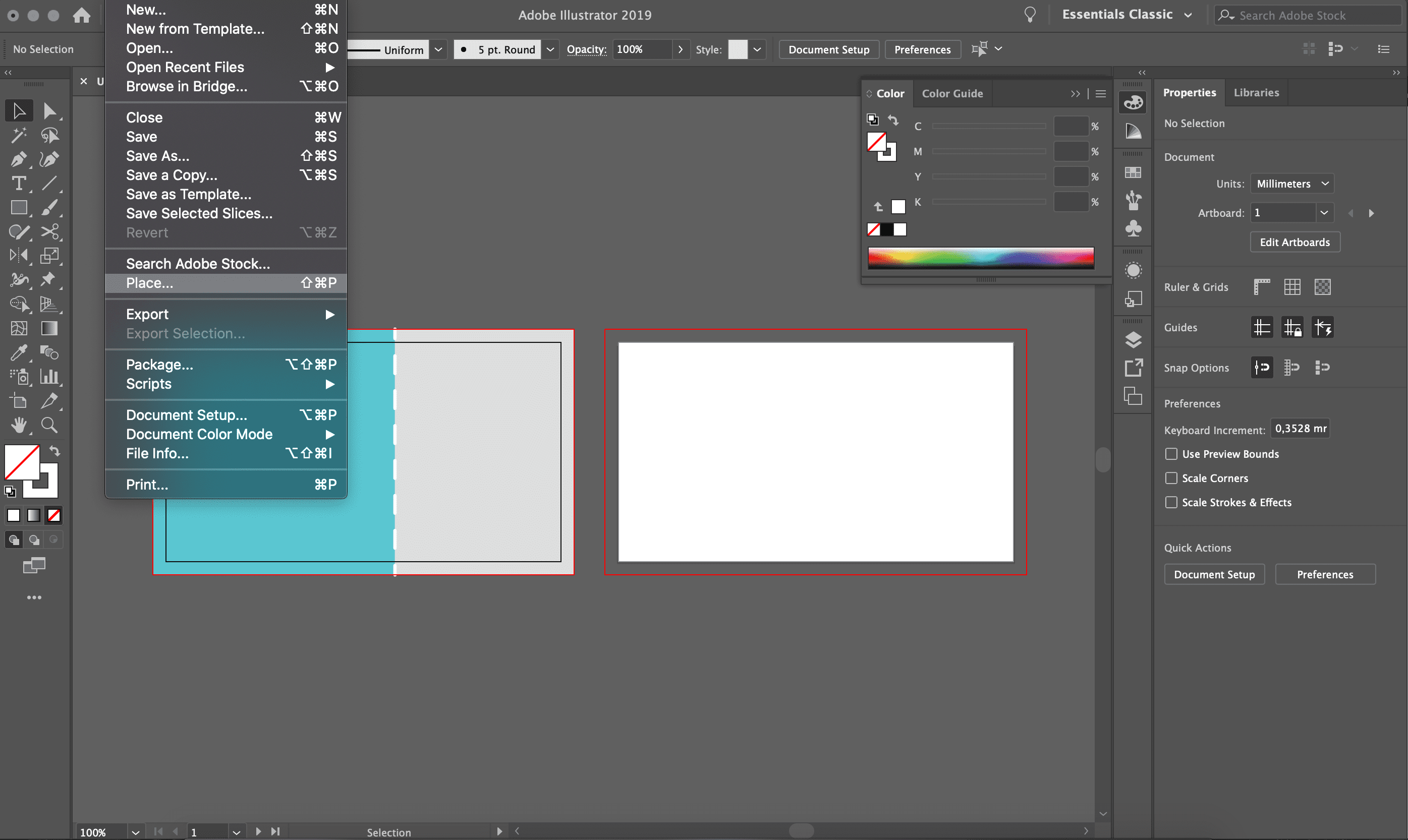
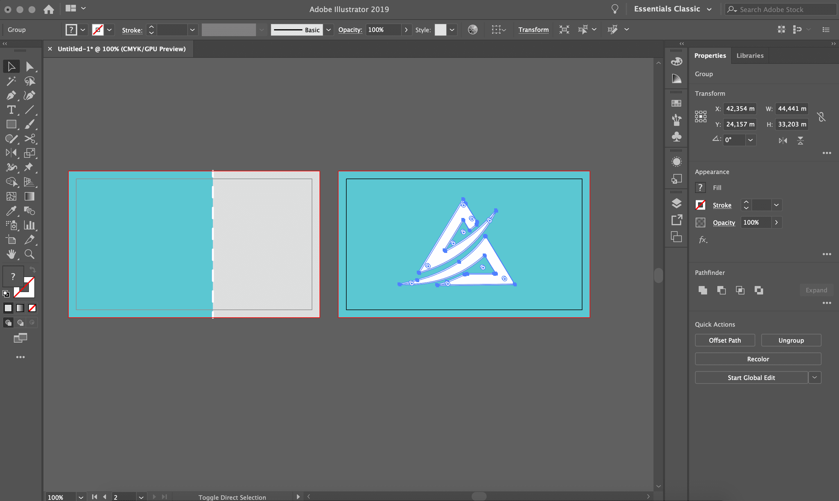
File > place > select your logo file.
The logo should be a vector graphic. Avoid accepting from the client the logo as a small .jpg or .png because that could affect the quality of the project which is actually your responsibility as a designer. If there is no other option but to use one of those formats, make sure it is big enough and you do not have to scale it up by stretching it.
Insert Your Details
I wanted to create a contemporary design and that means no extra decoration is needed. A two-sided business card seems to be the best option as it will allow me to set all the contact information in the back, keeping plenty of open space in the front and highlighting the logo.
Be sure to include basic details so that your customer can reach you easily. Avoid over-crowding the design.
Size: No smaller than 8pt
Format Your Text
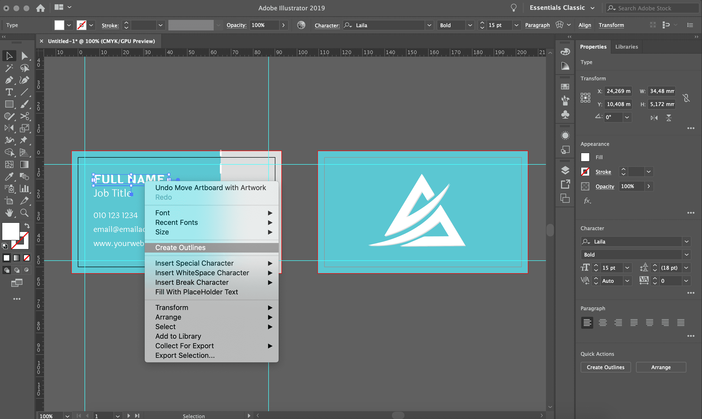
Transform the text into outlines, by going to Type > Create Outlines or using the shortcut ⇧⌘O. You can also select the words, right click and select Create Outlines. This embeds the font, turning the letters into shapes. This means your text is in no danger of disappearing when printed.
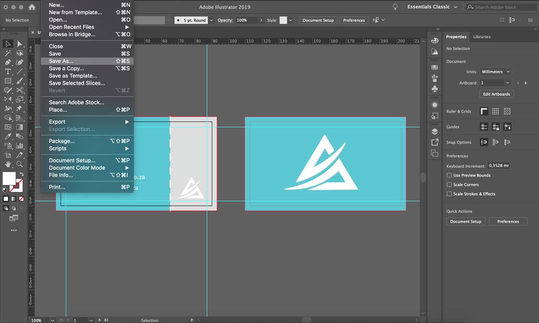
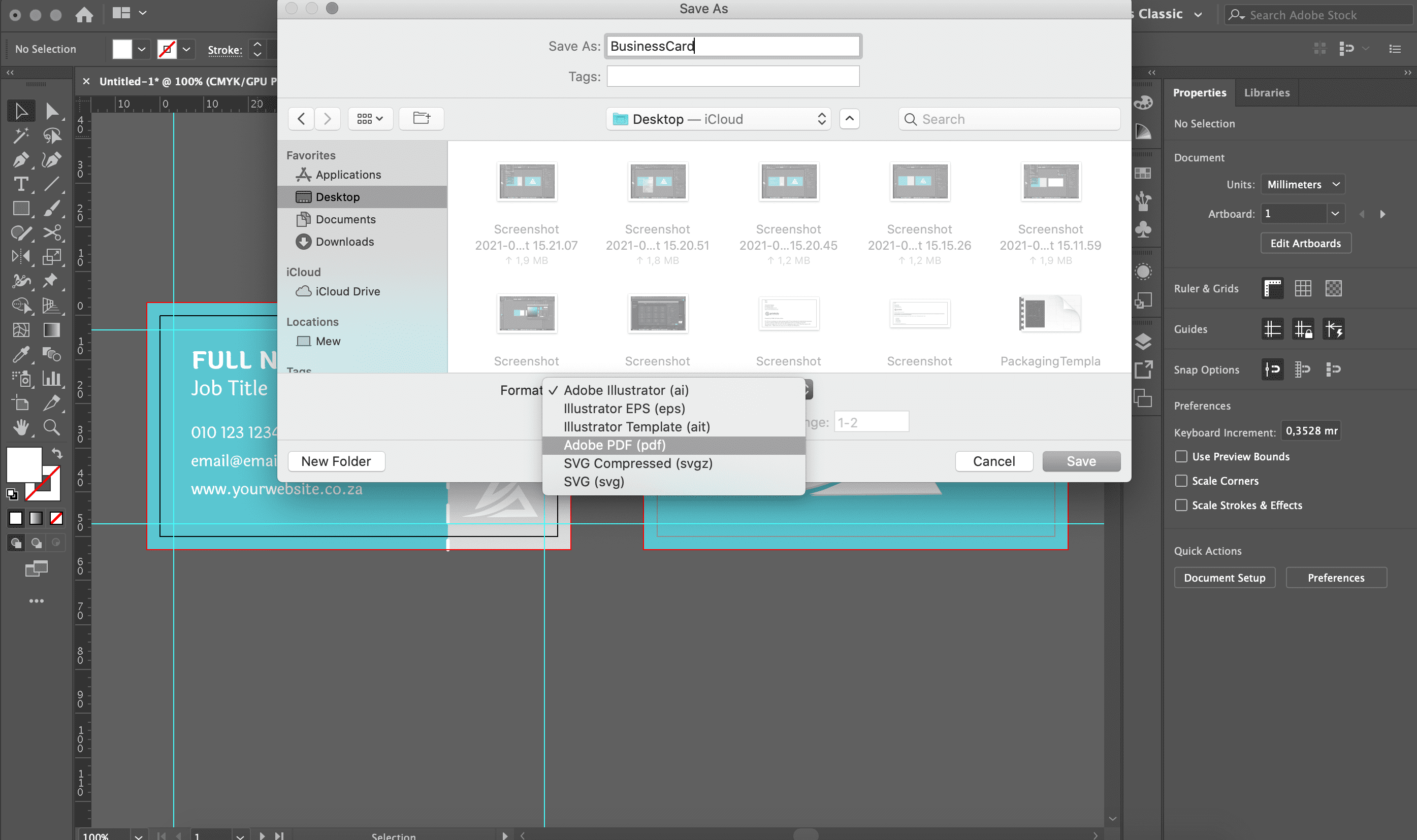
Save Your File
Export your file as a .pdf with a high-quality print preset.
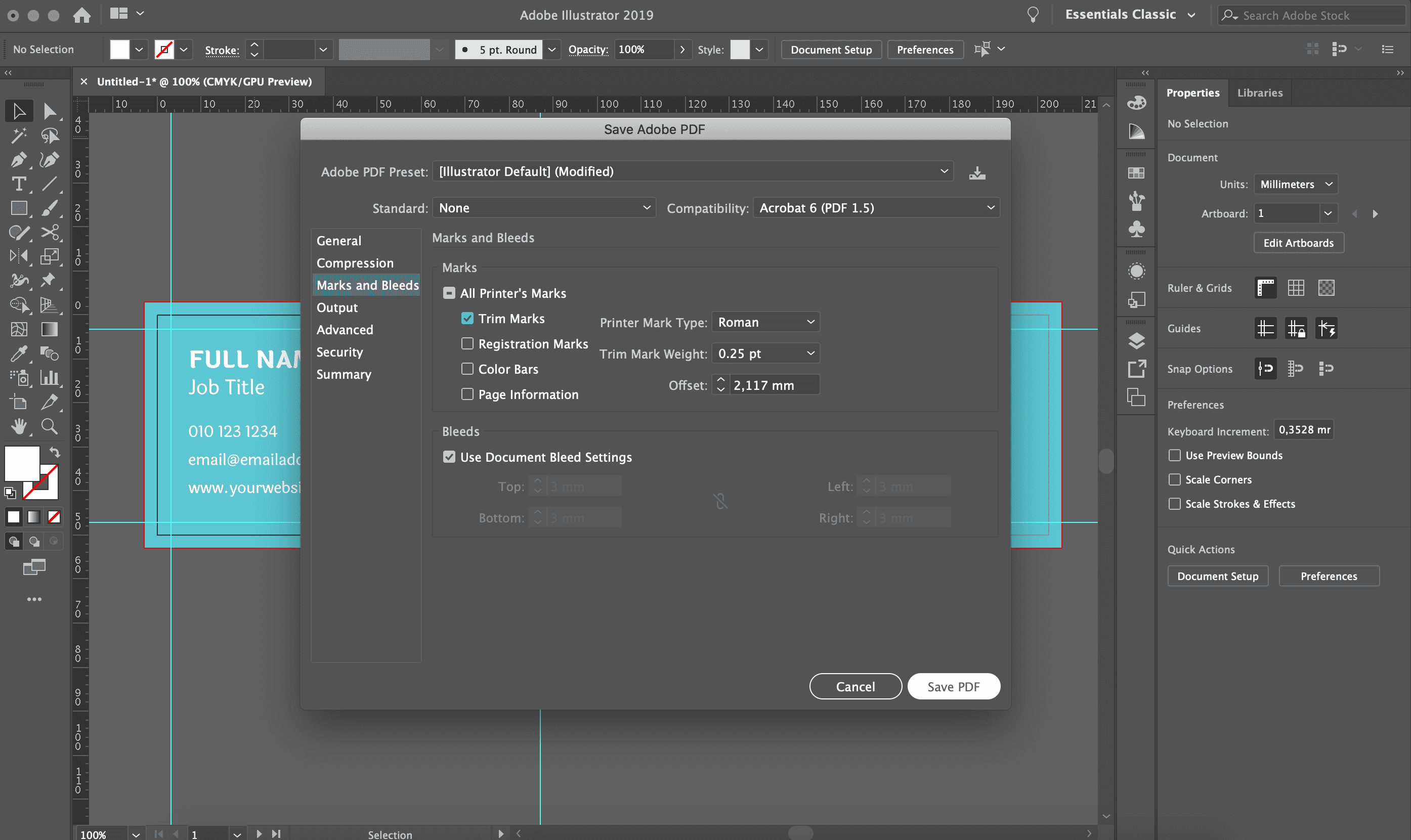
Select marks and bleed when exporting the file, to ensure the bleed marks are saved into the final PDF file.
Remember that every little piece you include in your designs should be there for a reason. Next time you place your business card order with Printulu, select our design services and avoid the stress of having to design business cards yourself. Happy shopping!
How to Prepare a Business card for Print in Illustrator
To prepare a business card for print in Illustrator is fairly easy as you can see in the above Instructions. IT really boils down to this checklist:
• Is your artwork set up in the correct size? 90 x 50mm OR 85 x 55mm
• Is your colour Mode CMYK?
• Did you avoid using text in the outer 3mm all around your artwork?
• Have you added bleed to your business card in Illustrator? Remember it is crucial to extend your design into the bleed
• Have you ensured that all text in your business card design is bigger than 5 points font size?
• Is all image resolution 300dpi or higher for your business card design?
• When saving your business card for print in Illustrator, have you added converted font to paths and saved with bleed & trim marks?
If all these questions are ticked, you should be good to go!
Psst… Here are some design ideas we found to help you get started.
