Are you a small business owner or entrepreneur looking to make a big impression? Well, look no further than the humble business card. Despite the advancements in technology, the business card remains a powerful marketing tool. It's your opportunity to leave a lasting impression on potential clients and customers. But before you rush to print your cards, take a moment to consider the importance of proper layout for your business cards. In this article, we will guide you through the process of creating eye-catching business cards that will make you stand out from the crowd.

Choosing the Right Design Software for Your Business Cards
When it comes to designing your business cards, choosing the right software is crucial. The software you use will determine the quality of your design and ultimately the impression it makes on your recipients. For professional results, we recommend using professional design software such as Adobe Illustrator or InDesign. These programs offer a wide range of tools and features that will allow you to create stunning and unique designs.
However, if you don't have access to these programs or simply prefer a more user-friendly experience, there are plenty of online design tools available. Canva, for example, offers an intuitive online design tool that allows you to create professional business card designs with ease. With a wide range of templates and customization options, you can create a design that truly reflects your brand.
Adobe Illustrator, part of the Adobe Creative Suite, is a powerful vector graphics editor favoured by professional designers worldwide. Its versatility and range of tools make it ideal for creating intricate designs with precision. From typography to illustrations, Adobe Illustrator provides the tools needed to bring your business card ideas to life. If you need to, you can always start out in Word if you are on a budget (Here's how to design business card for print in Word)
Exploring Different Layout Options for Business Cards
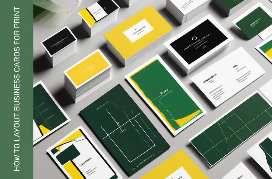
Now that you've chosen the right software, it's time to start exploring different layout options for your business cards. The layout you choose will depend on your industry, personal style, and the message you want to convey. Here are a few popular layout options to consider:
- Classic: The classic layout features your logo and contact information on one side, with a clean and simple design. This layout is timeless and works well for any industry.
- Modern: The modern layout often includes a bold and eye-catching design element, such as a geometric pattern or vibrant color. This layout is perfect for businesses looking to make a bold statement.
- Minimalist: The minimalist layout focuses on simplicity, using white space to create an elegant and clean design. This layout is ideal for businesses that want to convey a sense of professionalism and sophistication.
Remember, the layout you choose should align with your brand and target audience. Consider your industry and the impression you want to make before making a decision.
When it comes to business cards, the design and layout play a crucial role in making a lasting impression on potential clients and partners. In addition to the popular layout options mentioned above, there are also other creative choices you can explore to make your business cards stand out.
One innovative layout option is the interactive business card, which incorporates elements like QR codes or augmented reality to provide recipients with a unique and engaging experience. This type of business card is particularly effective for tech-savvy industries and can leave a memorable impact on those who receive it.
Common Mistakes to Avoid When Designing Business Cards
Now that you have an idea of the layout options available, let's talk about some common mistakes to avoid when designing your business cards. These mistakes can undermine the effectiveness of your cards and leave a negative impression on your recipients. Here are a few to watch out for:
- Poor typography: Using hard-to-read fonts or overcrowding your text can make your business cards difficult to read. Stick to clean and legible fonts to ensure your message is easily understood.
- Low-resolution images: Using low-resolution images can result in blurry or pixelated prints. Make sure to use high-quality images to maintain a professional appearance.
- Overcomplicated design: While it's important to make your business cards stand out, an overcomplicated design can be overwhelming and confusing. Keep your design clean and simple for maximum impact.
By avoiding these common mistakes, you can ensure that your business cards leave a positive and lasting impression on your recipients.
Another mistake to avoid when designing business cards is neglecting the importance of whitespace. Whitespace, also known as negative space, is the empty space around elements in your design. It helps create a sense of balance and allows the important information on your card to stand out. Avoid overcrowding your business cards with too much text or images, as this can make them look cluttered and unprofessional.
Additionally, it's crucial to consider the use of colour in your business card design. While colours can enhance the visual appeal of your cards, using too many colours or clashing colour combinations can be off-putting. Stick to a cohesive colour scheme that aligns with your brand identity and conveys the right message to your audience. Remember, simplicity and consistency are key when it comes to colour choices for your business cards.
How to Prepare Business Cards for Print
Now that you have designed your business cards, it's time to prepare them for print. Proper preparation is essential to ensure that your cards look professional and high-quality. Here are a few tips on how to prepare your business cards for print:
- Check the dimensions: Make sure your design meets the standard business card dimensions (85mm x 55mm OR 90mmx 50mm). This will ensure that your cards fit seamlessly into wallets and cardholders without any issues.
- Set the bleed: A bleed is the extended area outside the artwork that will be trimmed after printing. It's important to set a bleed of at least 3mm to prevent any white edges from appearing on your cards.
- Check the resolution: Ensure that all images and graphics used in your design have a resolution of at least 300 DPI (dots per inch). This will ensure a crisp and clear print.
Once your design is ready, you can simply upload it to Printulu's website and place your order. The printing experts at Printulu will ensure that your business cards are printed to the highest quality standards, leaving you with professional and eye-catching cards.
When designing your business cards, it's important to consider the paper stock you will be using. The choice of paper can greatly impact the look and feel of your cards. Opting for a thicker paper stock, such as 400gsm, can give your cards a more premium and durable finish.
Another crucial aspect to keep in mind is the finish of your business cards. You can choose from a variety of finishes, including matte, gloss, or even a luxurious velvet finish. The finish you select can enhance the overall aesthetic of your cards and make them stand out to potential clients and customers.
Understanding the Importance of Proper Business Card Layout
As you can see, proper layout is crucial when it comes to designing business cards for printing. A well-designed and properly laid out business card can make a significant impact on your brand image and leave a lasting impression on your recipients. By following the guidelines in this article and using the right design software, you can create business cards that truly stand out from the competition.
When it comes to business card layout, there are several key elements to consider. The placement of your logo, contact information, and any additional graphics or images should be carefully thought out to ensure a visually appealing and professional design. Remember to leave enough white space to avoid a cluttered look and make important information easily readable.
It's also essential to choose the right font styles and sizes to maintain consistency with your brand identity. A cohesive design that reflects your brand's tone and values will help reinforce brand recognition and credibility. Additionally, consider using high-quality paper and printing techniques to enhance the overall look and feel of your business cards.
So, what are you waiting for? Get started on designing your business cards today and take your brand to the next level with Printulu!


