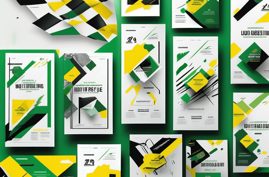
Typography plays a crucial role in the design and effectiveness of flyers. When it comes to flyer design, choosing the right fonts can make all the difference in capturing your audience’s attention and conveying your message effectively. In this article, we will explore the importance of typography in flyer design and provide tips for selecting the perfect fonts for your flyers.
Understanding the importance of typography in flyer design
Typography goes beyond just selecting fonts – it is a powerful tool in communication. The way text is presented can evoke different emotions and perceptions, influencing how your audience perceives your flyer. It sets the tone and establishes the personality of your brand or event.
When delving into the world of typography, one must consider not only the font choice but also factors such as spacing, alignment, and hierarchy. These elements work together to create a harmonious visual experience for the reader, guiding them through the content in a structured and engaging manner.
The role of typography in communication
Typography enables us to express ideas, convey messages, and evoke emotions. The right font choice can help establish credibility, professionalism, playfulness, or elegance, depending on the desired tone of your flyer. Effective typography ensures that your message is not only read but also understood and remembered.
Furthermore, typography can be used to create visual hierarchy, directing the reader’s attention to key information and guiding them through the content in a logical sequence. By utilising different font sizes, weights, and styles, designers can emphasise important details and create a more dynamic and engaging layout.
How typography influences the effectiveness of a flyer
Did you know that 95% of design-related complaints are about typography? Choosing the wrong font can lead to a loss in readability, engagement, and overall impact of your flyer. On the other hand, using the right fonts can enhance the visual appeal and legibility, making your message more impactful.
In addition to font selection, factors such as line length, spacing, and contrast play a crucial role in the readability of a flyer. Properly kerned and leading text can improve legibility, while strategic use of colour and font pairings can create visual interest and draw the reader in.
The art of choosing the right font for your flyer
Now that we understand the importance of typography, let’s explore some factors to consider when selecting fonts for your flyer.
Typography plays a crucial role in design, influencing how your message is perceived by the audience. The right font can evoke emotions, convey information effectively, and enhance the overall visual appeal of your flyer.
Factors to consider when selecting a font
1. Readability: Ensure that the font you choose is easy to read, even at smaller sizes. Steer clear of overly decorative or complex fonts that may hinder legibility.
2. Alignment with brand: Consider the personality and values of your brand or event. The font should align with the overall aesthetic and convey the desired tone of your message.
3. Target audience: Understand who you are trying to reach and tailor your font choice accordingly. Fonts that appeal to a younger audience may not resonate with an older demographic.
When selecting a font, it’s essential to strike a balance between creativity and legibility. Experiment with different fonts to find the perfect match that captures the essence of your message.
Common mistakes to avoid when choosing fonts
1. Using too many fonts: Cluttering your flyer with multiple font styles can make it look unprofessional and confusing. Stick to two or three font styles at most.
2. Neglecting contrast: Ensure enough contrast between your font and the background for easy reading. Avoid light-colored fonts on light backgrounds or vice versa.
3. Ignoring licensing: Be mindful of font licensing when using custom or premium fonts. Ensure that you have the necessary licenses to avoid any legal issues.
By paying attention to these factors and avoiding common mistakes, you can create a visually appealing flyer that effectively communicates your message to the target audience.
Exploring different types of fonts
Fonts can be broadly categorized into two main styles: serif and sans serif.
When delving into the world of typography, it’s fascinating to explore the intricate details that differentiate serif and sans serif fonts. Serif fonts, such as the timeless Times New Roman, boast small decorative strokes at the end of each letter. These elegant embellishments are often associated with tradition, seriousness, and formality, making them a popular choice for academic papers and printed materials. On the other hand, sans serif fonts like Arial exude a more contemporary and streamlined aesthetic, devoid of these decorative strokes. The absence of serifs gives sans serif fonts a modern edge, making them ideal for digital content and designs that require a clean, minimalist look.
Serif vs sans serif: What’s the difference?
Serif fonts, like Times New Roman, have small decorative strokes at the end of each letter. They are often associated with tradition, seriousness, and formality. Sans serif fonts, such as Arial, do not have these decorative strokes, giving them a more modern and streamlined appearance. Depending on the nature of your flyer, you can choose between the two styles to create the desired impact.
Furthermore, the choice between serif and sans serif fonts can significantly influence the overall tone and perception of your design. Serif fonts are renowned for their classic appeal and readability in print, making them a popular choice for body text in newspapers and books. In contrast, sans serif fonts are favoured for their contemporary feel and enhanced legibility on digital screens, making them a go-to option for websites and online content.
Script and decorative fonts: When to use them
Script and decorative fonts add a touch of elegance and personality to your flyers. They are perfect for event invitations, creative designs, or showcasing a unique message. However, be cautious when using these fonts, as they can be challenging to read in large amounts of text. Reserve them for headlines or important highlights.
When it comes to script and decorative fonts, their ornate flourishes and artistic flair can elevate the visual appeal of your design, adding a sense of sophistication and charm. These fonts are particularly well-suited for special occasions such as weddings, where a touch of elegance is desired, or for branding purposes to convey a sense of luxury and exclusivity. While script fonts exude a sense of handwritten elegance, decorative fonts offer a myriad of styles ranging from vintage to modern, allowing you to tailor your choice to suit the mood and theme of your project.
Combining fonts in flyer design
Just like mixing ingredients in a recipe, combining fonts in your flyer design can yield a harmonious and visually appealing result. Here are some tips for successful font pairing.
When it comes to combining fonts in flyer design, it’s essential to consider the mood and message you want to convey. Different fonts evoke different emotions and associations, so choosing the right combination can enhance the overall impact of your design. For instance, pairing a playful handwritten font with a clean, modern sans-serif font can create a fun and approachable vibe, perfect for a casual event or promotion.
Tips for successful font pairing
1. Contrast is key: Pair fonts with contrasting styles to create visual interest. For example, pairing a bold and attention-grabbing font with a more subtle and minimalist font can create a striking effect.
2. Stick to a hierarchy: Assign specific font styles for headings, subheadings, and body text. This helps establish a visual hierarchy and guides the reader’s attention.
3. Test different combinations: Experiment with different font combinations to find the perfect match for your flyer. Take advantage of online tools or consult with professionals for guidance.
Exploring font combinations is not just about aesthetics; it’s also about ensuring readability and accessibility. Choosing fonts that are legible and easy on the eyes is crucial for effectively communicating your message to your audience. Consider factors such as font size, spacing, and colour contrast to enhance the readability of your flyer design.
The impact of font combinations on flyer aesthetics
A well-executed font combination can elevate the aesthetics of your flyer, making it more visually appealing and memorable. It can set your design apart from the competition and create a lasting impression on your audience.
Furthermore, font combinations can help reinforce your brand identity and establish a cohesive visual language across all your marketing materials. Consistency in font usage builds brand recognition and fosters a sense of professionalism and trust with your audience. Whether you’re designing a flyer for a one-off event or a long-term campaign, choosing the right font combinations can play a significant role in shaping how your brand is perceived.
Typography best practices for flyer design
Now that we’ve covered the fundamentals, let’s dive into some best practices for using typography effectively in your flyer design.
Ensuring readability and legibility
Avoid using small or overly decorative fonts that compromise readability. Opt for fonts with sufficient spacing between letters and lines for easy reading. Additionally, be mindful of font color and background contrast to ensure legibility.
Remember for printed products on paper the minimum prescribed font size is 5 points.
Balancing font size and spacing
Font size and spacing play a crucial role in creating a visually pleasing flyer. Make sure your font sizes are appropriate for different sections, emphasising key elements such as headlines and important details. Leave ample negative space around text to maintain a clean and organised layout.
Remember that typography is not an afterthought but an integral part of your flyer design. By carefully selecting fonts, considering readability, and exploring creative combinations, you can create visually stunning and effective flyers that leave a lasting impression on your audience. With the right typography, you can make your flyer stand out from the crowd and drive the desired response to your brand or event. Start experimenting with fonts today and see the difference it can make in your flyer designs!


