Graphic design trends are not a fad but an insightful reflection of the changes that are taking place in our society. Graphic designers love to follow them to understand what the market may hold in the future, and how our work can be useful for businesses today.
One factor that shaped the design of communications over the past year: the COVID-19 pandemic has accelerated the digitalization of the world. Another important factor is video content domination on the web - a trend that came from social media.
There are however some trends in design that you need to avoid rather than just falling into the trap of leaving any uniqueness at the door.
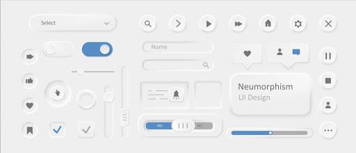
1. Neumorphism
Reasons to avoid it: low functionality, doesn’t work for inclusive products, impossible to use in bright sunlight, hard to implement at a programming level.
Check out neumorphic designs on Dribbble.
In the beginning, there was skeuomorphism (design elements that mimicked their real-world counterparts), and in response, designers invented neumorphism. By 2019, platforms like Dribbble were overrun with designs in this style. Modern, trendy, and sophisticated, they quickly won the hearts of the public who wanted to see more real-life allusions online, but with less visual noise.
Alas, contrary to optimistic forecasts, the neumorphism trend turned out to be stillborn. Try to find at least one digital product in this style yourself. Did not succeed? That's right, neumorphism turned out to be an impractical style because it was hard to use in inclusive products and the cost of translating designers' ideas into software was high. Moreover, the subtle shading of neumorphic designs makes them user-unfriendly.
2. Illustrations featuring abstract concepts (flat or 3D)
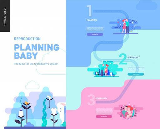
Reasons to avoid it: all apps and websites look pretty similar while using typical metaphorical illustrations
Vector illustrations have many benefits for digital product developers and marketers. First, downloading them to the user's device consumes very few resources, which speeds up website loading and lowers the bounce rate.
Second, illustrations enable companies that cannot display any specific products on their pages (typical for service companies and IT) to make good-looking, engaging, and memorable websites.
What's wrong with illustrations in 2021? The problem is that similar flat and 3D illustrations are now used by almost every company on the market. Competitors’ sites are nearly indistinguishable from one another. A design trend that is growing in popularity to combat this homogenization: custom and more authentic illustrations (for example, imitating children's drawings).

3. Overuse of organic shapes
Reasons to avoid it: breaks page hierarchy, confuses your audience and eventually leads to higher bounce rates
The rounded corners of buttons and contact forms make these interface objects look inviting and increase click rates. The reason for this? We subconsciously associate sharp corners and edges as something threatening.
In addition, organic forms can help guide your users through a site or application; with their soft and subtle help, you can direct focus and point your visitors in the right direction.
However, things change if you use this trick too often; your entire product becomes shapeless, which can confuse users and cause them to leave your page. Our conclusion: use rounding only where you need to capture the attention of a potential client or have them take a specific action.
4. Extreme brightness and contrast
Reasons to avoid it: unrealistic, overprocessed visuals are commonly associated with dishonesty in communication and attempts to hide something important, bright color contrasts create a visual mess and increase users’ eye fatigue, too-bright shades increase feelings of anxiety and danger
On one hand, the more your interface elements contrast with the page background, the more noticeable they are to the user. This, in turn, helps users navigate sites or apps. On the other hand, according to the 2021 Visual Trends Report by Depositphotos, muted colors may be a better solution this year. In particular, Pantone Colors of the Year 2021 (Ultimate Gray and Illuminating) and Dulux Color of the Year 2021 (Brave Ground) are soothing and muted.
Why are the bright colors and sharp contrasts a bad choice this year? The main reason is that your potential clients have likely experienced persistent anxiety about the instability of their lives during these recent months. They crave the calmness and support that designs in muted shades can convey. For a while, at least, we should forget about caustic colors and show our clients a little sympathy.
5. Dark and customizable themes
Reasons to avoid it: not useful if you are working with non-mobile design, hard to use when it is sunny, eyes easily get tired watching bright letters on dark backgrounds
In certain cases, having a dark background on a website, in a presentation, or for an ad or app is perfectly justified. For example, many instant messenger and news platforms offer you a choice between “day” and “night” modes so you won’t disturb other people while checking updates at night and you could save energy for your mobile display.
And if you plan to project videos or static ads onto a wall, you may find it more convenient to use white letters on a dark background than vice versa. However, this approach works well only for small text: when reading larger white-colored text, our eyes get tired much faster, and users tend to leave the page much sooner.
Another related anti-trend is the ability to customize your background. While this feature is designed to make users more attached to a tool they use by involving them in the design creation process, most of us ignore customization options – this phenomenon is called the default effect. Our takeaway: think twice before working on a dark-themed design or adding a custom background feature.
The main professional challenge for graphic designers this year is to grab the user's attention in a time when everything has moved online and the competition for such attention has intensified.
The netizens themselves have also changed. Their attention span has shortened and they have become less inclined to interact with static content (photos plus text).
And while modern AI-powered technologies are now able to find those who are most likely to react to our social media content online, graphic designers continue to face new professional dilemmas. For example, whether it is ethical to manipulate users by evoking fear, confusion, and despair (which is easy against the backdrop of the global pandemic).
More on this in another post - coming soon.


