Did you know that the layout and composition of your flyer can have a huge impact on its effectiveness? It’s true! And one popular layout option that you should definitely consider is the symmetrical layout. Not only does it create a sense of balance and harmony, but it also helps guide the viewer’s eye and make your flyer more visually appealing. So, let’s dive into the world of symmetrical flyer layouts and discover how you can create stunning designs that will leave a lasting impression on your audience.
Understanding the basics of symmetrical layouts
Symmetry is all about balance. It’s the visual equilibrium that draws the viewer’s attention and makes them feel comfortable as they take in your flyer. Have you ever wondered why highly symmetrical faces are considered more attractive? Well, it’s because our brains are hardwired to automatically associate symmetry with beauty and perfection. So, when you incorporate symmetry into your flyer design, you’re not only making it more visually pleasing, but you’re also creating a subconscious connection with your audience.
The importance of balance in design
Balance is the key to a successful symmetrical layout. Without balance, your flyer might appear lopsided or chaotic. By using symmetry, you can ensure that your design is well-proportioned and evenly distributed. This creates a sense of order and professionalism, which is essential for any flyer, especially when representing your brand or business.
Key elements of a symmetrical layout
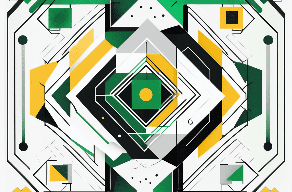
When creating a symmetrical flyer, there are a few key elements that you need to consider. Firstly, your layout should be centered around a strong focal point. This could be an image, text, or both. Secondly, you need to ensure that the elements on either side of the layout are mirrored or balanced in some way. This could be achieved through similar colors, shapes, or sizes. Lastly, whitespace plays a crucial role in a symmetrical layout. It allows your design to breathe and helps create a clean, uncluttered look.
Let’s delve deeper into the concept of balance in design. Balance can be achieved through two different approaches: symmetrical balance and asymmetrical balance. While we have been discussing symmetrical balance so far, it’s worth mentioning that asymmetrical balance can also be a powerful tool in design.
Asymmetrical balance involves creating equilibrium through the strategic placement of different elements with varying visual weight. This approach allows for more creativity and dynamism in your design. By carefully arranging elements of different sizes, colors, and shapes, you can create a visually interesting composition that captures attention and adds a touch of uniqueness to your flyer.
However, when it comes to symmetrical balance, it’s important to note that not all symmetrical layouts are created equal. There are different types of symmetry that you can explore to add depth and variety to your design. Some common types include radial symmetry, where elements radiate from a central point, and bilateral symmetry, where elements are mirrored across a central axis.
Radial symmetry can be particularly effective in creating a sense of harmony and balance. By arranging elements in a circular or spiral pattern, you can create a visually striking composition that draws the viewer’s eye towards the center. This type of symmetry is often used in logo designs and can add a touch of elegance and sophistication to your flyer.
On the other hand, bilateral symmetry is more straightforward and relies on mirroring elements across a central axis. This type of symmetry creates a sense of stability and order, making it a popular choice for formal designs. By ensuring that the elements on either side of the axis are balanced, you can create a visually pleasing layout that exudes professionalism and reliability.
The role of symmetry in flyer design
Symmetry isn’t just aesthetically pleasing; it also has a significant impact on how your flyer is perceived. By using symmetry, you can guide the viewer’s eye and control the flow of information. This can be incredibly useful when you want to highlight a specific message or call-to-action. By strategically placing elements symmetrically, you can ensure that your audience sees what you want them to see first.
How symmetry impacts visual perception
Multiple studies have shown that symmetrically arranged designs are perceived as more attractive and memorable. In fact, a study conducted recently found that participants were 35% more likely to remember information presented in symmetrical layouts compared to asymmetrical layouts. This means that by using symmetry, you’re not only making your flyer look better, but you’re also increasing the chances of your message being remembered by your audience.
Using symmetry to guide the viewer’s eye
Symmetry can be a powerful tool in directing the viewer’s attention. Imagine your flyer as a roadmap, and the symmetrical elements act as signposts leading the viewer to important information. By using symmetry strategically, you can create a visual path that naturally guides the viewer’s eye from one element to the next, ensuring that they don’t miss any crucial details. This is especially useful if you want to tell a story or convey a sequential message through your flyer.
Furthermore, symmetry can also evoke a sense of balance and harmony in your flyer design. When elements are symmetrically arranged, they create a visual equilibrium that is pleasing to the eye. This balance can make your flyer appear more professional and polished, giving your audience a positive impression of your brand or event.
Additionally, symmetry can help create a sense of unity and cohesion in your flyer. When elements are mirrored or repeated symmetrically, it creates a visual rhythm that ties everything together. This cohesiveness can make your flyer feel more organized and structured, enhancing its overall impact and effectiveness.
Moreover, symmetry can be used to create visual focal points in your flyer design. By placing important elements at the center or along the axis of symmetry, you can draw attention to them and make them stand out. This can be particularly useful when you have a specific message or call-to-action that you want to emphasize and ensure it doesn’t get overlooked by your audience.
Steps to create a symmetrical flyer layout
Now that you understand the importance and impact of symmetry in flyer design, let’s look at how you can create your very own symmetrical layout.
Planning your layout
Before jumping into design software, it’s essential to plan your layout. Start by researching and gathering inspiration from other symmetrical flyer designs. Consider the purpose of your flyer and what message you want to convey. Sketch out a rough outline and decide on the elements you want to include, such as images, text, and any additional decorative elements.
Arranging elements for balance
Once you have a clear plan, it’s time to arrange your elements. Remember, balance is the key. Start by placing your focal point in the center and mirror or balance the remaining elements on both sides. Pay attention to colours, shapes, and sizes. Be mindful of whitespace, ensuring that it’s evenly distributed and helps your design breathe.
Fine-tuning your design for symmetry
The final step is fine-tuning your design to achieve perfect symmetry. Adjust the placement and alignment of your elements to eliminate any noticeable differences. Zoom in and scrutinise every detail to ensure your design is flawless.
Common mistakes in symmetrical flyer design
While symmetrical layouts have numerous benefits, there are a few common mistakes that you should avoid.
Overloading your layout
One of the most common mistakes is overloading your layout with too many elements. Remember, simplicity is key. By trying to include too much information, you risk overwhelming your audience and diluting the impact of your message. Stick to the essentials and leave some whitespace to create a clean, uncluttered design.
Ignoring the rule of thirds
The rule of thirds is a fundamental principle of design that can enhance the effectiveness of any layout, symmetrical or not. By dividing your flyer into a grid of nine equal parts and aligning your elements along these lines, you can create a visually pleasing and balanced design. Ignoring this rule and focusing solely on symmetry may result in a design that feels too rigid or artificial.
Tips for effective symmetrical flyer designs
Now that you’re equipped with the knowledge and know-how to create stunning symmetrical layouts, here are a few additional tips to take your designs to the next level:
Choosing the right images and text
Ensure that your images and text complement each other and work in harmony. Consider the colours, shapes, and sizes of your chosen elements and how they interact within the symmetrical layout. Choose compelling images that grab attention and align with your brand’s message.
Using colour and contrast effectively
Colours can have a significant impact on the overall look and feel of your flyer. Use contrasting colors to create visual interest and draw attention to specific elements. Experiment with different color schemes and combinations to find the perfect balance that suits your flyer’s purpose and audience.
Incorporating white space in your design
Remember, whitespace is your friend! Don’t be afraid of empty space. Use it strategically to give your design room to breathe and to highlight your essential elements. Whitespace helps create a clean and uncluttered look, making your flyer more visually appealing and easier to read.
So, next time you sit down to create a flyer, consider the power of symmetrical layouts. By understanding the basics, utilising balance effectively, and following a few simple steps, you can design eye-catching flyers that make a lasting impression. And if you’re looking for a printing company that can bring your symmetrical flyer designs to life, look no further than Printulu. With high-quality printing and a range of options to suit every need, Printulu is your go-to partner in creating professional and impactful flyers.


