Grid-based layouts are a fundamental aspect of flyer design, providing the structure and organization needed to create visually appealing and effective designs. In this article, we will explore the basics of grid-based layouts, the process of creating them, different types of grids, and tips for designing flyers that stand out from the crowd. So, grab your designing tools and let’s dive into the exciting world of grid-based flyer layouts!
Understanding the basics of grid-based layouts
Have you ever wondered why some flyers catch your attention while others leave you feeling uninterested? The secret lies in the grid system used to organize and balance the elements on the flyer. Grid-based layouts provide a solid foundation for effective flyer design by ensuring consistency and cohesiveness.
By breaking down the flyer into a series of horizontal and vertical lines, grids create a framework that guides the placement of text and graphics. This framework ensures that each element is positioned harmoniously, allowing the message to be conveyed clearly and concisely. In fact, research has shown that using a grid-based layout can improve the readability and memorability of information by up to 89%! Now, that’s a statistic that speaks volumes.
The importance of grid systems in flyer design
Grid systems in flyer design provide numerous benefits, such as establishing hierarchy, enhancing readability, and maintaining consistency. Hierarchy refers to the arrangement of elements based on their importance, guiding the viewer’s eyes to the most important information first.
When designing a flyer, you want the main message to grab attention immediately. By utilising a grid system, you can make the headline more prominent and position it in a way that draws the eye. This helps in capturing the viewer’s attention, making them more likely to read the rest of the flyer.
Furthermore, grids ensure that content is organised in a logical and digestible manner. Instead of overwhelming the viewer with a haphazard arrangement of text and images, the grid provides clear divisions, making it easier for the reader to navigate the information. Grid systems also facilitate consistency by providing guidelines for spacing and alignment, resulting in a polished and professional-looking flyer.
Key elements of a grid-based layout
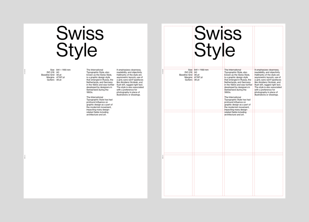
Grid-based layouts consist of several key elements that work together to create a stunning design. These include columns, rows, gutters, and modules.
Columns and rows divide the flyer into vertical and horizontal sections, respectively. The number of columns and rows can vary depending on the complexity of the design and the amount of information you need to convey. For example, a simple flyer may have just two columns, while a more intricate design may have four or more columns.
Gutters refer to the space between columns and rows, allowing for breathing room and preventing elements from merging together. It’s essential to strike a balance between gutters that are too wide, wasting valuable space, and gutters that are too narrow, causing overcrowding.
Modules are the individual units within the grid, where the content is placed. A module can contain text, images, or other elements, and their size and placement determine the overall balance and flow of the design.
Now, let’s delve deeper into the concept of hierarchy in grid-based layouts. Hierarchy plays a crucial role in guiding the viewer’s attention and ensuring that the most important information stands out. By utilising different sizes, fonts, and colours, you can create a visual hierarchy that directs the viewer’s eyes to the key elements of the flyer.
For example, the headline of the flyer can be made larger and bolder to make it the focal point. Supporting information can be placed in smaller text below the headline, creating a clear distinction between the primary and secondary content. Additionally, using contrasting colours for different sections of the flyer can further enhance the hierarchy and make the design more visually appealing.
Another aspect to consider when designing with grids is the concept of whitespace. Whitespace, also known as negative space, refers to the empty areas between elements. While it may seem counterintuitive to leave empty space on a flyer, whitespace is actually essential for creating balance and allowing the content to breathe.
By strategically incorporating whitespace into your design, you can prevent the flyer from appearing cluttered and overwhelming. Whitespace helps to highlight the important elements, making them stand out and ensuring that the viewer’s attention is focused on the key message. It also adds a sense of elegance and sophistication to the overall design.
The process of creating a grid-based flyer layout
Now that we understand the importance of grid-based layouts and the key elements involved, let’s dive into the process of creating a stunning flyer layout from scratch.
Before we delve into the intricate details of crafting a visually appealing flyer layout, it’s worth exploring the historical significance of grid-based design. Grid systems have been utilised in design for centuries, with roots tracing back to ancient manuscripts and early printed material. The meticulous alignment and organisation provided by grids not only enhance the aesthetic appeal of a layout but also improve readability and user experience.
Starting with a blank canvas: Setting up your grid
When starting a new design, it’s crucial to establish the foundation of your grid system. Begin by selecting a grid-based template or create one yourself using design software like Adobe InDesign. Define the number of columns, rows, and gutters based on the amount of content and the desired visual impact.
Furthermore, it’s essential to consider the concept of the ‘golden ratio’ when setting up your grid. The golden ratio, a mathematical proportion that is often found in nature and art, can be applied to create a visually pleasing and harmonious layout. By incorporating this principle into your grid structure, you can achieve a sense of balance and proportion that resonates with viewers on a subconscious level.
Once your grid is set up, it’s time to bring your design to life! Remember, your grid is your friend – it will help you maintain consistency and balance throughout the design process.
Balancing content within your grid
Now that you have your grid established, it’s time to start adding content. Begin with the most important elements, such as the headline and images. Position them strategically within the grid to create hierarchy and visual interest. Use larger modules for prominent elements and smaller ones for supporting information.
As you fine-tune the placement of content within your grid, consider the psychological impact of visual hierarchy. By manipulating the size, colour, and position of elements, you can guide the viewer’s eye through the layout and emphasise key information effectively. Remember, a well-balanced composition not only enhances the aesthetic appeal of your flyer but also improves its overall readability and impact.
Experiment with different placements until you find a layout that balances the elements and creates an engaging design. Don’t be afraid to play around with different compositions – sometimes the most unexpected arrangements can result in the most eye-catching designs!
Read More: A Printer’s Tips to Flyer Design
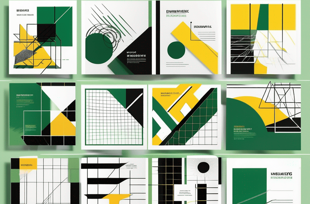
Different types of grid-based layouts
Grid-based layouts come in various shapes and sizes, allowing you to experiment and create designs that suit your specific needs. Let’s explore some of the most popular types:
Symmetrical and asymmetrical grids
Symmetrical grids create a sense of stability and order by organising elements along a central axis. They are ideal for conveying a formal and balanced aesthetic. On the other hand, asymmetrical grids provide a more dynamic and unconventional look, allowing for more creative freedom. They can be used to create a sense of movement and energy within a design.
Modular and hierarchical grids
Modular grids divide the layout into multiple modules of equal size, creating a uniform and structured design. This type of grid is great for displaying content in a clean and organized manner, making it ideal for flyers with a lot of information.
Hierarchical grids, on the other hand, use modules of different sizes to create emphasis and guide the viewer’s attention. By varying the size and placement of modules, you can create a visually engaging design that highlights the most important elements.
Tips for effective grid-based flyer design
Now that you have a good understanding of grid-based layouts, let’s dive into some tips to help you create visually stunning and effective flyer designs:
Ensuring readability through grid design
One of the primary purposes of a flyer is to convey information clearly and concisely. A well-designed grid can greatly enhance readability by providing structure and organisation. Ensure that your text is aligned properly and has enough space around it to prevent overcrowding. Use font sizes and styles that are legible and appropriate for the context.
Using grids to create visual interest
Grids don’t have to be rigid and boring – they can also add visual interest to your flyer designs! Experiment with combining different types of grids, playing with grid variations within a single design, or even breaking the grid intentionally to create a sense of excitement and dynamism.
Consider using grids to create visual connections between different elements, such as aligning images with text or using lines and shapes to guide the viewer’s eye. The possibilities are endless when it comes to using grids creatively!
Common mistakes to avoid in grid-based flyer design
While grid-based layouts offer numerous benefits, there are a few common pitfalls to watch out for:
Overcrowding your grid
It’s easy to get carried away and try to fit as much information as possible into the available space. However, overcrowding your grid will result in a cluttered and confusing design. Give each element room to breathe by leaving enough white space between them.
Neglecting the power of white space
White space, or negative space, refers to the empty areas within a design. Don’t underestimate the impact of white space – it allows elements to stand out, enhances readability, and creates a sense of elegance and sophistication. Embrace the beauty of white space and use it strategically to create a balanced and visually pleasing design.
So there you have it – a comprehensive guide to grid-based layouts for flyer design! Remember, a well-designed grid can turn an ordinary flyer into an extraordinary one, capturing attention and conveying your message effectively. So go ahead, unleash your creativity, and let the power of grids take your flyer designs to new heights. And don’t forget, if you’re looking for professional printing services to bring your grid-based flyer designs to life, head over to Printulu, your one-stop solution for all your printing needs!