Flyer design is an art form that takes creativity, skill, and attention to detail. One often overlooked element of flyer design is the use of white space. Yes, you heard it right, white space. Despite its name, white space is not ’empty’ space. In fact, it plays a crucial role in capturing the attention of your audience and delivering your message effectively.
Understanding the concept of white space in design
Now, let’s dive deeper into the concept of white space. Simply put, white space refers to the areas of a design that don’t contain any text, images, or graphics. It is the breathing room for your content. It helps to create a sense of balance, harmony, and clarity, making your flyer more visually appealing.
White space is a fundamental principle in design that is often overlooked but plays a crucial role in enhancing the overall aesthetic and functionality of a layout. It is not just about leaving areas blank; it is a strategic tool used to guide the viewer’s eye, emphasise key elements, and improve readability. When used effectively, white space can transform a cluttered design into a sophisticated and engaging composition.
The definition of white space
White space, also known as negative space, is like the pause between musical notes or the silence between spoken words. It allows your design to breathe and gives your content room to shine. By strategically placing white space around your text and images, you can create a sense of rhythm and flow that draws the viewer in.
Moreover, white space can convey a sense of luxury and elegance, elevating the perceived value of a product or service. In the world of advertising, brands often use generous amounts of white space to communicate a message of sophistication and exclusivity. This technique not only attracts attention but also builds a sense of trust and credibility with the audience.
Why white space is not ’empty’ space
Some may think that white space is a waste of valuable real estate, but that couldn’t be further from the truth. In fact, studies have shown that white space can significantly improve reader comprehension and retention. According to a study by the Software Usability Research Laboratory, adequate white space can increase comprehension by up to 20%.
Furthermore, white space is essential for creating a sense of hierarchy within a design. By varying the amount of white space around different elements, designers can establish a visual order that guides the viewer’s attention and helps them navigate the content more easily. This structured approach not only enhances the user experience but also reinforces the brand identity and messaging.
The psychological impact of white space in flyer design
White space doesn’t just make your flyer look aesthetically pleasing; it also has a profound psychological impact on your audience. The use of white space in design has been a topic of interest for psychologists and designers alike, as it plays a crucial role in shaping the way individuals perceive and interact with visual stimuli.
When it comes to flyer design, the strategic use of white space can significantly influence how your message is received and understood by your target audience. By understanding the psychological principles behind white space, designers can create layouts that not only look visually appealing but also effectively communicate the intended message.
How white space influences readability
One of the primary benefits of white space is that it improves readability. By giving your text room to breathe, you make it easier for your audience to absorb the information. Research conducted by the Nielsen Norman Group found that increasing spacing between paragraphs and lines of text can improve reading comprehension by up to 20%.
Moreover, white space can help reduce cognitive overload by allowing the reader’s eyes to rest between blocks of text, making it easier to process information. This can be particularly beneficial in flyer design, where the goal is to convey a message quickly and effectively to capture the viewer’s attention.
The role of white space in guiding viewer’s attention
Another psychological aspect of white space is its ability to guide the viewer’s attention. By strategically using white space, you can direct the viewer’s eye to specific elements or focal points in your design. This can be particularly useful when you want to highlight important information or call your audience to action.
Furthermore, white space can create a sense of balance and harmony in your flyer design, making it more visually appealing and engaging for the viewer. By carefully considering the placement of white space around different elements, designers can create a sense of flow that guides the viewer’s gaze through the content in a natural and intuitive way.
Practical tips for using white space in flyer design
Now that you understand the importance of white space, let’s explore some practical tips for incorporating it into your flyer designs.
White space, also known as negative space, is a crucial element in design that helps create balance, harmony, and focus. It allows the content to breathe and guides the viewer’s eye to the most important information on the flyer. When used effectively, white space can enhance the overall aesthetic appeal and readability of your design.
Balancing white space with other design elements
It’s essential to strike the right balance between white space and other design elements, such as text and images. Too much white space can make your flyer feel empty and dull, while too little can make it cluttered and overwhelming. Experiment with different layouts and proportions until you find the perfect equilibrium.
Consider the hierarchy of information on your flyer and use white space to create visual separation between different sections. This can help prioritise key messages and make the flyer more scannable for the reader. Remember, white space doesn’t have to be literally white – it can be any empty or unmarked space in your design.
Avoiding common mistakes with white space
When using white space, it’s crucial to avoid common mistakes that can undermine its effectiveness. One common pitfall is cramming too much content into a small space, which can make your flyer look cluttered and difficult to read. Another mistake to avoid is neglecting the margins and padding around your text and images. Giving them enough breathing room is essential for a clean and professional look.
Whitespace can also be used strategically to create a sense of elegance and sophistication in your flyer design. By allowing elements to have room to stand out, you can draw attention to specific details and create a more visually appealing composition. Remember, white space is not just empty space – it’s a powerful tool that can elevate your flyer design to the next level.
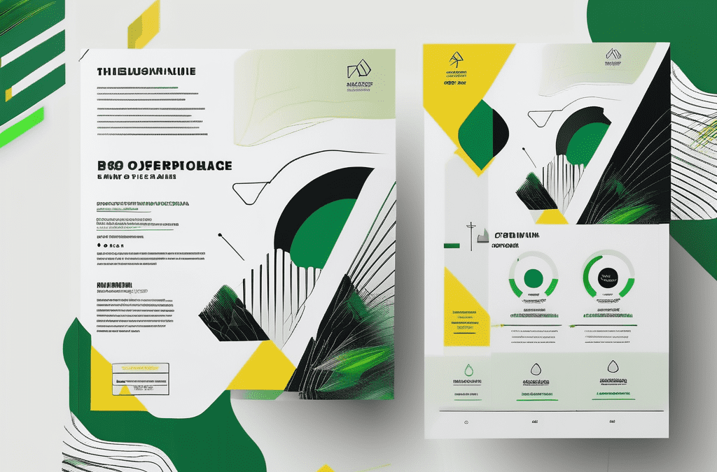
The role of white space in different flyer formats
White space is not a one-size-fits-all solution. Its usage may vary depending on the format of your flyer.
White space, often referred to as negative space, is a fundamental design element that plays a crucial role in enhancing the overall look and feel of a flyer. It provides breathing room for the content, allowing the important information to stand out and capture the viewer’s attention effectively.
White space in digital vs. print flyers
When designing digital flyers, you have the advantage of infinite scrolling and zooming capabilities. This means you have more flexibility in how you utilise white space to guide the viewer’s eye through the content. On the other hand, print flyers require a more strategic approach due to the physical limitations of the paper size. Ensuring the right balance of white space is essential in preventing the design from feeling cluttered or overwhelming.
Adapting white space usage for different flyer sizes
Whether you’re designing a large poster or a small handout, considering the size of your flyer is crucial in determining how much white space you can incorporate. Larger flyers allow for more generous white space, giving each element room to breathe and making the overall layout appear more sophisticated. Conversely, smaller flyers require careful consideration to avoid overcrowding the design. Maintaining a harmonious balance between text, images, and white space is key to creating a visually appealing and easy-to-read flyer.
A general rule of thumb is to leave at least 20% of your flyer empty to ensure optimal readability and visual impact. This guideline can help you achieve a clean and polished design that effectively communicates your message to the target audience.
Evaluating the effectiveness of white space in your flyer design
So, how can you tell if your use of white space is hitting the mark? Look out for these signs of success and red flags indicating poor white space management.
Signs of successful white space usage
A successful use of white space leaves the viewer feeling calm, focused, and eager to engage with your content. If your design feels balanced, easy to read, and visually appealing, then you can pat yourself on the back for a job well done.
Red flags indicating poor white space management
If your design feels cluttered, overwhelming, or unbalanced, it may be an indication that you’re not using white space effectively. Additionally, if readers find your content hard to follow or remember after reading your flyer, it’s time to reevaluate your white space strategy.
Now that you have a solid understanding of the importance of white space in flyer design, put these tips into practice and witness the impact it can have on capturing the attention of your audience. Remember, white space isn’t just ’empty’ space – it’s a powerful tool that can elevate your flyer design to new heights of visual appeal and effectiveness.
So, whether you’re designing event flyers, promotional materials, or business advertisements, never underestimate the power of white space in delivering your message and making a lasting impression. And when you’re ready to bring your flyer design to life, head on over to Printulu – your go-to online printing company for quality and affordable printing solutions. Happy designing!