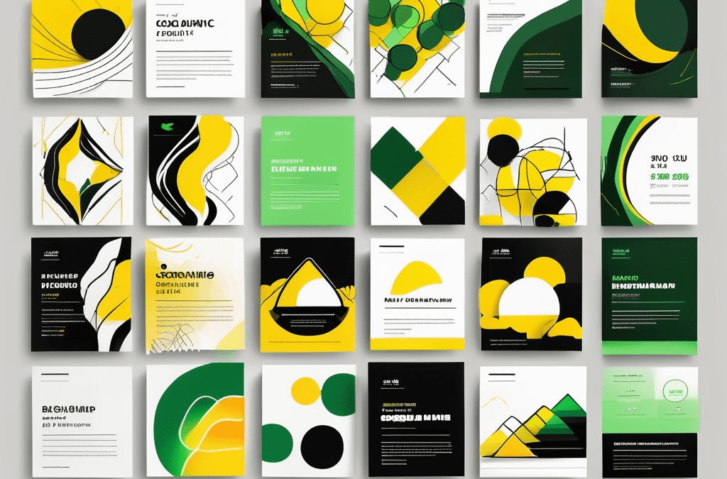
Are you ready to unleash the power of colors? Well, buckle up because we are about to take a wild ride through the wonderful world of color theory for flyers! In this article, we will explore the importance of color theory in flyer design and how you can use it to make your flyers pop.
Understanding the importance of color theory in flyer design
Did you know that colors have the ability to evoke certain emotions and create a specific mood? It's true! Color theory plays a crucial role in flyer design as it helps convey the right message and grab the attention of your target audience.
The psychology behind colour choices
Colors have a psychological impact on our emotions. For example, warm colors like red and orange can create a feeling of excitement, while cool colors like blue and green can evoke a sense of calmness. By understanding the psychology behind color choices, you can design flyers that elicit the desired response from your audience.
How colors can influence perception
Believe it or not, colors can affect how we perceive things. Bright colors tend to grab our attention and make objects appear closer, while muted colors can create a sense of depth and make objects seem further away. This knowledge is particularly important when designing flyers that need to showcase products or services in an enticing way.
Furthermore, the cultural significance of colours cannot be overlooked. Different cultures associate varying meanings with different colours, so it's essential to consider the cultural background of your target audience when selecting colours for your flyers. For instance, while white symbolises purity and peace in Western cultures, it represents mourning in some Eastern cultures.
In addition to evoking emotions and influencing perception, colours can also aid in brand recognition. Consistent use of specific colours in your flyers can help reinforce your brand identity and make your business more memorable to customers. This is why many successful companies have a distinct colour palette that is instantly recognisable to consumers.
The fundamentals of color theory
Now that we've scratched the surface of the psychology behind colors, let's dive deeper into the fundamentals of color theory.
Color theory is a fascinating subject that delves into the intricate world of hues, shades, and tones. It explores how colors interact with each other and how they can evoke different emotions and responses in viewers. Understanding the principles of color theory can elevate your design work to new heights, allowing you to create visually captivating and impactful pieces.
Defining primary, secondary, and tertiary colors
When it comes to color theory, it all starts with the primary colors - red, blue, and yellow. These colors are the building blocks of all other colors. By mixing primary colors, you can create secondary colors like purple, green, and orange. And if you take it a step further and mix a primary color with a secondary color, you get tertiary colors. Understanding these color relationships is key to creating harmonious designs for your flyers.
Primary, secondary, and tertiary colors form the basis of the colour wheel, a fundamental tool in the world of design. The colour wheel is a circular diagram that showcases the relationships between colours. It is divided into segments that represent different colour groups, helping designers to choose complementary or contrasting colours for their projects. By mastering the art of the colour wheel, you can unlock a world of creative possibilities and elevate your design skills to new heights.
The color wheel and its significance
Imagine a magical wheel that holds all the secrets of color combinations. Well, that's the color wheel! The color wheel is a visual representation of the relationship between colors. It's like your very own compass to guide you in choosing the perfect color scheme for your flyers. By understanding the color wheel, you can create eye-catching and visually pleasing designs.
Applying color theory to flyer design
Now that you have a solid understanding of color theory, it's time to put it into action and apply it to your flyer design!
Understanding the psychology of colors can significantly impact the effectiveness of your flyer. For example, did you know that red can evoke feelings of passion and urgency, while blue is often associated with trust and reliability? By incorporating these colour meanings into your design, you can subtly influence how your audience perceives your message.
Choosing a color scheme for your flyer
When selecting a color scheme for your flyer, consider the message you want to convey. Are you promoting a vibrant music festival? Go for bold and energetic colors. Is it a calming yoga retreat? Opt for soothing and tranquil hues. By carefully selecting a color scheme, you can set the right tone for your flyer and capture the attention of your target audience.
Furthermore, understanding colour harmonies, such as complementary, analogous, or triadic schemes, can help you create visually pleasing combinations that enhance the overall look of your flyer. Experimenting with different harmonies can add depth and sophistication to your design, making it more engaging for the viewer.
Balancing colors for visual appeal
Balance is the key to creating visually appealing designs. Using contrasting colors can add excitement and make elements stand out. However, be mindful of not overloading your flyer with vibrant colors, as it can become overwhelming. Finding the right balance between colors is crucial to creating harmony in your design.
Consider incorporating white space into your design to allow the colours to breathe and prevent the flyer from looking cluttered. White space can help direct the viewer's focus and create a sense of elegance and sophistication. Remember, sometimes less is more when it comes to effective flyer design.
Common mistakes in using color theory
As much as we love colors, it's important to be aware of the common mistakes that can occur when using color theory in flyer design.
Understanding colour theory is essential in creating visually appealing designs. It involves the study of how colours interact with each other and how they can evoke different emotions and responses from viewers. By mastering colour theory, designers can create harmonious and impactful designs that effectively communicate their message.
Overuse of vibrant colors
While vibrant colors can be eye-catching, using them excessively can be a recipe for disaster. Remember, less is more! Focus on using vibrant colors strategically to draw attention to key elements of your flyer.
It's important to consider the psychological effects of colours when designing a flyer. For example, red can evoke feelings of passion and excitement, while blue is often associated with trust and professionalism. By understanding the meanings behind different colours, designers can choose the most appropriate palette to convey the desired message.
Ignoring the importance of contrast
Contrast can make or break your design. Ignoring the importance of contrast can result in a flyer that appears flat and uninspiring. Experiment with light and dark shades, as well as complementary colors, to create visual interest and make your flyer pop.
In addition to contrast, designers should also pay attention to colour harmony. Colour harmony refers to the pleasing arrangement of colours in a design. By using techniques such as the colour wheel and colour schemes like analogous or triadic, designers can create visually appealing flyers that resonate with their target audience.
Tips for mastering color theory in flyer design
Now that you are armed with the knowledge of color theory, let's dive into some tips to help you master flyer design!
Using color to highlight important information
Colors can be used strategically to emphasize key information on your flyer. For example, using a bright and contrasting color for your call-to-action button can draw attention and increase click-through rates. Don't be afraid to play with colors and make important elements stand out!
The role of color harmony in design
Creating harmony in your design is like music to the eyes. When colors work together seamlessly, they create a sense of unity and coherence. Pay attention to how colors interact with each other and aim for a harmonious composition that will leave a lasting impression on your audience.
When considering color harmony, it's essential to understand the different types of color schemes. Complementary colors, which are opposite each other on the color wheel, create a vibrant and dynamic look. Analogous colors, found next to each other on the wheel, offer a more subtle and harmonious feel. Triadic color schemes, formed by three colors equidistant on the wheel, bring a balance of contrast and cohesion to your design.
So there you have it - the basics of color theory for flyers! Now that you have a solid foundation, go forth and create stunning and impactful designs for your flyers. Remember, colors can tell a story, evoke emotions, and make your flyers shine. Happy designing!


