Looking to make a bold statement with your marketing materials? Discover the ins and outs of color flyer printing in this article.
Color flyer printing is an essential marketing tool that can make a big impact on your business. Whether you're promoting an upcoming event, advertising a sale, or spreading the word about your products or services, colorful flyers are an effective way to catch people's attention and get your message across. In this article, we'll explore the world of color flyer printing and provide you with tips and ideas to help you create eye-catching designs that will leave a lasting impression.
Order your color flyer printing now
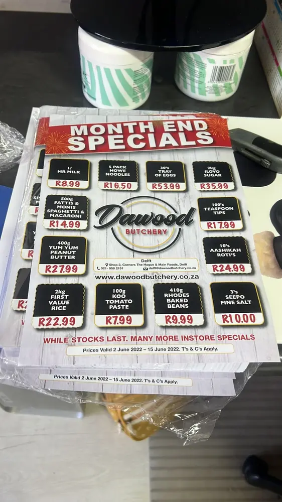
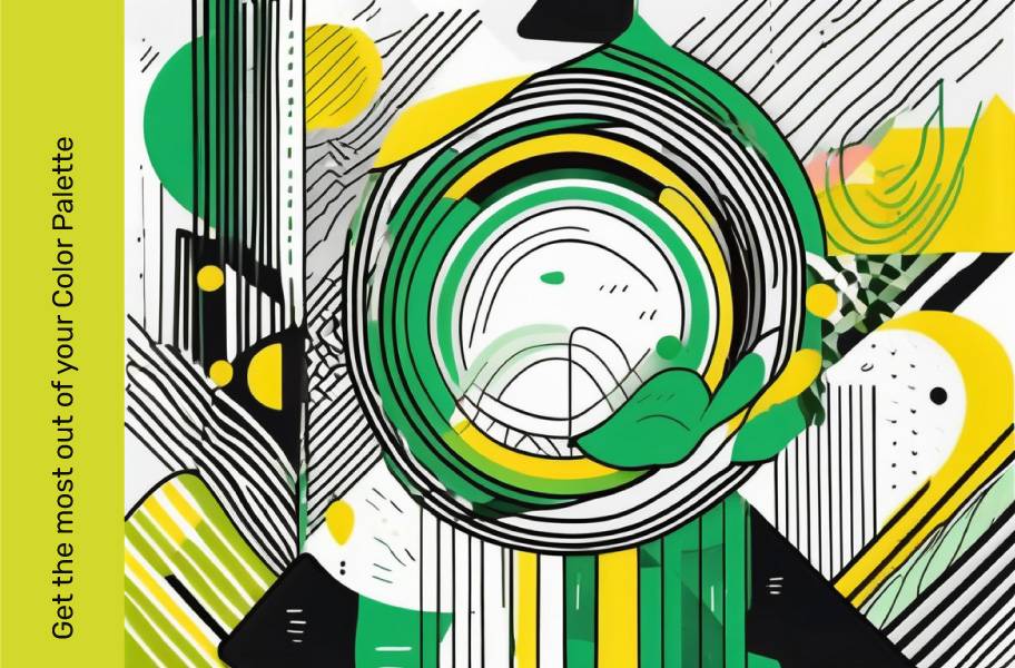
Choosing the Right Color Palette for Your Flyers
Colors play a vital role in the success of your flyers. The right color palette can evoke specific emotions and convey your brand's personality. When choosing colors for your flyers, it's important to consider your target audience and the message you want to convey. For example, if you're targeting a younger demographic, vibrant and bold colors might be more appropriate. On the other hand, if you're targeting a mature and sophisticated audience, softer and more muted tones may be the way to go.
Additionally, it's essential to use colors that are consistent with your brand. This helps to create a cohesive and recognisable look across all your marketing materials. If you already have an established brand color palette, incorporate those colors into your flyer design. If not, consider using colors that align with the industry you're in. For example, if you're in the health and wellness industry, greens and blues are often associated with feelings of tranquility and balance.
Moreover, it's worth delving into the psychology of colors when selecting the perfect palette for your flyers. Different colors can evoke different emotional responses. For instance, red is often associated with passion, energy, and excitement, making it a great choice for promoting sales or events. On the other hand, yellow is linked to optimism and youthfulness, making it ideal for targeting a younger audience or promoting a fresh and innovative brand.
Furthermore, the use of complementary colors can enhance the visual appeal of your flyers. Complementary colors sit opposite each other on the color wheel and create a dynamic contrast when used together. This contrast can help certain elements of your flyer design stand out and grab the viewer's attention. For example, pairing blue with orange or purple with yellow can create a visually striking effect that draws the eye.
Color associations, impact on sales, and examples
Red: Urgency, power. Triggers action, effective for impulse purchases Sales signs, e-commerce buy buttons
Blue: Calm, stability Indirectly. Boosts sales by reducing anxiety Financial websites, big-ticket item purchases
Green: Nature, environment. Solid choice for CTAs, associated with freedom Environmental businesses, high-end consumer tec
Purple: Royalty, creativity. Standout branding choice, versatile Luxury brands, websites with muted color schemes
Black: Luxury, contrast. Provides contrast, effective in luxury branding Luxury brands, high-end retail websites
Orange: Bright, positivity. Stands out, commonly used for CTAs Websites with clean, simple designs, brands seeking attention
Check out our suggested AI Tools for design, Khroma can help you set up a colorscheme
Design Tips for Eye-Catching Color Flyers
Now that you have a color palette in mind, let's dive into some design tips to make your flyers stand out from the crowd.
First, keep it simple. A cluttered and busy design can be overwhelming and confuse your audience. Instead, opt for a clean and uncluttered layout that highlights the most important information. Use headlines, subheadings, and bullet points to break up the text and make it easier to read at a glance.
When considering the layout of your flyer, think about the visual hierarchy of information. This involves arranging elements in a way that guides the reader's eye through the content in a logical order. By prioritising key details and using design elements like colour, size, and placement, you can create a flow that leads the reader from one point to the next seamlessly.
Second, don't be afraid to experiment with different fonts. Choose a font that is easy to read but also reflects the personality of your brand. Mixing and matching fonts can add visual interest and make your flyer more memorable. Just be sure not to go overboard, as too many fonts can make your design look unprofessional.
Consider the psychology of fonts when making your selection. Different fonts evoke different emotions and associations, so choose one that aligns with the message you want to convey. For example, a sleek and modern font may be suitable for a tech company, while a more traditional font could be better suited for a heritage brand.
Third, incorporate images and graphics. Visual elements can instantly grab attention and make your flyer more visually appealing. Use high-quality images and graphics that are relevant to your message. Additionally, consider using illustrations or icons to add a touch of creativity and uniqueness to your design.
Images can evoke powerful emotions and help tell a story, so choose visuals that complement and enhance your message. Whether you opt for photographs, illustrations, or a combination of both, ensure that the imagery aligns with your brand identity and the overall theme of the flyer.
Finally, always proofread your content before sending it to print. Spelling and grammatical errors can undermine your credibility and professionalism. Double-check all the details, including contact information, dates, and times, to ensure everything is accurate.
Remember that consistency is key in design, so ensure that your fonts, colours, and overall style remain cohesive throughout the flyer. By paying attention to these details and following these design tips, you can create eye-catching color flyers that effectively communicate your message and capture the attention of your target audience.
Read our tips on Flyer Design, printing and Distribution
Top Trends in Color Flyer Printing
Staying up to date with the latest trends in color flyer printing can give your designs a fresh and modern look. Here are a few trends worth considering:
- Minimalism: Clean and minimalist designs with ample white space are gaining popularity. They allow the message to take center stage and make for a more sophisticated and elegant flyer.
- Typography as a design element: Using typography as a focal point in your design can add visual interest and create a unique and memorable flyer.
- Soft gradients: Gradients can add depth and dimension to your design. Instead of bold and vibrant colors, consider using soft gradients for a more subtle and contemporary look.
- Metallic accents: Metallic colors like gold, silver, or rose gold can add a touch of luxury and elegance to your flyers.
Embracing these trends can help your flyers stand out and make a lasting impression on your target audience.
Furthermore, in the world of color flyer printing, it's essential to consider the quality of paper used. Opting for high-quality, thick paper stock can enhance the overall look and feel of your flyers. The weight and texture of the paper can impact how colours appear and how durable the flyers are, ensuring they withstand handling and distribution.
When designing your flyers, don't overlook the importance of incorporating your brand's identity. Consistency in branding elements such as logos, colours, and fonts can help reinforce brand recognition and make your flyers instantly recognisable to your audience. By aligning your flyer designs with your brand guidelines, you can create a cohesive and professional image that resonates with your target market.
Printing Techniques to Enhance Color Vibrancy
Once you've designed your flyers, it's essential to choose the right printing techniques to enhance the color vibrancy. Here are a few techniques to consider:
- Glossy finish: A glossy finish can make colors appear more vibrant and eye-catching. It also adds a layer of protection to your flyers, making them more durable.
- UV spot printing: UV spot printing can create a glossy and raised effect on specific areas of your design. It adds a tactile element to your flyers and makes them more visually appealing.
- High-quality paper: Choosing high-quality paper can enhance the overall look and feel of your flyers. Matte or satin finishes can provide a modern and elegant touch.
- Die-cut shapes: Experimenting with different shapes can make your flyers more unique and attention-grabbing. Die-cut shapes add a touch of creativity and can help reinforce your brand identity.
Remember, printing techniques can have a significant impact on the final result, so choose wisely to ensure your colors truly pop off the page.
When it comes to enhancing color vibrancy in your printed materials, there are a few additional techniques you may want to consider. One such technique is the use of metallic inks. By incorporating metallic inks into your design, you can add a touch of elegance and sophistication to your flyers. These inks have a reflective quality that can make your colors shine and stand out. Printulu doesn't offer Metallic ink print at the moment - But we're working on it!
Another technique to enhance color vibrancy is the use of spot varnish. Spot varnish is a clear, glossy coating that can be applied to specific areas of your design. By selectively applying spot varnish to certain elements, such as your logo or important text, you can create a contrast between the glossy and matte areas, making the colors appear even more vibrant. Printulu offers this but you will need to request a custom quote.
Furthermore, consider the use of embossing or debossing to add depth and texture to your flyers. Embossing involves raising certain areas of your design, while debossing creates a depressed effect. Both techniques can create a visually striking effect that enhances the overall appearance of your printed materials. Although this technique can add visual appeal, it can also add A LOT to your price tag.
Color flyer printing is a powerful marketing tool that allows you to captivate your audience and convey your brand message effectively. By choosing the right color palette, incorporating eye-catching design elements, staying on top of the latest trends, and using the right printing techniques, you can create flyers that leave a lasting impression and drive results for your business. When it comes to color flyer printing, trust the experts at Printulu, your online printing partner. Contact us today to bring your vibrant flyer designs to life!
A Green or Red Call to Action will alway have a higher conversion rate - Read about colour psychology here
6 Colors That Are Proven to Boost Sales, The Daily Egg


