You can’t do business without connecting with people, it’s no wonder why we have so many methods to connect and communicate. Just over the last 20 years, we have innovated more media and devices to enable seamless connections and instant communication, and, there is one medium in particular that has served the need to communicate and connect for more than 5 centuries… The business card.
Now, there are arguments as to whether this treasured medium is still necessary. Depending on who you talk to the answer is either a resounding “yes” or a jeering “no”. Sure, we have mobile devices that allow us to capture and store contact details; even just knowing someone’s name enables you to communicate and connect with them.
So look, you don’t need them, but the real question is: is there a benefit to having business cards?
As an online marketing professional, the answer is yes. Even I with my tech savviness cannot leave my business cards at home. Why?
The business card is a simple, elegant and tangible way to connect with someone. Let’s think about it this way; you meet someone who you want to connect with and you decide to exchange contact details. One option is to take out your phone and exchange details, but what if your battery is dead or dying? Sure, this seldom happens, but it has happened. Other times you are typing a difficult-to-spell name and struggling with auto-correct, you actually take down the wrong digit or make a mistake in the email address. Again, seldom, but it happens. The other option, paper and pen, like we did before the business card…
Look this may be a dramatic example. Essentially, what I am emphasizing is this miniature billboard with your name, your logo, your speciality and your contact details is always ready for that moment when your potential connection says: “let’s keep in touch”, and with a smooth hand over, I picture a slide across a mahogany desk, the deed is done. Just like that, you have traded details and you can get back to your uninterrupted conversation. Also, with some design flairs and interesting finishes, this can serve as a conversation starter or drive the conversation deeper.
Something like this:
Now that we have covered the what and why of business cards, let’s get into the how to get the most from your business cards.
[Related: Your Business Stationery Checklist]
How to get the best out of your business cards?
In an ideal situation, your business card sits at the top of the stack, in a business card holder, and your connection makes contact with you within 3 days. The most common situation is your card sits somewhere in the stack and your contact recalls your conversation when the need for your services arises (that’s if you made a great impression).
Therefore what you want from your business card is something that carries the impression further than just that initial conversation. You need something that creates a great first impression and sustains that impression. You want something that will occupy the top of the stack and stand out from the rest in the stack.
So here are a few things to consider to create that appeal.
Design
On a high level, this is your company logo and colour scheme. Getting these 2 right is the biggest step towards a final design as this influences your layout and identity.
[Related: 4 ways to save money on graphic design]
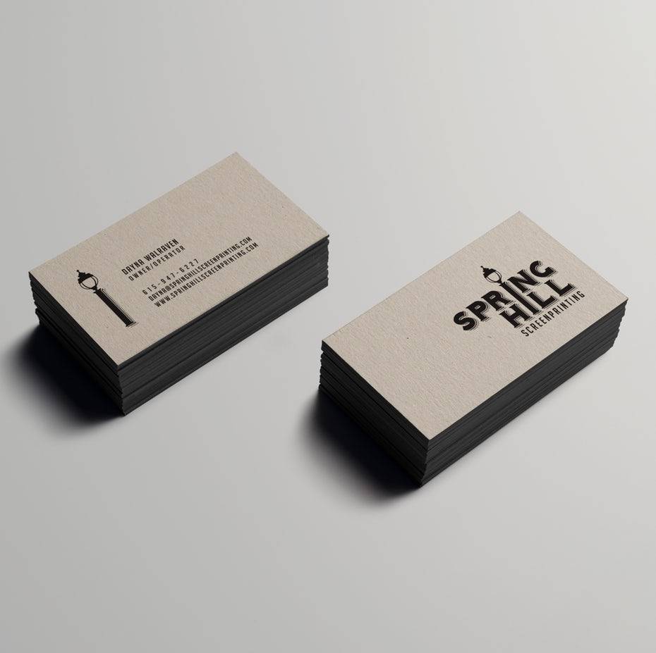
Business Card Design. Source: 99 Designs Blog
Logo best practice
Your logo is the main focus of your business card. This usually occupies one side of your business card, conventionally known as the back, while the other side is dedicated to your contact information. However, you are not limited to having the logo only on the back. You can also include a smaller logo with your contact details as long as it’s not taking the focus away from your contact details.
Brand colour scheme
Your brand’s colour scheme is useful for conveying the personality of your brand. Decide early on what impression you want to make as soon as you present your business card, the colour that gets the most prominence decides how you and your brand is perceived.
Colour – Photo by Rawpixel on Unsplash
Use only the necessary contact details
These are the most common options:
Necessary
Name – Your given name.
Company name – Unless you’re a freelancer, this will be different from your name.
Job title – this gives the holder an indication of your speciality and what you can do for them.
Phone number – Ensure that this is a number where people can reach you during business hours.
Email – As a freelancer, it’s wise to have a dedicated work-only address in this field that you constantly monitor.
Website URL – or the primary platform where you can be reached online.
Slogan – Add this to the side with your logo.
Optional
Social media – If it really matters that your social media pages or profile be seen, then add this.
Address – These are details that can be found on your website. Necessary if you are a retail store or showroom.
QR code – This can be useful to easily drive people to your website or to easily add your contact details to a mobile phone.
Orientation and shape
A landscape is the most common orientation. This makes it easy to read especially when sitting in a cardholder.
Portrait orientation is the least common and therefore more likely to stand out. The only downside is that, in a cardholder, it can be more difficult to read than landscape.
Die-Cut special shapes can make an added impact and enhance the overall impression. While these special shapes can be more fun and outstanding, they can be difficult to fit in a standard wallet or cardholder, therefore decreasing their portability. The same goes for square formats and shapes other than the conventional rectangular card.
Quick information about sizes:
55mm x 85mm OR 90mm x 50mm – Both sizes are available online.
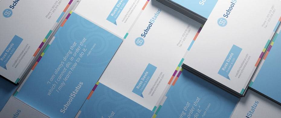
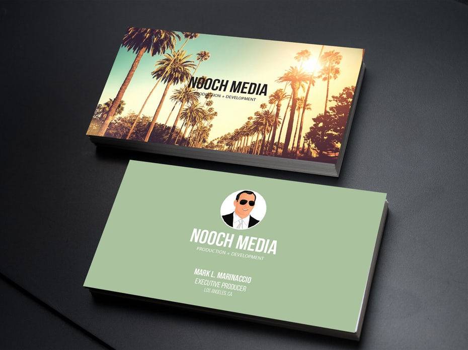
School status business cards. Source: 99 Designs Blog
Paper versus plastic
Paper is the most commonly used material for business cards. There are a variety of paper grammages you can choose from. We offer 250gsm and 350gsm which are your most common paper types for business cards.
350gsm gives your cards a heavier feel and therefore convey a higher quality standard.
250gsm is the more cost-effective paper for tighter budgets.
It is best to opt for the higher grammage as the thinner paper can crack easily and appear folded or scratched over time.
Plastic business cards are great for creating a more memorable business card with extra impact. However, these are more expensive than your paper business cards. These can be great for networking events where your business card has to work extra hard to stand out.
Square corners versus rounded corners
Square corners are the most conventional cut. These create a formal impression and appeal.
Rounded corners create a more friendly and approachable appeal.
Bleeds
We see a lot of business cards with neat borders that frame everything perfectly. These give a more formal impression. If that’s not the impression you wish to achieve then you can use a design that extends beyond the bleed to give your cards a less formal and more playful impression.
Typography
Factors like font and font colour will be dictated by your company brand guidelines. Check that these fonts and colours work with your colour scheme, and are easy to read when sized for the limited space on your business card. Legibility is more important than flair in this regard.
Related: Is your typography print ready?]
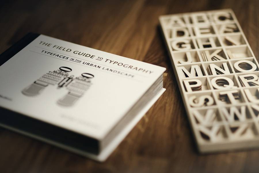
Typography – Photo by Alexander Andrews on Unsplash
Lamination
We offer Matt Lamination, Gloss Lamination and Soft Touch Lamination.
Matt Lamination absorbs light and gives your cards a smooth and sophisticated finish.
Gloss Lamination reflects light and gives your cards an elegant and vibrant finish.
Soft Touch Lamination is our most premium finish. This also absorbs light and creates a silkier feel than matt lamination.
Conclusion – Your own personal billboard that creates a lasting impression
Yes, you have various devices and other means of connecting with people. However, there is an advantage to having your business cards handy with you. It’s a quick and easy way to connect with someone you meet whether at a networking event, conference, dinner/lunch party, airport lounge, etc. While sharing your contact details they can also convey the personality and appeal of your brand, consider this when choosing your design, formats and finishes.
[Related: Tools for Entrepreneurs: How to start in a world of Amazon and Co.]
Resources
- 5 Reasons Business Cards Still Matter
- 28 cool business card ideas that seal the deal
- 4 tips to get you started in business card design
- How to design a business card: the ultimate guide
Related
- Your Business Stationery Checklist
- 4 ways to save money on graphic design
- Is your typography print ready?
- Tools for Entrepreneurs: How to start in a world of Amazon and Co.

