Branding identity is one of the biggest drivers of customer loyalty and brand recognition. We, like you, want our brand to be snappy, memorable, and inspire confidence. Here at Printulu, we do that through consistently providing information on new products, keeping knowledgeable staff, and maintaining a level of undeniable quality in all products (like our great business cards and letterheads)!
Creating a brand identity can be a simple as picking a logo and tagline, or utilising individual brand identity components, like typeface and colour, to create a memorable visual marker of the quality and product you want to deliver. But these components and the science behind them shift every year! For example, nostalgia marketing may have been popular in 2019, but what about 2020 onwards? Will brands and consumers still favour pastel shades and typewriter-reminiscent fonts? What are consumers drawn to with all the changes happening around us going into 2021? To help answer these questions today, we examine three branding identity trends set to take centre stage in 2021.
Remember, a brand logo or identity component is only as good as the printers that reproduce them. If you want to keep a consistent brand identity across branded products, check out our promotional items and gifting items. These print strategies are scientifically proven to help improve memorability and consumer impressions.
1. Put A Face To The Name.
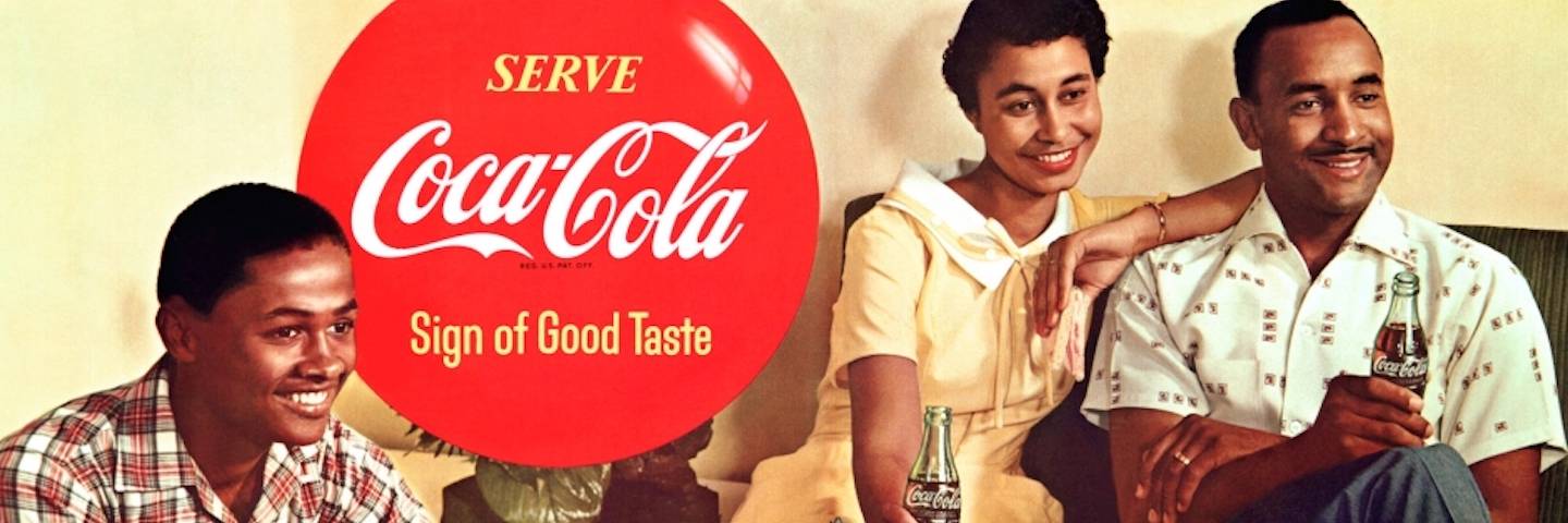
If it’s one thing humans like to see, it’s other humans—especially in social media posts. Lately, branding designers are catching on to this and we’re seeing a lot more imagery of people representing the brand, particularly faces, and particularly faces with personalities. After all, faces humanize a brand very well, and a lot of branding trends in 2021 lean towards this overall humanization.
Often with this branding trend, companies use an illustrated depiction of a real person. This not only allows for better control over the final look, but also opens up opportunities for different artistic styles, which can communicate the type of brand you are.
2. Quirky Art Is Taking The Ad World By Storm.
Especially if you’re targeting younger markets, you want your branding materials to display a distinguishing uniqueness—the quirky factor. Using one-of-a-kind imagery, particularly if cute, funny or whimsical, is a great path to memorability and recognition, two branding cornerstones.
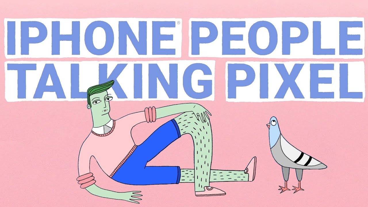
More often than not, brands use hand-drawn illustrations for this style, although by the definition of quirky, all art styles are in play. Don’t be afraid to experiment.
3. Embrace Expressive Brand Colours
Traditional branding says that simple, consistent colour schemes are best because consumers learn to associate your brand with its key colours. And while that’s true, at the same time it restricts your brand – what if you want to express your brand identity with more complex colour schemes and use different colours to give meaning to each of your products? The solution: expanding your brand colour palette to a variety of expressionist colours.
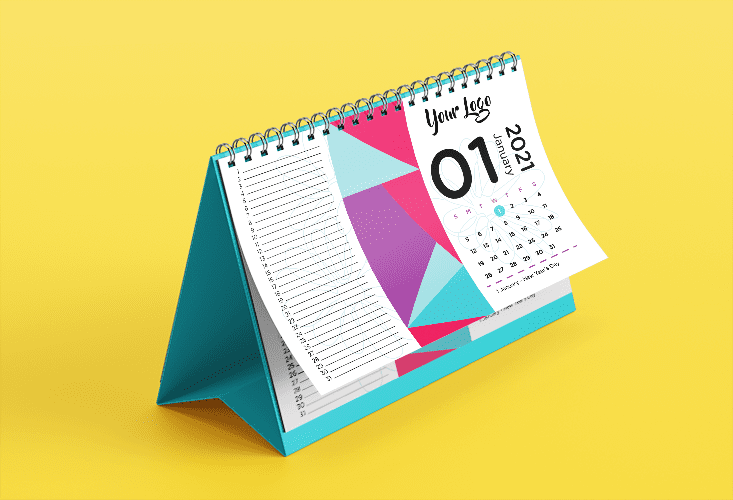
In 2021, meaningful and intense colours express what a brand stands for.
That’s why we’re seeing more and more brands test out unconventional, non-naturalistic colour schemes with plenty of variation and intensity. These impactful shades work both separately and together and say a lot about a brand or product through colour only.
4. Stand For A Cause
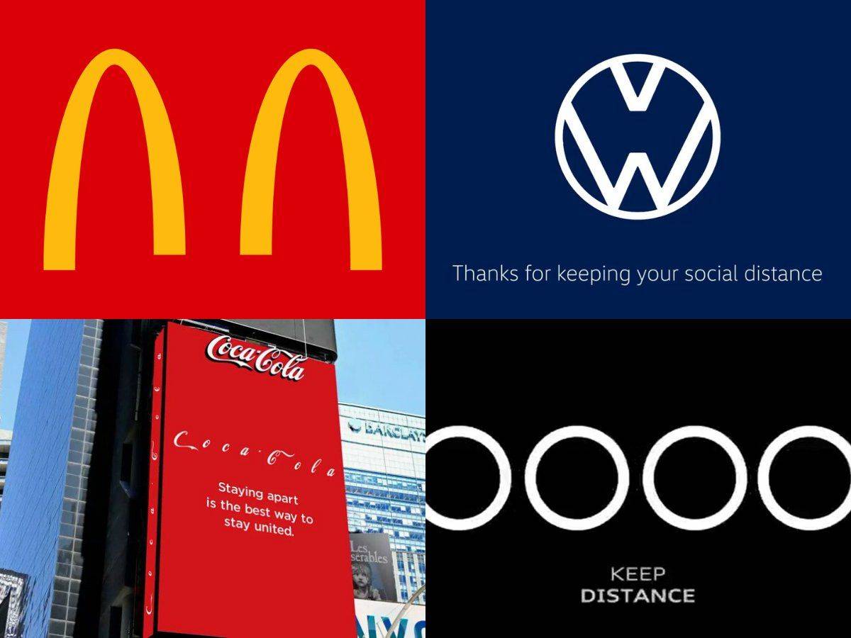
We’re not going to sugar-coat it: there’s a lot of bad stuff going on in the world. People in general are finding it harder to stay neutral, and the same goes for companies. Especially for younger markets like Gen Z and Millennials, consumers expect the brands they follow to take a stance, whether societal, environmental or economical. For more and more customers, brands that don’t stand for something really stand for nothing.
That’s why one of the branding trends of 2021 is taking a stance on an important issue, ideally the same stance as your target audience. Try to reflect your stance in your branding materials so people know what you’re about.
5. Geometric Shapes & Patterns For Days
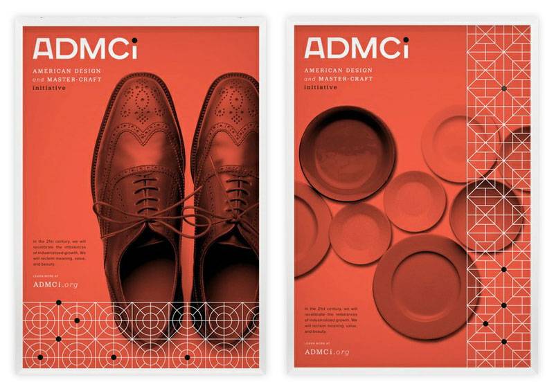
One of the more surprising 2021 branding trends is using patterns as an extension of your brand. Large blocks of repeated graphics create a hypnotizing wallpaper look. Patterns aren’t replacing logos or main images, but in the right spot, they can take your brand experience so much further.
6. Be Imperfect On Purpose
For certain audiences, perfection is flawed and inauthentic. More than a few consumers prefer a look that’s rough around the edges: asymmetry, scribbled writing, disproportionate imagery, and people that seem authentic and real.
An intentionally imperfect brand image, usually combined with illustrations and handwritten typography, resonates well with younger, more counter-cultural audiences (just like the quirky trend above). We’re also seeing a lot more imperfect branding with the emergence of people working from home. Live videos from the living room, ads shot in your backyard – it all creates a real, behind-the-scenes look at your brand.
This style won’t match every brand identity, but for some it will fit like a glove. If your brand targets more offbeat markets, this branding trend is a great opportunity to delve into uncharted territory and really give your brand a distinct look and feel.
The pandemic has shown up a lot of inauthentic efforts from brands, celebrities and politicians. This is why authenticity will be a defining brand design trend of 2021.
7. Make It Immersive
Your branding is not just your logo or website or packaging – it’s all of that and more. In 2021, people expect to receive not only a well-designed product, they expect you to take them on a journey. If you want to go the extra mile and really wow them, give them an experience.

Due to the increasing amount of online purchases, the unboxing experience is now more crucial than ever. In 2021, brands and designers think through the entire process of opening a package and make it a unique experience by ensuring that even the smallest detail is on the brand and captivates the customer as they open the box and unwrap their products.
Iconography Trends: On Trend Colour Palettes, Shapes, and Motion.
Iconography is the language of illustrations. Keeping your website, printed materials, and branding streamlined and thematic is a great way to build brand identity. Here’s what we’re expecting to see in 2021:
Muted Colours
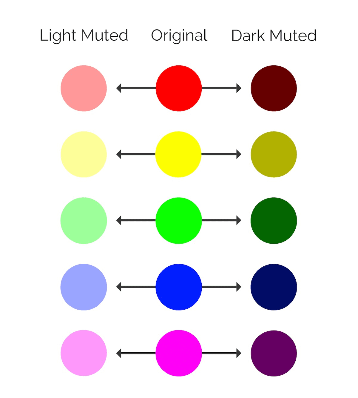
A few years ago, neon colours were all the rage. But there has been a distinct shift away from such bold colours since last year. Brand design trends now favour muted colours. These are softer hues that are mixed with either a black or white base. This takes the edge off the colour so it doesn’t look as bright.
Minimalism
Minimalism has been taking over as one of the top brand design trends of the past few years. There has been a steady shift towards more minimalist aesthetics every year, and that is going to continue into 2021.
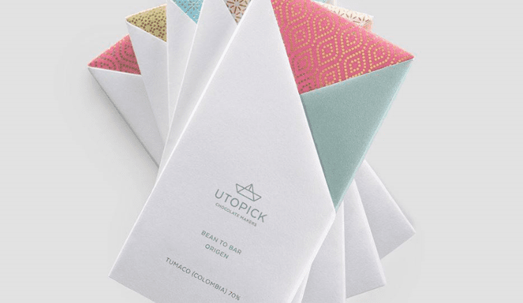
We are seeing minimalism across landing pages, social posts, newsletters, logos, and even offline, on branded merchandise.
Asymmetry
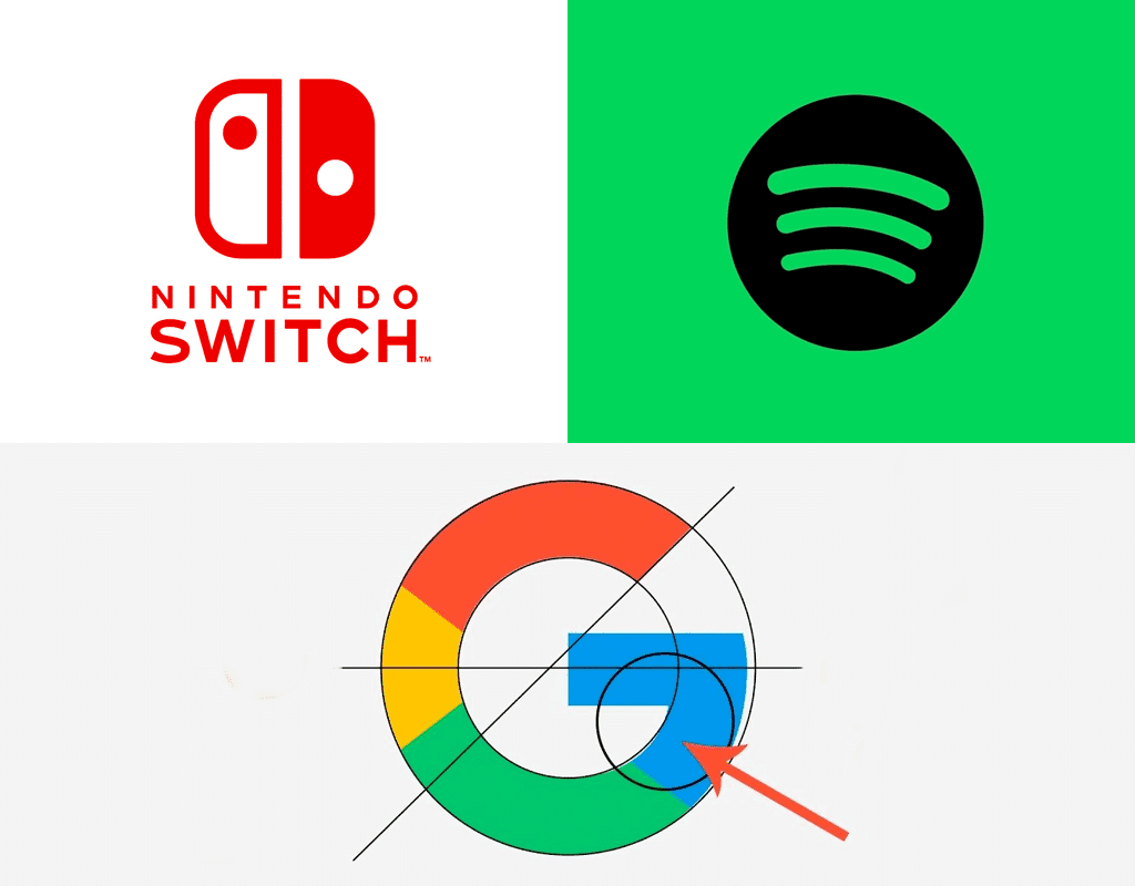
Grids are making their way out of brand design trends – instead, we’re going to see more asymmetry in web design and brand logos. It’s a distinct move away from the design trends of the past – but asymmetrical designs are distinctive and memorable.
Data Visualisation
Data has become part and parcel of the marketing landscape. But it isn’t just internally that data needs to be shared – prospects can be encouraged to become customers through data.
But sharing raw data holds little value to the viewer. You need to give it context so it’s easy to understand. You also need to make it visually appealing. Nobody wants to look at a bunch of numbers.
This is why data visualizations have become so intrinsic to visual marketing strategies. And for 2021, it will be simple visualizations that draw people in.
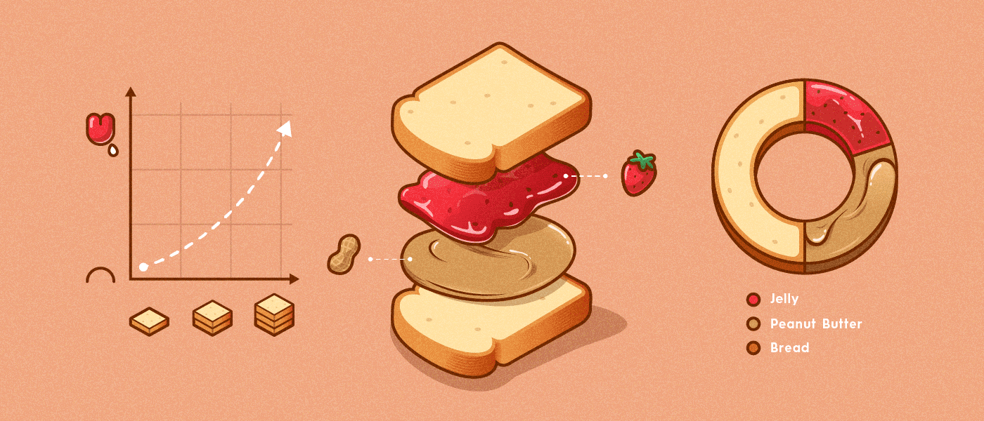
Why? Because people don’t want to work at understanding data graphics. You can create intricate visualizations, but they need to be easy to absorb or people will scroll past.
Flat Icons & Illustrations
The interesting thing about brand design trends is that something old often becomes new again. And this is exactly what we’re seeing with regard to icons and illustrations.

Flat icons and illustrations were all the rage a few years ago before 3D aesthetics took the world by storm. Now, we’re seeing a return to the flat look for 2021.
Motion Logos
Brand content is aimed at getting users to remain on the same page or post for a long time. The longer they look at a post, the more likely they are to engage with a brand.
The same principle applies to other branding elements – such as logos. We know that a brand logo is an integral part of a company’s identity — but it’s also one that people gloss over amidst the rest of the available content.
How do you jazz up your brand logo for 2021? By adding motion to it.
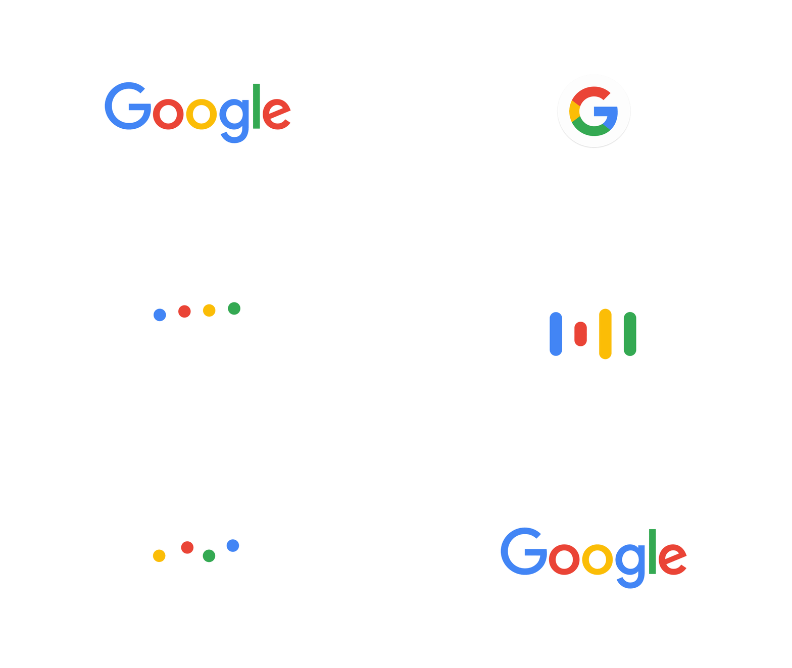
We are going to see more motion logos in the coming year, like the Google logo below.
Typography Trends: On Trend Fonts and Placements
The rule of thumb in branding identity components is keeping it consistent. Use the same heading style, stick to the same font, and have a placement style that is tried and true.
Simple & Classic Fonts
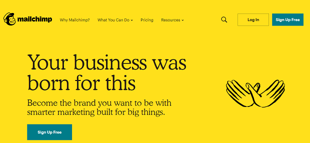
Classic serif fonts have been making a comeback and they’re going to be a brand design trend to follow in 2021.
These fonts evoke nostalgia, elegance, and trustworthiness, which is why they’re becoming popular again. The world can use some of those qualities right now. Classic fonts are not as easy on the eyes as sans serif fonts, so it’s best not to use this font for large paragraphs. Headers and subheadings will be enough.
Text Videos
There is no doubt that the pandemic has impacted the way we work and create content. Remote work has become the norm and will continue to be so in 2021. This makes creating new video content, especially with team members and management, that much harder.
But social media videos still draw four billion viewers daily, so it’s not something that brands can ignore.
Fortunately, you don’t have to. One of the brand design trends that has taken over during the pandemic is text videos.
These videos are simple to make and you can pack them full of branding elements like your fonts, colours and logo.

