Is the colour scheme you’ve chosen for your brand triggering a desired response? Do you find yourself overwhelmed by the number of potential brand colour palettes. Everyone has favourite colours they tend to gravitate toward when it comes to their work or otherwise.
But a skilled designer understands the importance of evaluating a colour scheme based on the brand. Colours actually cause emotional responses based on the palette you use.
Why Is Your Color Scheme So Important?
Before we jump into the process of selecting a color scheme for your site, it’s important to understand exactly why your website color scheme matters so much.
After all, you might be thinking that it’s the content that really matters. And that’s not untrue.
People love content. They’re drawn to fresh voices and enticing information, but you have to capture their attention first. That’s where website color palettes come into play.
If you choose the right website color scheme, you get the opportunity to blow your visitors with your content.
Here’s how:
1. Create brand recognition
Your brand needs to be consistent. And beyond that, it needs to be memorable enough that users will return after their first visit.
After all, many of your visitors won’t be ready to make a purchase or other major conversion during their first visit — and they need to remember your company in order to come back and take those actions.
Fortunately, colour increases brand recognition by 80%.
2. Shape how visitors feel about your business
In another study on how consumers’ first impressions are formed, 90 percent of initial assessments are based on colour alone.
To a certain extent, the reason for this is clear. After all, colour is one of the easiest aspects of a brand to “understand.” It can be assessed almost instantaneously and doesn’t require visitors to evaluate copy or other messaging.
3. Develop a sense of order
Aside from the emotional responses the individual colours you choose might evoke, it’s also necessary to consider the way the colours in your brand interact with one another.
The best way to do that is by looking at a few basic principles of colour theory.
4. Make certain elements stand out
A defined colour palette can be helpful for signifying that certain elements are important.
You can maximize this impact by keeping the Isolation Effect in mind as you determine how to use your colour scheme on your merchandise.
The general idea behind this psychological principle is that the more an item stands out, the more likely it is to be noticed and remembered.
Make sure that the colours you choose give you the ability to make certain calls to action stand out on your pages without clashing with the rest of your design.

How many colours should you incorporate?
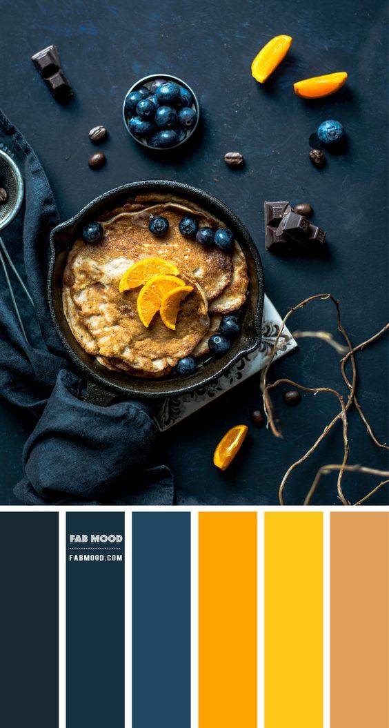
It all depends on the complexity of your design and the types of colour combinations. For instance, if you’re using a monochromatic design palette, you might need seven or even more shades of that colour to capture enough variety.
You’ll want to specify colours for specific parts of your merchandise, such as text, backgrounds, and CTAs.
Good colour choices take careful planning.
They can influence how a prospect interprets what they see as much as a site’s layout and typography – and, when done well, they can have a positive impact on each visitor’s evaluation of the brand as a whole.
Choosing a colour palette is one of the best ways to convey the mood of your brand and create an experience for your customers. Building a cohesive colour palette can be overwhelming because there are so many directions you can go. Before choosing your colour palette, it’s important to define your brand’s personality so that you can choose colours that represent it well.
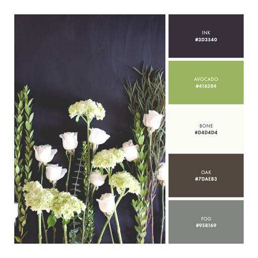
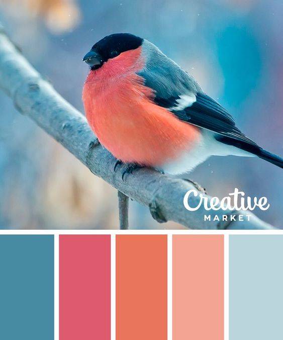
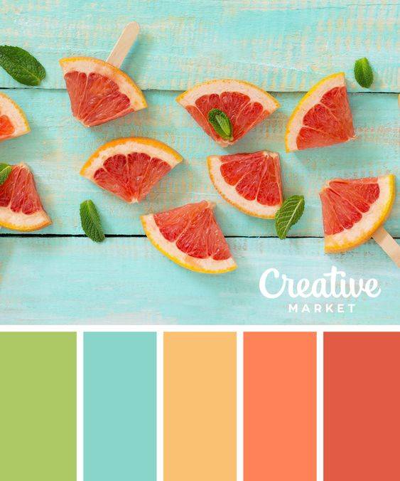
1. Determine your brand personality
Before we get to colour, it’s important to identify your brand personality. To do this, you’ll make a list of 8-10 keywords that describe what you want your brand to be.
Ask yourself questions like, ‘How do I want people to feel when they experience my brand?’ and ‘What words would I use to describe how I’d like my business to come across?’. After you write out your list, narrow it down to 3-5 top words that we’ll use to build your color palette.
2. Pick colours that match your brand personality
Now that you’ve narrowed your list down to 3-5 keywords, it’s time to start looking at colours that support those words. If you describe your brand as strong and luxurious, you’ll want to stay away from delicate pastels such as lavender and look for more intense, saturated colours like dark icy blues and metallics.
Start a Pinterest board at this step if you don’t have one already. Start collecting images that feature colours you respond to, don’t filter too much at this point, we’ll narrow it down in the next step.
3. Narrowing it down
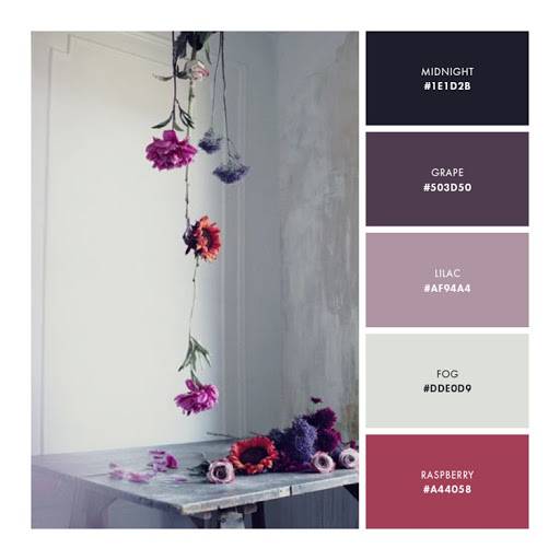
Usually at this point I try to step away from the project for at least a day. Give yourself some time and come back to it with fresh eyes. Go back through your Pinterest board and pull images that feature your favourite palettes. I like to choose multiple images and create a full inspiration board, but you can also choose one image to build your palette from. If you’re using Adobe InDesign, Illustrator, or Photoshop, you can open your image in one of these programs and use the eye dropper tool to sample colours directly from the image. Keep in mind you need to have a range of colours including a darker option for text, and a “pop” of colour for buttons or calls-to-action.
4. Bringing it all together
Now that you have your colour palette, you can create your palette board by simply drawing shapes (such as circles or squares) and filling them in with your colors. I also like to include the colour codes for consistency across print and digital materials. Without further ado though, here are a few sample colour palettes that you can take inspiration from.
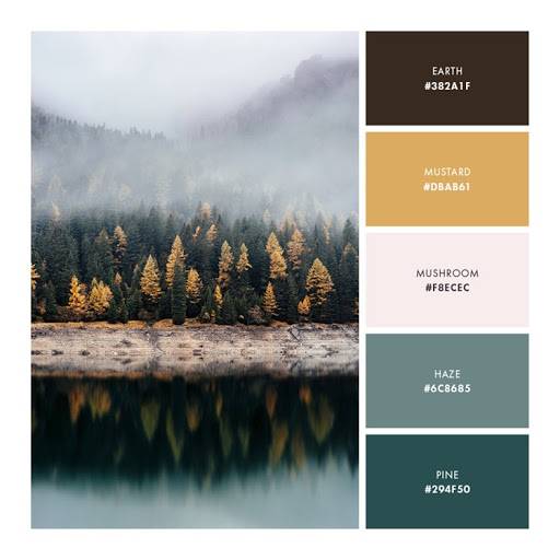
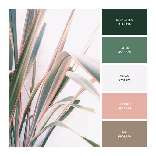
Sample Brand Colour Palettes For Inspiration
1. The Big Top
BigTop is a community that specializes in helping startups network. The site uses an unusual but extremely attention-grabbing combination of jewel tones that range from purple and blue to bright orange and yellow.

The primary colours are all cool colours, which makes the warmer colours pop. You’ll notice in the homepage screenshot that the orange and yellow CTA grabs your attention before anything else.

2. Fiverr
You might notice that many companies reserve a specific colour – in the case of Fiverr, green – exclusively for CTAs. It doesn’t appear elsewhere on the site.


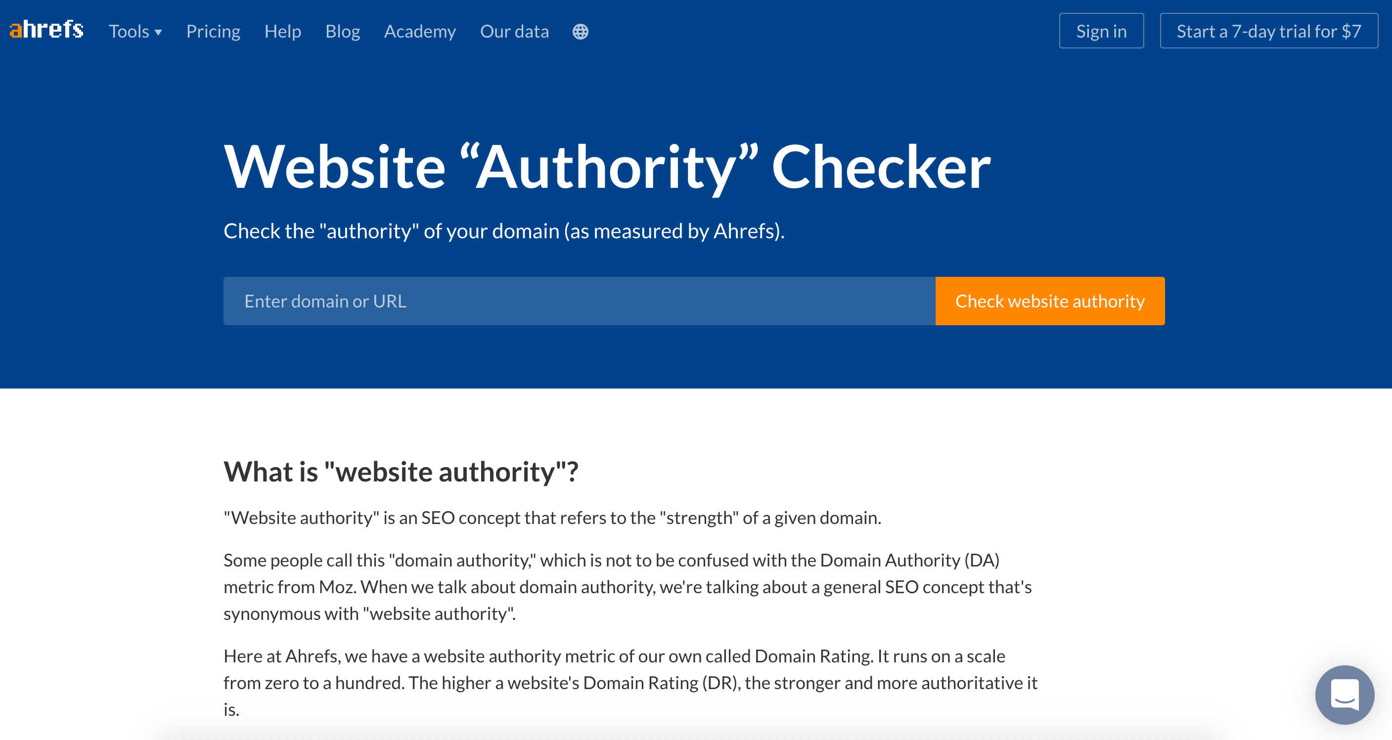
3. Ahrefs
Ahrefs is an example of a website that uses its colour palette liberally. A darker blue serves as the dominant color, but variations of it exist throughout the site. The same goes for the orange, pink, and teal colors.

4. Salt & Candy
Neutral earth tones can work well when you want to put the visitor at ease. Salt & Candy employs liberal doses of light browns and forest greens.


5. Absa
Absa‘s rebrand was a very controversial topic. However, they still stayed within the warmer tones of the original branding. This denotes authority, but with the introduction of the cooler colour variations, it seems much more familiar, young, vibrant and approachable.


Conclusion
Your website colour palette should not only reflect your brand, but also appeal to your audience. Otherwise, people might be turned off by your branding without even realizing it.
Start with what you like. Consider choosing a palette that’s different from others in your niche so you stand out. Then begin testing.
Give yourself the opportunity to make your site as visually appealing and memorable as possible.


