Welcome to a fresh take on notepad customisation for those who love refined stationery design. If you’re into personal notepad enhancement, love creative journaling, or want to boost your productivity stationery, you’re in the right spot. We’ll explore how to turn a simple notepad into a powerful tool for efficiency and style.
It’s not just about writing notes; it’s about creating an experience. Whether you’re jotting down ideas in a small 4” x 6” pad or using a larger 8.5” x 11” one, design details count. We’ll look at how customisation, from colours to fonts, can transform notepads into something inspiring and useful.
For South African professionals, these tips can make your notes stand out. For businesses, custom notepads can remind people of your brand, with 85% recall from promotional items. Let’s make that everyday office item a symbol of sophistication and your brand’s values.
Key Takeaways
- The importance of notepad customisation and design in boosting productivity and brand awareness.
- The right notepad size, from small Junior to large Tall, matters for user comfort.
- Choosing thicker 70 lb paper for a better feel, unlike regular copy paper.
- Ordering in bulk for custom notepads can save money and build customer loyalty.
- Modern printing services like Printulu offer quick same-day printing for urgent needs.
Understanding the Importance of Notepad Design
Notepad design is more than just looks. It affects how we use and enjoy stationery. It’s key to think about notepad aesthetics, color psychology, and notepad dimensions. This ensures both looks and function are top-notch.
Why First Impressions Matter
First impressions with custom stationery are crucial. Great notepad aesthetics grab and keep our attention. It can turn a simple notepad into something special. This is vital for brands, as it helps build recognition and loyalty through beauty.
The Psychology of Colors
Colour in notepad design impacts our feelings and actions, thanks to color psychology. Blue can calm and stabilise, perfect for work notepads. Orange, on the other hand, sparks creativity, ideal for art notepads. Choosing the right colours makes notepads more effective and appealing. Learn more about notepad design here.
Selecting the Right Size
Notepad size is critical for its use. It’s important to know about notepad dimensions. Small notepads are great for quick ideas, while big ones are for detailed notes. Designers suggest at least 8mm line spacing for easy reading and use.
In conclusion, notepad design combines usefulness and personal flair. Done well, it makes everyday items into essential tools or powerful marketing tools.
Key Elements of Notepad Design
Mastering the key elements of notepad design is crucial. It makes the notepad both functional and visually appealing. Designers focus on headers and footers, typography, and layout to boost usability and beauty.
Headers and Footers
Headers and footers are key for effective organization. They frame the content, adding consistency and space for titles, page numbers, or contact details. This helps create a professional and cohesive notepad layout.
Typography Choices
Font selection is vital for readability and personality. Fonts like Arial, Verdana, and Times New Roman are clear and formal. Bold and italics can highlight important sections, making text more engaging.
Layout Considerations
The notepad layout must balance white space and content. This involves choosing margin sizes, text alignment, and spacing. The layout should match the notepad’s purpose, with options like lined or grid formats.
Visual Hierarchy
Creating a visual hierarchy is key to design fundamentals. It guides the user’s eye, placing important information first. This is done through font size, color, and element positioning, for a better user experience.
Designers can make notepads both beautiful and functional. This thoughtful design makes office tasks simpler and more enjoyable.
Choosing the Right Color Palette
Choosing the right colors for stationery is key for looks and mood. It’s about picking colors that match the tone and emotion you want to share. Understanding color theories helps create a palette that reflects your desired mood.
Exploring Popular Color Schemes
In design, like notepad customization, certain color schemes are popular. They aim to evoke feelings or show a brand’s identity. Tools like ColorBrewer and Data Color Picker help designers pick colors that look good and are easy for everyone to see.
- Qualitative palettes, great for showing differences without order, work best with up to ten colors to avoid confusion.
- Sequential schemes, where colors get darker or lighter, are good for showing data in order, like scales.
- Diverging palettes, which show data around a middle point, are perfect for data with a key median or zero.
Effects of Color on Mood
Studies show colors can really affect our mood. For example, red can make us feel energetic, while blue is calming. Choosing the right colors for your notepad can make it more than just a tool.
“90 percent of initial assessments are based on colour alone.”
Combining Colors Effectively
Creating a good design is all about color combinations. The 60-30-10 rule is a good guide. It suggests using 60% of one color, 30% of another, and 10% as an accent. This balance makes the design interesting but not too much.
| Color Type | Usage | Effect on Mood |
|---|---|---|
| Primary (Blue) | 60% | Calming, Trustworthy |
| Secondary (Grey) | 30% | Neutral, Balanced |
| Accent (Yellow) | 10% | Energetic, Optimistic |
Remember, when picking colors, think about cultural views and how colors are seen. Tools like Viz Palette help check how colors look to people with color blindness. This makes your design more accessible and effective, improving mood through color.
Customizing Your Notepad Cover
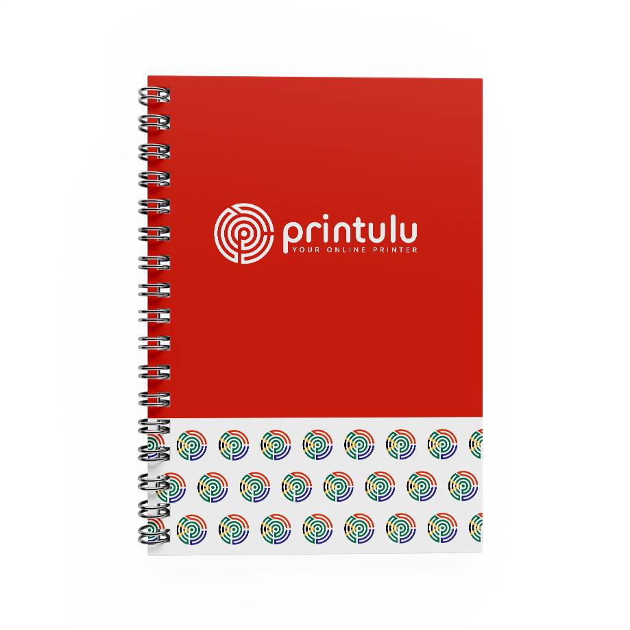
Turning a notepad cover into a personal statement or a brand image is more than a trend. It’s a smart way to show off your style or brand. Custom covers in notepad design are not just about looks. They are also a key marketing tool.
By personalising covers with graphic design and branding, a simple notepad becomes a professional and unique accessory.
Materials that Make an Impact
The materials used for custom covers greatly affect the notepad’s look and feel. Options like luxurious leather, eco-friendly recycled paper, or sleek vinyl improve the feel and last longer. Choosing materials wisely can show off your brand or personal values.
This choice also reflects the growing trend towards eco-friendly products.
Designing Eye-Catching Graphics
Graphic design is key in making custom covers stand out. Using bold colours, patterns, or simple designs turns the cover into a piece of art. For businesses, using brand-specific graphics boosts recognition.
For individuals, designs can be more abstract or themed, showing their personal style. High-quality printing keeps these designs bright and lasting, pleasing both the eye and the practical side.
Incorporating Branding Elements
Adding branding to custom covers is vital for businesses to increase visibility and loyalty. Elements like logos, slogans, and colours make each notepad part of a bigger story. For personal use, adding unique motifs or monograms makes the notepad special.
Custom covers, with their memorable materials, striking designs, and strong branding, are more than just useful. They are powerful tools for branding and self-expression. This tailored approach meets the need for both practicality and personalisation in today’s market.
Typography: Making Your Words Stand Out
The art of typographic design in notepad creation is key. It makes sure the text looks good and works well. Choosing the right fonts and pairing them well is crucial. It helps readers understand and enjoy the text more.
Choosing Fonts for Readability
Fonts should make reading easy. Fonts like Arial or Helvetica are great for digital screens. They help readers see the text better, even when they’re scanning quickly.
Pairing Fonts for Effect
- Pairing fonts is vital. It means picking fonts that work well together. This makes the text look better and helps focus on important parts.
- Using too many fonts can make it hard to focus. This shows why picking just the right fonts is so important.
Font Sizes and Styles
Choosing the right font sizes and styles is key. Using bigger fonts, like 16-point for body text, helps readers stay interested. Bold or italic styles make important info stand out, making it more impactful.
| Typography Technique | Effectiveness | Impact on Comprehension (%) |
|---|---|---|
| Optimal font sizes and contrast | Improves readability | 50 |
| Utilising alignment and spacing | Reduces perceived clutter | 40 |
| Strategic emphasis (bold/italic) | Enhances viewer retention of key info | 50 |
| Scaling for viewing distance | Ensures clarity and comprehension in outdoor settings | 40 |
In summary, knowing how to pick and pair fonts, and use sizes and styles wisely is crucial. It makes your notepad not just useful but also engaging for your audience.
The Role of Imagery in Notepad Design
Imagery is key in making notepads look good and work well. Choosing the right image quality and imagery incorporation changes how people see your notepad. Good images keep the design looking sharp and professional, which keeps users interested.
Using High-Quality Images
For any notepad design, high-quality images are a must. Image quality affects how professional and clear the notepad looks. Resizing images can make them smaller without losing quality, keeping the notepad looking sharp and fast to load.
Tools like TinyPNG can also make PNG files smaller by 50-80%, speeding up pages without losing image quality.
Stock Photos vs. Custom Illustrations
Deciding between stock photos and bespoke illustrations depends on budget and uniqueness needed. Stock photos are cheaper and easy to find, good for general topics. But bespoke illustrations are more original and can show off a brand’s unique style.
Using custom images can make your notepad stand out and tell a story through visuals.
Balancing Text and Images
Finding the right visual-text balance is crucial in notepad design. This balance makes sure text and images work together well, improving readability and keeping users engaged. Using CSS sprites can cut down HTTP requests by 20-50%, speeding up pages and keeping the design balanced.
Also, making sure images and text line up correctly keeps the design clean and interesting. This is important for keeping users focused and interested.
For more tips on using images in HTML notepads, check out how to insert and work with images in. Whether you’re aiming for beauty or performance, knowing how to use images is essential for great notepad design.
Utilizing White Space Effectively
Understanding white space utilisation in notepad design is key to a clean layout. This approach supports minimalistic design and clarity. By allowing content and visuals to breathe, designers improve user interaction.
Negative space, often overlooked, can change a notepad’s look and feel. Its strategic use is vital.
Benefits of Negative Space
White space, or negative space, guides a user’s focus. A study from Wichita State University found it boosts text comprehension by up to 20%. This shows the power of design where less is more.
Creating Breathing Room
White space in a notepad does more than clean up. It makes the page open, helping users focus and absorb info better. Good line spacing and margins are key for better reading.
Avoiding Clutter
To keep a layout clean, use Gestalt principles of proximity and simplicity. These principles group related items together but keep them distinct. This enhances clarity and reduces cognitive overload, making users feel less overwhelmed.
| Design Aspect | Benefit |
|---|---|
| Macro and Micro White Space | Directs user attention and highlights key areas effectively |
| Consistent Element Spacing | Reduces cognitive load and bounce rates |
| Balanced White Space Use | Creates aesthetically pleasing and functional designs |
| Logical Grouping | Improves information processing by enhancing logical flow |
Thoughtful notepad layouts that use white space strike a perfect balance. They are visually appealing and functionally superior. These designs lead to a more intuitive and satisfying user experience.
Designing for Functionality
When making custom notepad solutions, we look at more than just looks. We add practical features that make the user experience better. Each choice should blend beauty with functional design. This way, the notepad is not just pretty but also useful every day.
By designing with the user in mind, these notepads become more than a place to write. They become key tools for meetings, events, and daily work.
Creating Practical Layouts
It’s key to design layouts that meet user needs. Studies show layouts can make note-taking 40% more efficient. This boosts workplace productivity.
A good layout can turn a simple notepad into a powerful organisational tool. It can include timed sections, indexed pages, or quick-reference tabs.
Adding Unique Features
Adding special features like calendars, contact lists, or project trackers makes notepads more useful. These features give quick access to important info, perfect for meetings or when on the move.
Also, designing your own notepad can reflect your business’s unique needs and brand. This boosts brand recall and client engagement.
Testing User Experience
Before finalising a notepad design, test it with real users. This can spot about 75% of usability issues. It’s crucial to ensure the notepad is both practical and user-friendly.
Testing helps understand how the design meets the needs of the intended users in real life.
| Feature | Benefit | Percentage Increase |
|---|---|---|
| Structured Layouts | Improves note-taking efficiency | 40% |
| Custom Features | Enhances user engagement | 25% |
| Brand Recall | Increase through customisation | 50% |
In summary, designing custom notepads with functional design aims to create something useful and appealing. It also strengthens the corporate identity with smart, user-focused features.
Incorporating User Feedback
To excel in notepad design, using client feedback and market insights is key. This method refines the product and makes sure it meets user needs and market trends.
Gathering Insights from Clients
Getting useful feedback from clients is crucial. It helps create designs that users love. It’s about understanding their needs and how they use the notepad.
Making Iterative Improvements
Iterative design means making small improvements step by step. Each version gets better, thanks to user feedback. This process keeps improving the notepad until it’s perfect.
Importance of Market Research
Market research is very important. It gives insights that guide the design. By knowing the latest trends, designers can make products that users want and need.
| UI Design Trend | Emergence | User Relevance | Challenge |
|---|---|---|---|
| Skeuomorphism | Early 2010s | High initial user understanding | Increased load times, inefficiencies |
| Flat Design | Response to Skeuomorphism | Simplified visuals | Weak visual cues impacting usability |
| Neumorphism | Blend of skeuomorphism and flat design | Aesthetic appeal with tactile sense | Lack of contrast, usability issues |
This feedback-driven update cycle, backed by solid market research, makes sure the design is both beautiful and functional. It shows the true spirit of user-centric design.
Digital vs. Physical Notepad Design
In today’s world, choosing between digital and physical notepads is more than just a matter of taste. Each option has its own set of benefits and challenges. They cater to different needs and ways of working.
Pros and Cons of Each Medium
Digital notepads offer tech perks like search, cloud storage, and easy sharing. A study from South China University shows they provide better user experiences. But, they can be pricey and might make us rely too much on tech.
On the other hand, physical stationery is still loved for its feel and smell. Studies show it helps us think deeper. Yet, it can harm our forests, so we must think about its impact.
Tips for Digital Notepads
Make digital notepads easy to use with features like cloud syncing and tagging. With 88% of students using laptops, it’s key to make them work well in school or work. Keep the design simple and make sure it works on different devices.
Trends in Physical Notepads
Physical notepads are now focusing on being green and creative. They use eco-friendly materials and have cool designs. This shows people still love the feel of paper, even in a digital world.
| Feature | Digital Notebooks | Traditional Notebooks |
|---|---|---|
| User Experience | Highly interactive, feature-rich | Simple, tactile interaction |
| Cost Efficiency | Higher initial cost, lower long-term | Lower initial cost, no electronic waste |
| Eco-Impact | Less waste, uses electricity | Uses paper, risks deforestation |
| Cognitive Benefits | Encourages verbatim notes | Supports cognitive processing |
| Portability and Accessibility | Excellent, syncs across devices | Good, physically tangible |
In conclusion, digital notebooks are great for tech lovers, but traditional notebooks have their own charm. Both have their place in our lives, showing the value of variety and change.
Final Review and Adjustments
The end of our notepad design journey calls for careful final proofing. Every detail, from text to images, must come together perfectly. We aim to remove all errors and keep the design consistent. This is crucial before we move to print-ready files or digital upload preparation.This checklist will help you check off all the important design elements before you’re done.
Proofreading for Errors
A flawless notepad shows professionalism. It must have no errors. The data from journals like the Hobonichi 5 Year Journal and planners like PLOTTER shows that missing days can be a problem. Text mistakes can also ruin the user experience.
In South Africa, where notepads are part of business stationery, accuracy is essential. PDFs are often preferred for their ability to keep the design consistent from start to finish.
Ensuring Consistency
Design consistency is as important as the paper quality. Whether it’s the standard 80gsm bond paper or the luxurious 200g cover weight, it must be uniform. The choice between Wire Bound or Glue Bound notepads, printed in full-colour, also needs to be consistent.
The William Hannah notebook shows how flexibility can be maintained while keeping the design cohesive. Using Pantone Matching System (PMS) ensures colour consistency in branding across different prints.
Preparing for Print or Upload
Preparing for print requires careful attention to details like basis weights and colour separation. This ensures the file is ready for production. Resources like The Pen Addict can help understand what the community likes, influencing your design choices.
For digital upload, knowing what the audience prefers, like the low use of monthly pages in PLOTTER, can improve your design for digital platforms. Whether it takes minutes or days, the goal is to create a notepad that is both functional and beautiful.
FAQ
How does notepad customisation enhance productivity and creativity?
Customising your notepad with themes, multiple cursors, and advanced search can make it more intuitive. This leads to better productivity and creativity.
Why are first impressions important in stationery design?
A strong first impression can make users want to use the notepad. Design elements like color and typography play a big role in this.
How does color psychology impact notepad aesthetics?
Certain colors can make users feel certain ways. Knowing this can help create a design that matches the desired mood.
What should I consider when selecting notepad dimensions?
The right size depends on how you plan to use it. Smaller for quick notes, larger for detailed work. It’s about convenience and practicality.
How can I ensure effective organisation in my notepad layout?
Use headers and footers to organise content. A visual hierarchy helps focus on important parts, making the layout balanced and useful.
What are some popular color schemes for notepads?
Looking at trending color schemes can inspire your design. You can choose from bold and vibrant to soft and pastel, depending on the mood you want.
How does incorporating branding elements into my notepad cover benefit my business?
Branding elements help with recognition and loyalty. A branded notepad can be a powerful marketing tool that stands out.
Why is choosing fonts for readability essential in typography?
Readable fonts are key for clear communication and avoiding eye strain. This is crucial for stationery used often, like notepads and journals.
Stock photos vs. custom illustrations: which should I choose for my notepad?
Custom illustrations offer uniqueness and brand representation. Stock photos are cost-effective. Your choice depends on your brand’s needs and desired uniqueness.
How does white space utilisation enhance my notepad design?
Using white space well creates clarity and focus. It gives a calming experience and makes content easier to navigate by avoiding clutter.
What unique features can improve the practicality of my notepad?
Adding features like quick-reference tabs, integrated calendars, or document maps can make the notepad more functional. It becomes more convenient for daily tasks.
Why is gathering client feedback vital for notepad design?
Client feedback gives insights into what users like and dislike. It helps make improvements that meet real user needs and increase satisfaction.
What should I consider when choosing between a digital notepad and a physical one?
Think about what you prefer. Digital notepads are convenient and tech-savvy. Physical ones offer a real experience. Your choice might depend on personal use or business needs.
Why is it important to proofread notepad designs before finalising?
Proofreading ensures accuracy and professionalism. Design errors can harm credibility and user experience, which is critical for print or professional use.
Source Links
- Notepad Printing – Custom Notepad Designs – https://www.nextdayflyers.com/notepad-printing/?srsltid=AfmBOoqr3CONE1uLrtoP7wKN6sQH5i7ZHaGPEUduVfgec6aIKuOO2hHI
- Custom Notepads by 123Print® – https://www.123print.com/office-stationery/notepads.aspx?srsltid=AfmBOoouRTELhzTRvFd6akb7sHgDqRueTS6BdlUN4uJXkbpEX8LaZjVP
- Noteworthy Notepad Design: Line Thickness Matters! – https://www.linkedin.com/pulse/noteworthy-notepad-design-line-thickness-matters-printulu
- Notepad Writing – The Science Behind Memory Retention – https://www.print2day.com.au/blog/notepad-writing-the-science-behind-memory-retention/
- Unlock the Power of Notepad Printing for Your Brand – https://www.mvpprint.com.au/unlock-the-power-of-notepad-printing-for-your-brand/
- 4 Tips for Impressive Notepad Design for Business – https://printingpress.website2.me/blog/tips-for-impressive-notepad-design
- The Art of Notepad Printing: A Comprehensive Guide – https://discoverprint.co.uk/blog/the-art-of-notepad-printing-a-comprehensive-guide/
- Custom Notepad Design Tips – LA Print Center – https://laprintcenter.com/custom-notepad-design-tips/
- Data Viz Color Selection Guide | Atlassian – https://www.atlassian.com/data/charts/how-to-choose-colors-data-visualization
- The Best Brand Colour Palettes to Increase Engagement – https://printing.printulu.co.za/best-colour-palettes-for-your-brand-2022/
- How to Choose the Right Colors for a Website — Squarespace Circle – https://pros.squarespace.com/blog/color-schemes-for-websites
- How to customize any notebook – https://www.delineateyourdwelling.com/how-to-customize-any-notebook/
- #1 Custom Notepads: A Step-By-Step Guide to Design Your Own | Usapad – https://www.usapad.com/blog/design-your-own-custom-notepads/
- Design Your Own Notebook | Cover, Size, Layout & More! – https://www.toaddiaries.co.uk/design-your-own-customised-notebooks
- The Importance of Typography in Digital Signage – https://www.risevision.com/blog/importance-of-typography-in-digital-signage
- Master The Art Of Typography: 6 Game-Changing Insights For Stunning Designs – https://ecommercefastlane.com/pt/6-things-know-typography/
- How to insert image in HTML using Notepad – https://www.contexteditor.org/how-to-insert-image-in-html-using-notepad/
- Custom Notepad Printing – Wizardz Print and Design Cape Town – https://wizardz.co.za/design-crazy-stuff/note-pads-memo-pads/
- White space design – 20 striking examples and best practices – Justinmind – https://www.justinmind.com/blog/white-space-design/
- What is White Space and Why is it Important in Design | Primoprint Blog – https://www.primoprint.com/blog/learn-why-white-space-is-such-an-important-design-tool/?srsltid=AfmBOoqlWqIxOhcgPxkupLNoRYj_0Q5eM1l8jcw5U1BizGh6fXigA_gv
- What is white space analysis? The ultimate guide to addressing unmet customer needs – https://www.zendesk.com/blog/white-space-analysis/
- Custom Notepad Design Services | Graphic Design Agency – https://www.graphicdigits.com/design-services/stationery-design/custom-notepad/
- Paper Prototyping: The 10-Minute Practical Guide – https://www.uxpin.com/studio/blog/paper-prototyping-the-practical-beginners-guide/
- Notepad Printing | Custom Business Notepads | Square Signs – https://www.squaresigns.com/product/notepad-printing/?srsltid=AfmBOopdPhvq_s7Lm-ZnBYVXuLUKEZGN6rNdYprYpXhCf2APzra1cjTU
- Skeuomorphism – https://www.nngroup.com/articles/skeuomorphism/
- Tyler’s Tech Tips #9 – Text Editing with Notepad++ – https://www.linkedin.com/pulse/tylers-tech-tips-9-text-editing-notepad-tyler-faulkner-pe
- Strategies That Improve UX (User Experience) Design Through Product Innovation – https://scholarworks.waldenu.edu/cgi/viewcontent.cgi?article=14173&context=dissertations
- Digital Notebooks vs. Traditional Notebooks (2024) – https://kitaboo.com/digital-notebooks-vs-traditional-notebooks/
- Digital vs Paper: Which is the Best Way to Take Notes? | ClickUp – https://clickup.com/blog/digital-notes-vs-paper-notes/
- 2024 Journal, Planner, and Notebook Setup — The Pen Addict – https://www.penaddict.com/blog/2024/1/1/2024-journal-planner-and-notebook-setup
- #1 Branded Notepad Printing | Custom Notepads | The Media Mafia – https://themediamafia.co.za/product/notepads/?srsltid=AfmBOopb8ea0TpKqaL5Jsf8wFbEuyXfD-PZ3l64ifyRSIyfaMW8gu6iK

