Are you tired of your flyers not standing out from the crowd? Do you want to captivate your audience with eye-catching designs? Look no further than the timeless magic of complementary colors! In this article, we will explore the secrets of color theory and how to use complementary colors to create visually striking flyers that will leave a lasting impression.
Understanding the basics of color theory
Before diving into the world of complementary colors, it’s important to understand the fundamental principles of color theory. Colour isn’t just about aesthetics; studies have shown that it can elicit emotional responses and significantly impact decision making. In fact, 85% of consumers claimed that color is one of the primary reasons they purchase a particular product.
Delving deeper into the realm of color theory reveals a fascinating interplay between different hues and shades. From the vibrancy of primary colors to the subtlety of pastel tones, each colour carries its own unique significance and symbolism. Exploring the psychological effects of colours can unveil a whole new dimension to the art of design, allowing for a more nuanced and strategic approach to visual communication.
The importance of color in flyer design
When it comes to flyers, choosing the right color palette is crucial. Colors have the power to evoke emotions and communicate messages. Did you know that using warm colors like red and orange can create a sense of urgency, while cooler tones like blue and green are associated with trust and relaxation? By strategically selecting your colors, you can attract the attention and interest of your target audience.
Furthermore, the cultural connotations of colours add another layer of complexity to the design process. For instance, in Western cultures, white is often associated with purity and weddings, while in some Eastern cultures, it symbolises mourning and death. Understanding these cultural nuances can help ensure that your flyer design resonates with diverse audiences on a global scale.
Defining color theory: A brief overview
Color theory is the art and science of using colors to create visually appealing combinations. It’s about understanding the relationships between colors and how they interact with each other. Let’s take a quick dive into the world of basic color theory principles. Buckle up!
Exploring the colour wheel, which showcases the relationships between primary, secondary, and tertiary colours, provides a solid foundation for understanding colour harmonies. Whether it’s the striking contrast of complementary colours or the soothing blend of analogous hues, grasping these concepts can elevate your design prowess to new heights. The intricate dance of warm and cool tones, tints and shades, opens up a world of creative possibilities waiting to be explored.
Delving into complementary colors
Now, let’s focus on the star of the show – complementary colors. Complementary colors are pairs of colors that are opposite each other on the color wheel. When these colors are placed side by side, they create a high contrast that is visually appealing and grabs attention.
Understanding complementary colors goes beyond just their visual impact. The concept of complementary colors can be traced back to the 18th century when scientists and artists began to explore the relationship between colors. This exploration led to the development of colour theory, which laid the foundation for our understanding of how different hues interact with each other.
What are complementary colors?
Complementary colors are like the yin and yang of the color world. They are the perfect partners that enhance each other’s vibrancy and make the other stand out. For example, red and green, blue and orange, and yellow and purple are classic examples of complementary color pairs.
When it comes to design and art, complementary colors are often used to create dynamic compositions that draw the viewer’s eye. By strategically incorporating these pairs into a piece, artists can evoke a sense of balance and harmony while also adding a bold visual impact.
The science behind complementary colors
The beauty of complementary colors lies in the way our eyes perceive them. When two complementary colors are placed next to each other, they create an optical illusion that amplifies their intensity. This effect is called simultaneous contrast, where each color appears more vibrant compared to when they are alone.
Furthermore, the psychological impact of complementary colors should not be underestimated. Studies have shown that these colour pairings can evoke specific emotions and moods in viewers. For instance, the combination of blue and orange is often associated with a sense of energy and vitality, while red and green can evoke feelings of warmth and coziness.
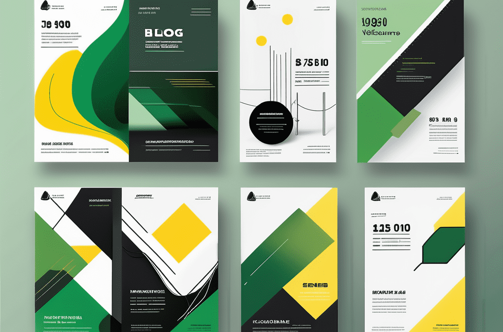
Applying complementary colors in flyer design
Now that we understand the magic behind complementary colors, let’s explore how to apply this knowledge to create visually stunning flyers.
When it comes to designing a flyer that truly stands out, understanding the psychology of colour is paramount. Complementary colours sit opposite each other on the colour wheel, creating a dynamic and eye-catching contrast. This contrast can be used to grab the viewer’s attention and convey a sense of harmony in your design.
Choosing the right complementary colors
In order to select the perfect complementary colors for your flyer, consider the emotions you want to evoke and the message you want to convey. Are you promoting a lively event or offering a calming service? Once you have identified the mood you want to capture, browse through a color wheel and experiment with different combinations to find the perfect balance.
It’s important to note that the intensity of the colours you choose can also impact the overall feel of your flyer. Bright, highly saturated complementary colours can create a bold and energetic look, while softer, muted tones can evoke a more subtle and sophisticated feel.
Balancing complementary colors for visual impact
Using complementary colors doesn’t mean simply slapping them together. To create a visually striking design, you need to find a harmony between the colors. Try using one color as the dominant hue while using its complementary color sparingly for contrast. This creates a sense of harmony and prevents your design from becoming overwhelming.
Another technique to enhance the visual impact of your flyer is to incorporate shades and tints of your chosen complementary colours. This adds depth and dimension to your design, making it more visually engaging. Experiment with different tones to create a cohesive and captivating composition that will leave a lasting impression on your audience.
Common mistakes to avoid with complementary colors
Like any art, using complementary colors requires precision and a keen eye. Avoid these common pitfalls to ensure that your flyer design lives up to its full potential.
When delving into the world of complementary colors, it’s important to understand the psychology behind them. Complementary colors sit opposite each other on the color wheel, creating a dynamic and vibrant contrast. This contrast can be visually striking and attention-grabbing, making it a popular choice for designs that aim to stand out.
Overusing complementary colors
While complementary colors are a powerhouse when used correctly, going overboard with them can lead to visual chaos. If every element on your flyer is screaming for attention, your message will be lost in the chaos. Remember, balance is key!
One way to avoid overusing complementary colors is to introduce neutrals or white space into your design. This will help create breathing room for the eye and prevent the colours from overwhelming the viewer. By strategically incorporating complementary colours alongside neutrals, you can create a harmonious and impactful design that guides the viewer’s gaze without causing sensory overload.
Misunderstanding color harmony
Color harmony refers to how well the colors in your design work together. It is essential for creating a visually pleasing composition. While complementary colors create contrast, incorporating other harmonious colors, such as analogous or triadic colors, can add depth and complexity to your design.
Exploring different colour harmonies can open up a world of possibilities for your flyer design. Analogous colours, which sit next to each other on the colour wheel, create a sense of unity and cohesion. On the other hand, triadic colours, formed by selecting three equidistant hues on the colour wheel, offer a balanced yet vibrant palette. By experimenting with various colour harmonies, you can elevate your design and evoke different emotions and moods in your audience.
Tips for effective use of complementary colors
Now that you’re armed with the knowledge of complementary colors, let’s dive into some practical tips to help you make the most of this powerful tool.
Considering your audience and purpose
Before you start experimenting with colors, it’s crucial to understand your target audience and the purpose of your flyer. Are you targeting young adults for a trendy event or aiming for a more mature audience? By aligning the color scheme with your target audience’s preferences and expectations, you can create a stronger emotional connection and increase the likelihood of a positive response.
Experimenting with different shades and tints
Don’t limit yourself to the standard hues of complementary colors. Play with shades and tints to add depth and variety to your design. By using lighter or darker variations of your chosen colors, you can create contrast within the complementary scheme and make certain elements stand out.
So, there you have it – a crash course in color theory and the vibrant world of complementary colors. Armed with this knowledge, you can confidently design flyers that pack a visual punch. Remember to choose your complementary colors wisely, balance them harmoniously, and consider your audience and purpose for maximum impact. Unleash your creativity and watch as your flyers become the talk of the town!