Flyers are a versatile and cost-effective marketing tool that can help businesses reach their target audience and promote their products or services. In this article, we will explore the key elements of an effective flyer design, including the purpose, essential elements, layout and composition, printing considerations, and common mistakes to avoid. So let’s dive in and discover how you can create attention-grabbing flyers that leave a lasting impression on your audience!
Understanding the purpose of a flyer
Before diving into the nitty-gritty of flyer design, it’s essential to understand the purpose of a flyer. In simple terms, a flyer is a printed advertisement that aims to capture attention and convey important information. Whether it’s promoting an upcoming event, advertising a special offer, or introducing a new product, flyers are designed to create awareness and generate interest.
Moreover, flyers have been a popular marketing tool for decades, with their origins dating back to the early 19th century. Initially used for political campaigns and public announcements, flyers have evolved to encompass a wide range of purposes in the modern world. From promoting local businesses to spreading awareness about social causes, the versatility of flyers makes them a valuable asset in the marketing toolkit.
Defining your target audience
One of the crucial steps in creating an effective flyer is identifying your target audience. Knowing who you’re trying to reach will help you tailor your design and message to resonate with them. Are you targeting young professionals or families? Are you promoting a local event or a national campaign? By understanding your audience, you can create a flyer that speaks directly to their needs and interests.
Furthermore, understanding the demographics and psychographics of your target audience can significantly impact the success of your flyer campaign. By delving deeper into their preferences, behaviours, and motivations, you can craft a flyer that not only grabs their attention but also compels them to take the desired action.
Identifying the key message
Once you know your target audience, it’s time to identify the key message you want to convey through your flyer. What do you want your audience to know or do after reading your flyer? Whether it’s making a purchase, attending an event, or visiting your website, your key message should be clear and compelling.
Moreover, the design elements of your flyer, such as colours, fonts, and images, play a crucial role in reinforcing your key message. A well-designed flyer not only conveys information effectively but also evokes emotions and creates a lasting impression on the audience. By striking the right balance between visual appeal and informative content, you can ensure that your flyer leaves a lasting impact on the recipients.

Essential elements of a flyer
Now that we’ve covered the purpose of a flyer, let’s explore the essential elements that make a flyer effective and eye-catching.
When designing a flyer, it’s crucial to pay attention to the layout and composition. A well-structured layout can help guide the reader through the information in a logical and engaging way. Consider using grids or columns to organise your content and create a sense of balance. White space is also essential as it can help prevent the flyer from looking cluttered and overwhelming.
The role of typography in flyer design
The typography you choose can significantly impact the readability and overall appeal of your flyer. Aim for a font that is easy to read and matches the tone of your message. Consider using different font sizes and styles to create hierarchy and guide the reader’s attention to the most important information.
Furthermore, don’t underestimate the power of typography in conveying the personality of your brand. The right font choice can evoke different emotions and associations, so make sure it aligns with your brand identity and the message you want to communicate.
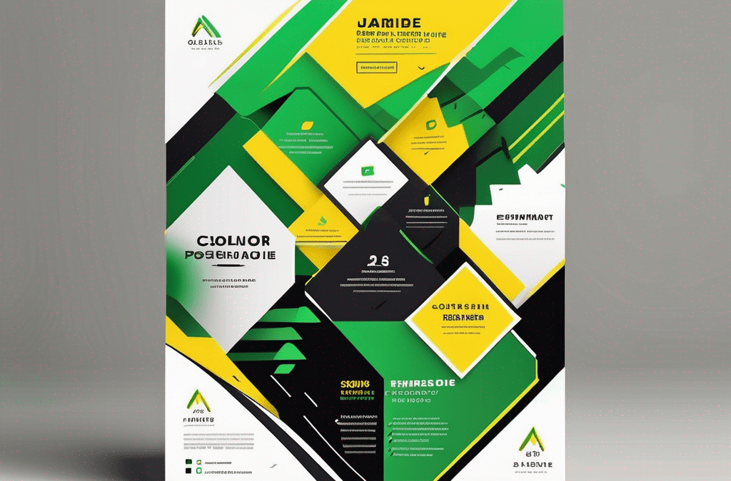
The importance of colour and imagery
Colour and imagery play a vital role in capturing attention and creating a memorable flyer. Use colours that align with your brand and evoke the desired emotions. High-quality images or illustrations can enhance the visual appeal and convey your message quickly. Be sure to choose visuals that are relevant to your content and resonate with your target audience.
When selecting colours for your flyer, consider the psychological impact they may have. Different colours can evoke specific feelings and associations, so choose wisely based on the message you want to convey. Additionally, ensure that the colours you use complement each other and create a harmonious visual experience for the reader.
The power of a strong call to action
A call to action (CTA) is a crucial element of any flyer. It’s the part that tells your audience what to do next. Whether it’s “Call now,” “Visit our website,” or “Limited time offer,” a strong and clear CTA encourages your audience to take action. Make it stand out by using contrasting colours and placing it strategically on your flyer.
Remember, the effectiveness of your CTA also depends on the clarity of your message and the incentive you provide. Make sure your CTA is compelling and offers a clear benefit to the reader to increase the chances of them responding to your call to action.
Layout and composition in flyer design
Now that we’ve covered the essential elements, let’s discuss the importance of layout and composition in flyer design.
When it comes to designing a flyer that catches the eye and effectively conveys your message, the layout and composition play a crucial role. A well-thought-out layout can guide the reader’s eye through the information in a logical and aesthetically pleasing way, ultimately enhancing the overall impact of the flyer.
Balancing elements for visual harmony
The key to an aesthetically pleasing flyer is achieving visual harmony. Distribute elements such as text, images, and white space evenly throughout the flyer to create balance. By carefully considering the placement of each element, you can ensure that the flyer is visually engaging and easy to navigate for the reader.
Moreover, white space, also known as negative space, is a powerful design tool that can help create a sense of elegance and sophistication in your flyer. Embracing white space allows the important elements of your design to stand out and grab the reader’s attention, without overwhelming them with too much information.
The rule of thirds in flyer layout
The rule of thirds is a compositional guideline that helps create visually appealing designs. By dividing your flyer into a grid of nine equal parts, both vertically and horizontally, you can create a layout that is visually balanced and engaging.
When applying the rule of thirds to your flyer design, consider placing key elements such as headlines, images, or call-to-action buttons at the points where the grid lines intersect. This technique not only adds visual interest to your flyer but also guides the viewer’s eye naturally across the content, making it more engaging and impactful.
Printing considerations for flyers
Now that you’ve designed the perfect flyer, it’s time to think about the printing process. Paying attention to these considerations can ensure your flyers turn out as intended.
When it comes to printing flyers, there are several key factors to consider beyond just the design. The printing process can greatly impact the final look and feel of your flyers, so it’s important to choose the right options for your specific needs.
Choosing the right paper stock
When printing flyers, selecting the right paper stock is crucial. Consider factors such as thickness, finish, and durability. For example, if you’re creating flyers for a high-end event, you might opt for a glossy or matte finish to convey a sense of luxury.
Additionally, the weight of the paper can also make a difference in how your flyers are perceived. Heavier paper stocks can give a more premium feel, while lighter weights may be more cost-effective for mass distribution.
Understanding print resolution and colour modes
Ensure that your flyer’s images and graphics have a high enough resolution for printing. The standard resolution for printed materials is 300 dots per inch (dpi). Also, make sure to use the appropriate colour mode, such as CMYK, for accurate colour representation when printed.
Furthermore, considering the colour psychology behind your colour choices can also impact the effectiveness of your flyers. Different colours evoke different emotions and responses, so selecting the right palette for your target audience is key to successful flyer printing.
Common mistakes in flyer design
While you now know the essential elements and considerations for flyer design, it’s crucial to be aware of common mistakes to avoid.
Overcrowding your flyer
One of the most common mistakes is including too much information on your flyer. Remember, less is more. Keep your design clean and uncluttered, focusing on the key message and engaging visuals that grab attention.
When designing a flyer, it’s important to strike a balance between providing enough information to convey your message effectively and overwhelming your audience with an excessive amount of text and images. White space is your friend in design, allowing elements to breathe and ensuring a visually appealing layout.
Neglecting to proofread
A simple yet critical mistake is overlooking typos and grammar errors. Proofread your flyer multiple times to ensure accuracy and professionalism. Mistakes can undermine the credibility of your message and reflect poorly on your brand.
Proofreading is an essential step in the design process that should never be skipped. It not only helps in catching spelling and grammatical errors but also ensures that the overall message is clear and coherent. Consider asking a colleague or friend to review your flyer as a fresh pair of eyes can often spot mistakes that you may have missed.
By understanding the purpose of a flyer, incorporating the essential elements, paying attention to layout and composition, considering printing factors, and avoiding common mistakes, you can create compelling and impactful flyers. Remember to keep your target audience in mind and let your creativity shine through. With Printulu – online printing, you can bring your flyer design to life and start spreading the word about your business or event. So get creative, start designing, and let your flyers do the talking!
Read More common Mistakes Here