Flyers are a fantastic way to grab attention and spread the word about your business or event. But did you know that the key to a successful flyer lies in balancing text and images? In this article, we'll dive into the world of flyer design and explore the importance of achieving the perfect balance.
Understanding the importance of balance in flyer design
When it comes to flyer design, balance is crucial. It's all about finding the right harmony between the text and images to create a visually pleasing and impactful design. But why is balance so important?
Balance in flyer design goes beyond just aesthetics; it also plays a significant role in how information is perceived and absorbed by the audience. A well-balanced flyer not only looks visually appealing but also ensures that the key message is effectively communicated to the reader. By carefully balancing elements such as text, images, and white space, designers can create a layout that is both engaging and easy to navigate.
The role of visual hierarchy in flyer design
Visual hierarchy refers to the arrangement and prioritisation of elements on a page. When designing a flyer, you want to guide the reader's eye and convey your message effectively. By establishing a visual hierarchy through balance, you can lead your readers through the content in a logical and engaging way.
Moreover, visual hierarchy helps in creating a sense of order and importance within the flyer. By strategically placing key information such as headlines, subheadings, and call-to-action buttons, designers can direct the reader's attention and ensure that the most crucial details are noticed first. This not only enhances the overall readability of the flyer but also increases the chances of the audience engaging with the content.
How balance contributes to effective communication
A well-balanced flyer ensures that your message is easily digestible and understood by the reader. When text and images work together harmoniously, they create a cohesive and impactful visual experience. This plays a huge role in capturing the reader's attention and encouraging them to take action.
Furthermore, balance in flyer design can evoke emotions and convey the tone of the message. Whether it's through the use of colour schemes, typography choices, or image placement, balance can help set the mood and create a connection with the audience. By striking the right balance between different design elements, designers can effectively communicate the brand's personality and values, ultimately leaving a lasting impression on the viewer.
The art of balancing text and images
So, how can you achieve the perfect balance between text and images? Let's explore some key elements to consider.
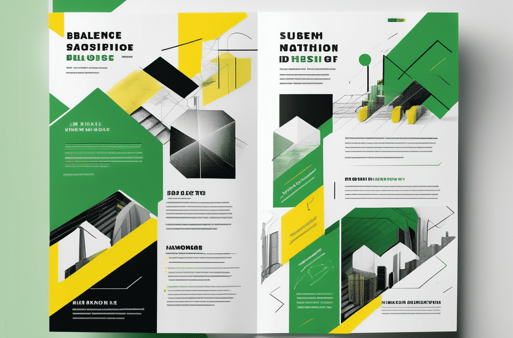
When designing a flyer, it is crucial to strike a harmonious balance between text and images. This balance is essential for creating a visually appealing and engaging layout that effectively conveys your message to the audience. By carefully considering the placement and size of text alongside images, you can create a cohesive design that captures the viewer's attention and communicates your information effectively.
Choosing the right font for your flyer
Fonts are like personalities for your text. Whether you opt for a bold display font or a sleek and minimalistic sans-serif font, your choice will greatly impact the overall feel of your flyer. Experiment with different fonts to find one that complements your message and enhances the visual balance.
In addition to selecting the right font style, it is important to consider factors such as font size, spacing, and alignment. These typographic elements play a significant role in determining the readability and visual hierarchy of your flyer. By carefully adjusting these aspects, you can ensure that your text is easy to read and effectively conveys your message to the audience.
Selecting images that complement your message
Images are powerful visual tools that can convey emotions and tell stories. When selecting images for your flyer, ensure they are relevant and support your message. Whether you go for bold, eye-catching visuals or subtle, understated imagery, make sure they enhance the overall balance and capture the reader's attention.
Consider the colour scheme, composition, and style of the images you choose. These visual elements should align with the tone and message of your flyer to create a cohesive and impactful design. By selecting images that complement your text and enhance the overall aesthetic, you can create a visually compelling flyer that resonates with your target audience.
Practical tips for achieving balance in flyer design
Now that we understand the importance of balance, let's dive into some practical tips for achieving it in your flyer design.
When it comes to creating a visually appealing flyer, balance is key. Achieving balance in design involves distributing elements evenly throughout the layout to create a sense of equilibrium. This ensures that no single element overpowers the others, resulting in a harmonious and engaging composition.
The rule of thirds in flyer layout
The rule of thirds is a compositional technique that can greatly enhance the visual appeal of your flyer design. By dividing the canvas into a grid of nine equal parts, you can strategically position key elements along these gridlines or at their intersection points. This not only creates a sense of balance but also guides the viewer's eye through the design in a natural and visually pleasing way.
Furthermore, the rule of thirds can help you create dynamic and interesting layouts by avoiding placing elements right in the centre. Offsetting your key elements slightly can add a sense of movement and energy to your flyer, making it more engaging for the audience.
Using white space effectively
White space, often referred to as negative space, plays a crucial role in achieving balance and clarity in flyer design. Embracing white space allows you to create breathing room between elements, making it easier for the viewer to digest the information presented. By strategically incorporating white space around key elements, you can draw attention to them and create a visual hierarchy that guides the reader's focus.
Moreover, white space can convey a sense of elegance and sophistication in your flyer design. A cluttered layout can overwhelm the viewer and dilute the impact of your message. By embracing white space, you can create a clean and polished design that exudes professionalism and style.
Common mistakes to avoid in flyer design
While we've discussed how to achieve balance, it's equally important to be aware of common mistakes that can disrupt this delicate equilibrium.
When crafting a flyer, it is essential to consider not only what to include but also what to avoid. By steering clear of these pitfalls, you can elevate your design and captivate your audience more effectively.
Overcrowding your flyer with text or images
When it comes to flyer design, less is often more. If your flyer is cluttered with too much text or overloaded with images, the balance will be thrown off. Keep your message concise and your visuals impactful to ensure a balanced and visually appealing design.
White space is a valuable asset in design, allowing elements to breathe and creating a sense of elegance. Embrace the beauty of simplicity and give your content room to shine, drawing the viewer's eye to the key information you want to convey.
Ignoring the importance of colour balance
Colour plays a vital role in flyer design. Ignoring the importance of colour balance can result in a design that feels jarring or visually overwhelming. Create harmony by selecting a colour palette that complements your message and ensures the overall balance of the flyer.
Consider the psychology of colours when making your choices. Different colours evoke specific emotions and associations, so strategically use them to reinforce the message you want to communicate. A well-thought-out colour scheme can enhance the impact of your flyer and leave a lasting impression on your audience.
Evaluating the balance of your flyer design
Once you've designed your flyer, it's essential to evaluate its balance before printing and distribution.
When assessing the balance of your flyer design, it's crucial to consider not only the placement of elements but also the visual weight they carry. Elements such as images, text, and white space all contribute to the overall equilibrium of the design. A well-balanced flyer will guide the viewer's eye smoothly across the content, ensuring that no single element overpowers the others.
Self-assessment techniques for your design
Take a step back and look at your flyer with fresh eyes. Assess the balance by considering how the elements work together and whether the overall design feels cohesive. Adjust any elements that feel out of place or disrupt the balance.
Furthermore, pay attention to the use of colour and typography in your design. Consistent colour schemes and font choices can enhance the visual harmony of your flyer, making it more appealing to the audience. Experiment with different combinations to find the perfect balance that suits your message and brand identity.
Seeking feedback on your flyer design
Don't hesitate to seek feedback from others! Show your design to friends, colleagues, or even your target audience to gain valuable insights. Listening to different perspectives will help you identify any imbalances and improve your flyer design.
Remember, achieving balance between text and images is the key to creating a visually appealing and engaging flyer. So, put these tips to practice and watch as your flyer design becomes a powerful tool for spreading your message and attracting attention to your business or event!