Flyers are a powerful marketing tool that can capture the attention of potential customers and convey your message effectively. In this blog post, we'll delve into the world of flyer design and explore the key elements and strategies that will help you create eye-catching flyers. From understanding the basics of effective design to incorporating compelling calls-to-action and showcasing your unique selling proposition (USP), this guide will equip you with the knowledge and skills to design flyers that leave a lasting impact on your target audience.
Understanding the Basics of Effective Flyer Design
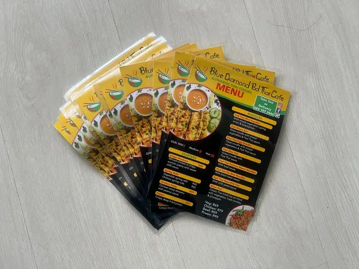
Effective flyer design begins with a clear understanding of your target audience and your marketing objectives. Consider the demographics and preferences of your audience and align your design choices accordingly. Pay attention to the layout, visual hierarchy, and readability to ensure your message is easily understandable. Balance the use of text and images, allowing each element to complement and reinforce the overall message of your flyer. Remember, people are overloaded with information, try and communicate with pictures rather than words. According to a Hubspot blog post, people are 80% more likely to remember something if they see it visually.
Top Tools for Designing and Printing Flyers
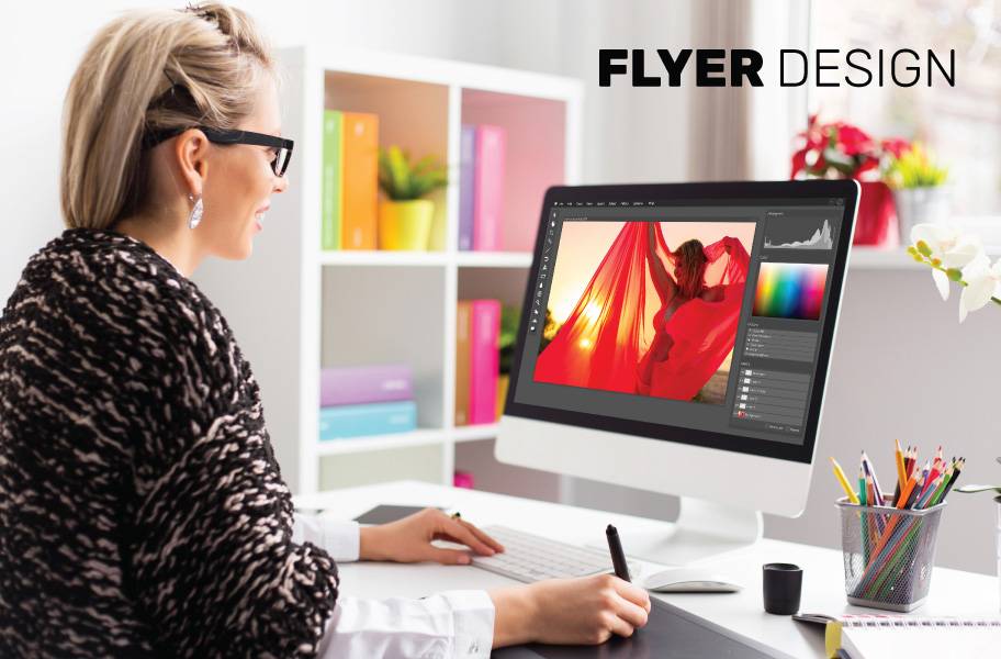
When it comes to designing flyers, having the right tools can make all the difference. Whether you're a seasoned graphic designer or a small business owner with limited design experience, these tools will help you create professional-looking flyers in no time:
Designing a flyer is not just about putting together some text and images; it's about creating a visual masterpiece that captures the attention of your target audience. The design tools you choose can greatly impact the outcome of your flyer, so it's essential to select the right ones for the job.
- Adobe Photoshop: This industry-leading software offers unlimited creative possibilities. From sleek graphics to stunning photo effects, Photoshop has it all.
- Canva: If you're looking for a user-friendly option, Canva is the way to go. With its drag-and-drop interface and extensive library of templates, anyone can design beautiful flyers.
- Inkscape
- Scribus
Creating a flyer that stands out from the crowd requires a combination of creativity and the right tools. By choosing the best design software for your needs, you can elevate your flyer designs and make a lasting impression on your audience.
Key Elements to Include in Your Flyers design
To create impactful flyers, certain key elements should be incorporated. Start with a compelling headline that grabs attention and communicates the essence of your message. Include relevant and concise content that highlights the benefits of your product, service, or event. Add captivating visuals that enhance the overall appeal of your flyer and resonate with your target audience. Finally, make sure to include your contact information and social media handles to encourage engagement and provide avenues for interested customers to reach out.
- Here is a handy title generator that can help you create kick-ass titles: Title Generator
- Contact Information: Create QR codes and short links to track: Bitly
- Generate your own visuals with AI: Picsart
- Customise an existing Flyer Design: Canva
- Heads up - Canva is based on US Sizes. Be sure to adjust your size (Resize) - This is a premium feature.
Tips for Choosing the Right Colours, Fonts, and Images
The choice of colours, fonts, and images greatly influences the visual impact of your flyers. Select colours that align with your brand identity and evoke the desired emotions in your audience. Use fonts that are legible and consistent with your brand's tone and personality. When it comes to images, opt for high-quality visuals that relate to your message and resonate with your target audience. Be mindful of copyright restrictions and consider creating original imagery or using stock photos from reputable sources.
- Quickly generate colour palettes from your logo: Brandmark.io
- Font Picker: Tasakade
Choosing the Right Color Scheme for Your Flyers
Colors play a crucial role in catching attention and conveying the right message. When selecting a color scheme for your flyers, consider the following:
• Branding: Use colors that align with your brand's identity to create a consistent look and feel across all your marketing materials.
• Contrast: Contrast helps elements stand out. Ensure that your text and images are easily readable by using contrasting colors.
• Psychology: Different colors evoke different emotions. For example, blue conveys trust and reliability, while red signifies urgency and excitement. Choose colors that reflect the mood you want to create. Read about colours & flyers here
When it comes to branding, it's essential to consider not only your logo colours but also the overall aesthetic that represents your company. Consistency in colour usage helps in brand recognition and creates a sense of unity across all marketing materials. This doesn't mean you have to stick to just one or two colours; you can create a palette that complements your brand colours and adds depth to your design.
Contrast is not just about using light and dark colours; it's also about considering warm and cool tones, complementary colours, or even playing with shades to create visual interest. Experimenting with different levels of contrast can lead to unique and eye-catching flyer designs that draw the viewer's attention to key information. Remember, the goal is to make your flyers visually appealing while maintaining readability.
Design Elements to Include in Your Flyers
Now that you have the tools and color scheme sorted, it's time to think about the design elements that will make your flyers pop:
When creating a flyer, it's essential to pay attention to the finer details that can truly elevate your design and capture the attention of your target audience. One crucial element to consider is the typography you use for your headline. The font style and size can significantly impact how your message is perceived. Experiment with different fonts to find one that not only stands out but also reflects the tone of your content.
• Compelling Headline: Your headline should grab attention and communicate the main message of your flyer in a concise and engaging way.
• Eye-Catching Graphics: Use high-quality images and graphics that are relevant to your message. Incorporating visuals can increase readers' understanding and retention of information.
• Whitespace: Don't overload your flyer with too much text and images. Whitespace allows for visual balance and makes your message easier to digest.
• Call to Action: Make sure to include a clear call to action that tells your audience what they should do next, whether it's visiting your website, making a purchase, or attending your event.
Another design element that can make a significant impact on your flyer is the use of colour psychology. Different colours evoke different emotions and responses in people, so choose your colour palette wisely to convey the right message. For example, blue is often associated with trust and professionalism, while red can create a sense of urgency or excitement. By understanding the psychological effects of colour, you can strategically use it to enhance the overall effectiveness of your flyer design.
Printing Options for Professional-Quality Flyers
While designing is one part of the process, the quality of the printed flyers is equally important. Here are some printing options to consider:
When it comes to paper quality, selecting the right stock can significantly impact the overall look and feel of your flyers. Opting for a high-quality paper stock that feels substantial and durable, such as glossy or matte finishes, can enhance the perceived value of your flyers and make them stand out from the competition. Consider the tactile experience you want to create for your audience and choose a paper stock that aligns with your brand image.
• Paper Quality: Opt for a high-quality paper stock that feels substantial and durable, such as glossy or matte finishes.
• Print Quantity: Printing in bulk is often more cost-effective. Evaluate your needs and consider how many flyers you'll require for your campaign.
• Finishing Options: Enhance the look of your flyers with additional finishing options, like spot UV, embossing, or foiling. These choices can elevate your flyers and make a lasting impression.
When deciding on the print quantity for your flyers, it's essential to strike a balance between cost-effectiveness and meeting your campaign's requirements. Printing in bulk can often result in lower costs per unit, making it a suitable option for large-scale distribution. However, be mindful of storage constraints and the possibility of information changes before committing to a high print quantity. Consider working closely with your printing provider to determine the optimal print quantity based on your budget and distribution strategy.
Using Images and Graphics Effectively in Flyers
Images and graphics are powerful tools for capturing attention and conveying your message. In today's digital age, where information overload is common, a well-chosen image can make all the difference in grabbing someone's attention amidst the sea of content they encounter daily.
When selecting images for your flyers, it's crucial to consider not just their aesthetic appeal but also their relevance to your content. A visually striking image that has no connection to your message can confuse your audience and dilute the impact of your flyer. Therefore, take the time to choose visuals that not only look good but also enhance and reinforce the message you're trying to convey.
• Relevance: Choose images and graphics that are relevant to your content. Irrelevant visuals can confuse your audience and dilute your message.
• Resolution: Use high-resolution images to ensure that your flyers maintain their quality when printed. Blurry or pixelated visuals can give a poor impression of your brand.
• Balance: Find the right balance between visuals and text. Make sure that your images and graphics complement your message rather than overpowering it.
Moreover, the resolution of your images is paramount. High-resolution images ensure that your flyers look professional and polished when printed. A pixelated or blurry image can detract from the overall quality of your flyer and may even reflect poorly on your brand's image.
Creating a Compelling Call-to-Action on Your Flyers
A compelling call-to-action (CTA) is essential to prompt your audience to take the desired action. Clearly state what you want your audience to do, whether it's visiting your website, making a purchase, attending an event, or contacting you. Use action-oriented language and make the CTA prominent and visually appealing. Consider offering incentives or limited-time offers to create a sense of urgency and drive immediate response. Here are 17 best practices to guide you to create the ultimate Call-to-Action.
Showcasing Your Unique Selling Proposition (USP) in Your Flyer Design
Your flyer is an opportunity to showcase your unique selling proposition (USP) and differentiate yourself from competitors. Clearly communicate what sets your product, service, or event apart from others in the market. Highlight the key benefits or features that make your offering unique and valuable. Incorporate testimonials or customer reviews to build trust and credibility. By effectively conveying your USP, you'll captivate your audience and compel them to choose you over the competition.
Designing eye-catching flyers requires a strategic approach that considers your target audience, incorporates key design elements, and effectively communicates your message. By understanding the basics of effective flyer design, choosing the right colours, fonts, and images, creating compelling calls-to-action, and showcasing your unique selling proposition, you can create captivating flyers that leave a lasting impression on your audience. Remember to align your design choices with your brand's identity and objectives, and seize the opportunity to include backlinks that drive traffic and provide valuable opportunities for brands. Elevate your marketing efforts with well-designed flyers that effectively engage and convert your target audience.


