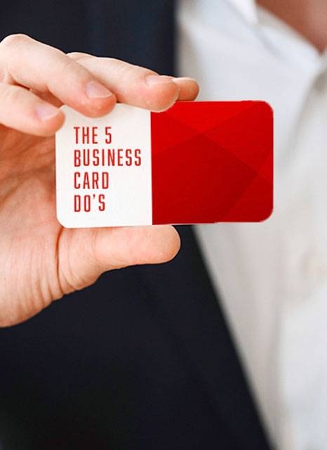
If there is one thing your business requires, it is the time old fashion that is business cards. These little gems might be a vintage idea but they are two other more important things: Always accessible (Because it can fit in your wallet) and one of the first impressions of your business. Not to mention that it is an affordable print item.
With that in mind, having a striking business card can go a long way in the mind of potential clients. Studies have shown that 39% of people wouldn’t do business with a company that has a cheap-looking business card.
Think of your business cards as your work outfit, you wouldn’t go into a meeting with a wrinkled jacket that has a mustard stain on it, would you? Luckily, you have lamination for business cards which can avoid the whole mustard scenario in totality.
As an ambassador for your brand, there are definitely a few key elements that you can look out for when it comes to the design of your business cards.

KEEP IT SIMPLE
OR KISS AS THEY SAY
Avoid bombarding your business card with irrelevant information. Prioritise readability over creativity but, use creativity to give your potential client a feel of what your business is about. They know your name; your title and they’ve got your website address.
Be sure that they can see what you do with one glance at your business card.
COLOUR IT UP CONSERVATIVELY
Avoid harsh colours, rather choose colours that are visually pleasing. A mix of overly bright colours may make your card stand out in a stack of 50, but not in the way you intended it to stand out.Try to keep your colour scheme consistent throughout your different contact points to develop a professional image of your brand.
INCLUDE MULTIPLE CONTACT CHANNELS
Remember, we live in a world that has all sorts of clients out there. Each of those clients choose to communicate through their own channel. The more channels for communication you have, the more likely you are going to attract a customer.
The most common channel of choice includes WhatsApp messaging because of the 98% open rate.
DO NOT SCRIMP ON
LEGIBILITY
The common rule for text size is 5 points, any smaller than that and your client won’t be able to read it.
Think of the four-eyed friends amongst us and keep to the minimum font size.
THE INFORMATION REQUIREMENTS
- It’s really important to have this information on your business card, believe it or not we have received business cards with a lot less.
- • Logo and tagline
- • Business Registration
- • Your name
- • Title
- • Relevant Contact information
Sometimes, physical business cards are better and more effective than any digital form of communication. You never know when you might meet a potential customer.


