
Picture this:
You're about to learn everything about "10 Graphic Designer Do's and Don'ts to Consider for your Next Print Run" — without the jargon, without the fluff, and with at least one dad joke that'll make you groan. Grab your coffee. Let's go.
Key Takeaways
9 min read
- 1What you need to know before printing
- 2Common mistakes to avoid
- 3How to get the best results
Graphic design isn't just art — it's communication with rules that serve a purpose. When you get it right, your print materials become powerful business tools that make your brand shine.
Many people think graphic design is simply "making things pretty," but there's so much more to it. Professional designers follow specific principles that transform cluttered, confusing layouts into clear, compelling messages. The good news? You don't need years of training to apply these fundamentals to your next print run.
<AcademyQuote> Graphic design is a way of making a message clear and easily understandable to a specific group of people, with the added bonus of making it look good. </AcademyQuote>
Whether you're designing business cards, <a href="https://www.printulu.co.za/product/flyers?utm_source=blog&utm_medium=content&utm_campaign=internal" class="internal-link text-[#007756] hover:text-[#005d42] underline font-medium">flyers</a>, or brochures, these 20 essential do's and don'ts will help you create professional-looking print materials that actually work.
The Top 10 Design Do's:#
1. Do Stay in the Lines#
Remember colouring inside the lines as a kid? That skill's about to pay dividends. In print design, you've got two critical "lines" to respect: bleed and safety margins.
Your bleed area (typically 3mm) ensures colours and images extend beyond the final cut line. Without proper bleed, you'll end up with ugly white edges if the cutting isn't perfectly aligned. The safety margin (another 3mm inward) keeps your text, logos, and important elements from getting chopped off.
Think of it this way: bleed protects your backgrounds, safety margins protect your content.
2. Do Spell Check#
This seems obvious, but even seasoned writers miss errors. Spelling mistakes don't just look unprofessional — they can cost you clients who question your attention to detail.
Check your copy three times: once while writing, once after completing the design, and once more before sending the final version. Better yet, get someone else to review it. Fresh eyes catch mistakes that yours might miss after staring at the same design for hours.
3. Do Tweak the Kerning#
Kerning is just fancy designer-speak for letter spacing. Poor kerning makes text hard to read and instantly signals amateur work to anyone with design experience.
Good kerning creates visual balance and improves readability. But don't go overboard — if you're adjusting kerning beyond a 25-point range, you probably need a different font entirely.

kerning
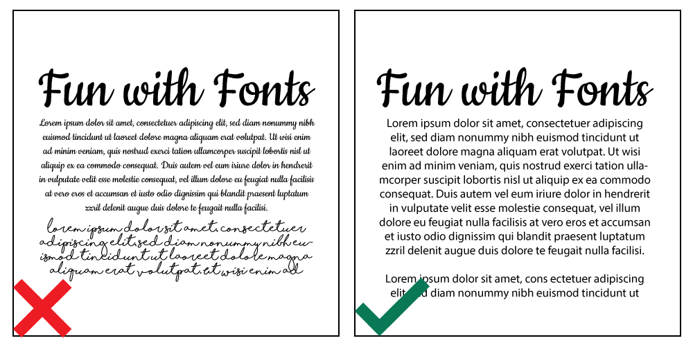
4. Do Have Fun with Fonts#
Font selection can make or break your design. Choose fonts that match your brand's personality and make sense for the content. A playful script might work for a children's party invitation but would look ridiculous on a law firm's letterhead.
Keep display fonts (the big, fancy ones) for headings only. They're designed to grab attention, not for reading large blocks of text. For body copy, stick with clean, legible options.
<AcademyProTip> Here's a quick font fact: "Arial" is a typeface, while "Arial Bold" and "Arial Regular" are fonts within that typeface family. The typeface is the overall design; fonts are the specific variations. </AcademyProTip>
font variants examples
5. Do Match Your Colours#
Colour theory isn't just academic fluff — it's practical knowledge that prevents eye-strain and communicates the right emotions. Red and green are complementary colours, which means they create visual tension when used together.
Start with Pinterest colour palettes if you're unsure. Research what your chosen colours communicate. Red suggests energy and passion, but might not suit that baby shower invitation where soft pastels would create the calm feeling you're after.
6. Do Fix Your Imagery#
Even professional photographers enhance their images before delivery. Your print designs deserve the same treatment. Adjust colour balance, brightness, and contrast to make images pop.
Pay attention to how image colours work with your overall colour scheme. This prevents that disjointed look that screams "amateur hour."
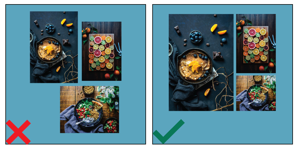
7. Do Be Illustrative#
People are visual creatures in a hurry. A well-designed icon or graphic often communicates faster and more effectively than paragraphs of text. That's why we've included graphics in this very blog post.
Icons, graphs, and simple illustrations help viewers process information quickly. In our fast-paced world, that's exactly what you want.

graphic example
8. Do Leave Some Breathing Room#
Cramped design elements create the same uncomfortable feeling as being squashed in a taxi during peak hour. Your design needs space to breathe.
White space (or negative space) isn't wasted space — it's a powerful design tool that makes your content easier to digest and more pleasant to look at. When elements have room to breathe, your audience feels at ease too.
9. Do Check Your Alignment#
Humans instinctively notice when things aren't aligned properly. It's an unconscious skill we all have, though professional designers tend to be more vocal about misalignment issues.
Proper alignment creates that clean, professional appearance that builds trust with your audience. Take time to line up text, images, and other elements precisely.
10. Do Keep It Simple#
This is where every designer needs to step back and ask: "What can I remove?" Like an over-complicated dish with too many conflicting flavours, busy designs confuse rather than communicate.
Sometimes the simplest solutions are the most effective. If an element doesn't help communicate your message or support the feeling you want to create, leave it out. Finding that sweet spot between boring and over-complicated takes practice, but when in doubt, simplify.
<AcademyDadJoke> Why don't graphic designers ever get lost? Because they always know where to draw the line! </AcademyDadJoke>
BONUS TIP!
Relax. You can't move a mountain in one go — it's one stone at a time. Graphic design should be enjoyable. If you're stressing over every decision, it'll show in your work. Cut yourself some slack and have fun with the process.
Top 10 Graphic Design Don'ts:#
1. Don't Use Too Many Fonts#
Multiple fonts create visual chaos that disorients your audience. Stick to one typeface and use its variations (regular, bold, italic) to create hierarchy and interest.
If your chosen typeface only has one variation, add a maximum of one complementary typeface. Three fonts should be your absolute limit, and only if absolutely necessary.
2. Don't Use Typical Stock Imagery#
We're talking about those meme-worthy photos of impossibly perfect families beaming at the camera. You know the ones. While stock imagery isn't inherently bad, overused clichéd photos make your design look cheap.
Try taking your own photos — modern phone cameras are surprisingly capable. If you need stock images, check out our blog for sources of beautiful, high-resolution, royalty-free images.
3. Don't Put Frames on the Edge#
Borders close to your artwork's edges are risky for print runs. If the cutting is even slightly off, your entire design will look skewed because the frame emphasises the misalignment.
If you must use borders, keep them well away from the edges of your design.
4. Don't Forget to Use Grids#
Grids are your secret weapon for professional-looking layouts. The Rule of Thirds is just one example — there are various grid systems that help you position elements to guide your viewer's eye through the composition.
Grids transform boring layouts into designs that appear considered and structured. They're the difference between amateur and professional-looking work.
alignment example
5. Don't Forget About Your Audience#
Different colours, symbols, and language carry different meanings across cultures. Before you start designing, research your target market. What appeals to them? What might offend them?
A corporate design won't work for a 5-year-old's birthday party invitation, just as playful cartoon elements won't suit a law firm's <a href="https://www.printulu.co.za/product/brochures?utm_source=blog&utm_medium=content&utm_campaign=internal" class="internal-link text-[#007756] hover:text-[#005d42] underline font-medium">brochure</a>. Tailor your design to your specific audience.
6. Don't Stretch the Type#
It's tempting to stretch text slightly to fit a space perfectly, but resist this urge. Fonts are professionally designed with specific proportions for good reason.
If you need wider or narrower text, find a different font. With millions of fonts available online, there's no excuse for warping perfectly good typography.
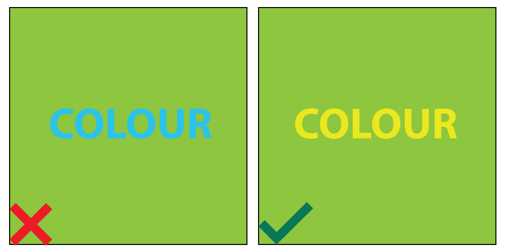
7. Don't Cause Colour Discord#
Clashing colours don't just look awful — they can completely derail your message. When viewers are distracted by jarring colour combinations, they miss what you're trying to communicate.
When in doubt, return to basic colour theory or invest in a colour wheel to guide your choices.
colour example
8. Don't Forget About Hierarchy#
Visual hierarchy ensures the most important information catches attention first. This might mean making key elements larger, bolder, or more colourful.
On a <a href="https://www.printulu.co.za/product/business-cards?utm_source=blog&utm_medium=content&utm_campaign=internal" class="internal-link text-[#007756] hover:text-[#005d42] underline font-medium">business card</a>, you'd typically want viewers to notice the company name/logo first, then the person's name and position, followed by contact details. The hierarchy changes based on purpose, but the principle remains constant.
9. Don't Simply Follow Graphic Design Trends#
Staying current with design trends is smart, but blindly following every new fad isn't. Your unique style is what sets you apart from competitors and attracts specific clients.
More importantly, not every trendy technique will suit your client's needs. Use your judgment and focus on what works for the specific project at hand.
10. Don't Use Too Many Effects#
Remember those cringe-worthy PowerPoint presentations with spinning, bouncing text? That's what happens when effects run wild.
A design with bevels, drop shadows, posterisation, and shine effects looks cheap regardless of your skill level. Clean, simple, and crisp always wins over over-designed chaos.

textures example
Remember that every graphic designer has their own unique style and flair. Don't be afraid to express your creative talent while following these guidelines. Trust your instincts, and you'll create print materials that truly work for your business.
You can order any of the mentioned products at www.printulu.co.za, or call our customer care team at (010) 593 0558 for assistance with your next print run.
Related Articles:
- Business Card Basics – What You Need To Know
- [Sticky Business – How to Design and Prepare <a href="https://www.printulu.co.za/product/stickers?utm_source=blog&utm_medium=content&utm_campaign=internal" class="internal-link text-[#007756] hover:text-[#005d42] underline font-medium">Stickers</a> for Print](http://bit.ly/2HbqHP7)
- Disappointed with your prints? Don't blame the printer just yet.
- Print Ready Artwork – An Easy Checklist
- 4 Ways to Save Money on Graphic Design (It Doesn't Have to be Expensive)
- Why Graphic Design is Useless! (Revealed)
[![Subscribe <a href="https://www.printulu.co.za/product/banners?utm_source=blog&utm_medium=content&utm_campaign=internal" class="internal-link text-[#007756] hover:text-[#005d42] underline font-medium">banner</a>](https://www.printulu.co.za/blog/wp-content/uploads/2019/05/Newsletter_Subscribe-01.png)](https://hello.printulu.co.za/popi-compliance--verify-your-email-address)